How do I make the top div of the full horizontal length of the main container, while keeping the next two div, .left and .right in flex to each other?
To look like this - 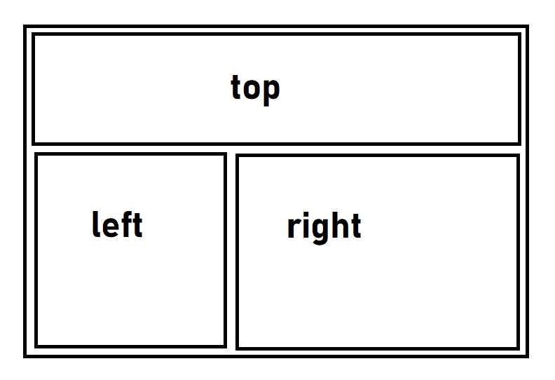
.main {
  border: 1px solid red;
  display: inline-flex;
}

.main div.top {
  border: 1px solid orange;
  width: auto;
  display: inline-block;
}

.main div.left {
  border: 1px solid blue;
}

.main div.right {
  border: 1px solid green;
}
<html>
<body>
<div class="main">
  <div class="top">
    <h1>top</h1>
  </div>
  <div class="left">
    <h1>left</h1>
  </div>
  <div class="right">
    <h1>right</h1>
  </div>
</div>
</body>
</html>