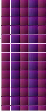
Yes, it is possible! Although it does not work as well as a real diagonal gradient in other browswers.
There are two important aspects of this solution that make it work:
- Two divs with the same position and different
z-index values (one on top of/in front of the other) and different gradient directions (one horizontal, one vertical)
- Transparent/translucent colors in gradients (you can read about this in CSS3 Transparency + Gradient)
Simply place the div with the vertical gradient behind the div with the horizontal gradient (or vice-versa, it doesn't really matter), and make sure the coloring of the topmost gradient is not opaque.
The result looks like this (Internet Explorer 8):
And the CSS:
//left sample
.back
{
    filter: progid:DXImageTransform.Microsoft.gradient(GradientType="0", startColorstr='#880088', endColorstr='#110011');
    z-index:0;
}

.front
{
    filter: progid:DXImageTransform.Microsoft.gradient(GradientType="1", startColorstr='#55ffa885', endColorstr='#55330000');
    z-index:1;
}

//right sample
.diaggradientback
{
    position:absolute;
    left:0;
    top:0;
    width:100%;
    height:100%;
    overflow:hidden;
    filter: progid:DXImageTransform.Microsoft.gradient(GradientType='1', startColorstr='#ffa885', endColorstr='#330000');
}

.diaggradientfront
{
    position:absolute;
    left:0;
    top:0;
    width:100%;
    height:100%;
    overflow:hidden;
    filter: progid:DXImageTransform.Microsoft.gradient(GradientType='0', startColorstr='#bbffa885', endColorstr='#bb330000');
}
Update:
The documention on this filter does say that multiple filters may be applied together. However, as it turns out, applying more than one gradient filter results in only the last one being applied, so simply applying both filters to one layer doesn't work, and two layers are necessary.