I want to place two or more containers inline here is my HTML code:
<div id="containers-place">
<div style="padding: 16px;">
<a href="https://google.com/" target="blank" style="text-decoration: none;"><div class="container" style="width: 20%;">
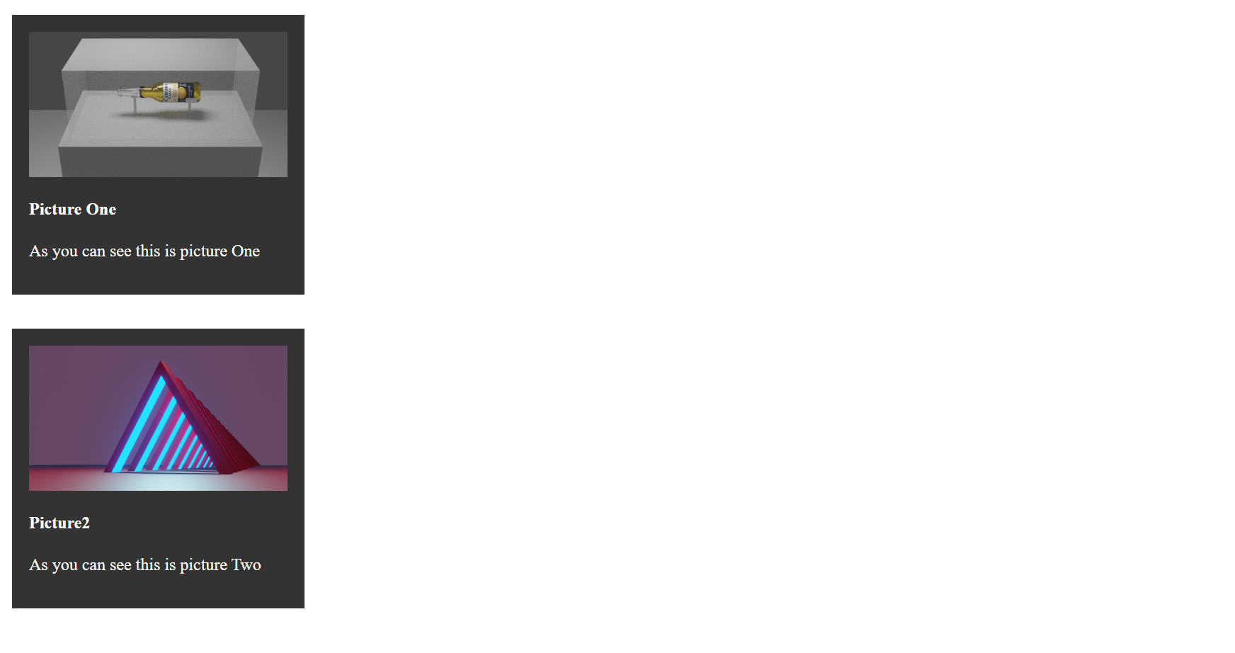
<img src="picture1.png" width="100%">
<h4>Picture One</h4>
<p>As you can see this is picture One</p>
</div></a>
</div>
<div id="idk" style="padding: 16px;">
<a href="https://google.com/" target="blank" style="text-decoration: none;"><div class="container" style="width: 20%;">
<img src="picture2.png" width="100%">
<h4>Picture2</h4>
<p>As you can see this is picture Two</p>
</div></a>
</div>
And the CSS:
.container {
  padding: 16px;
  background-color: #333333;
  color: #fff;
  display: block;
}
I took a screenshot of the browser: screenshoot