0

I'm trying to make the labels for a legend have the same alignment as with the print function. I have found this answer and others, that use leged(prop={'family':'monospace'}: Text alignment using format in matplotlib legend

The labels have been made with the format method: label='{:<8}{:<8}'.format(iso, 'n='+str(isotope_dict[iso]))

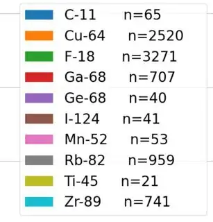
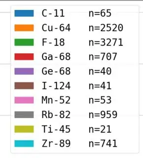
However, while the alignment now works, the font is changed, which doesn't look good for several figures side by side:

With legend()

With legend()

With legend(prop={'family': 'monospace'})

enter image description here

So, is it possible to get the desired alignment, but with the same default font the legend() uses?
Malte Jensen
  • 187
  • 1
  • 11
  • I'm afraid you might only be able to obtain that alignment (without writing each label individually) using a monospace font – Francisca Concha-Ramírez Apr 03 '20 at 13:40
  • Welcome to Stack Overflow! Please provide a [Minimal, Complete, and Verifiable example](https://stackoverflow.com/help/mcve) that includes a toy dataset (refer to [How to make good reproducible pandas examples](https://stackoverflow.com/questions/20109391/how-to-make-good-reproducible-pandas-examples)) – Diziet Asahi Apr 03 '20 at 13:40
  • What would happen if you added `\t` to your labels? – Mad Physicist Apr 03 '20 at 23:37

1 Answers1

3

I have a bit of a hacky answer for you, but it works. plt.legend() has an ncol parameter that allows you to divide your legend entries into multiple columns. By plotting a bunch of non-visible lines with non-visible markers, we can add labels to the legend and place them in the next column.

Here is the code:

import matplotlib.pyplot as plt

# Plot actual data
plt.plot([0, 1], [0, 1])
plt.plot([0, 1], [0, 1.1])
plt.plot([0, 1], [0, 1.2])
plt.plot([0, 1], [0, 1.3])
plt.plot([0, 1], [0, 1.4])

# Plot non-visible lines
plt.plot(np.nan, np.nan, '.', ms=0)

plt.legend(['Line 1', 'Line 2', 'Line 3', 'Line 4', 'Line 5',
            'Col Text 1', 'Col Text 2', 'Col Text 3', 'Col Text 4',
            'Col Text 5'], ncol=2, columnspacing=-1)
plt.show()

And this leads to the following plot:

plot with multiple columns in the legend

By adjusting the columnspacing parameter, you can move that second column closer or farther to the first. Again, this is a bit of a hack. I wouldn't be surprised if there is a better way to do this.

References:

EDIT: This works even if the line labels aren't the same length. Should've made my example show that...

luc
  • 526
  • 3
  • 6