As far as I know, IE does not have auto-flow of grid elements. We could assign a specific grid position to each grid element, please check the following sample:
<style>
    .container {
        display: grid;
        grid-template-columns: repeat(4, 1fr);
        grid-template-rows: 150px 50px;
        grid-gap: 1vw;
        display: -ms-grid;
        /* also faking 1vw grid-gap */
        -ms-grid-columns: 1fr 1vw 1fr 1vw 1fr 1vw 1fr;
        /* also faking 1vw grid-gap */
        -ms-grid-rows: 100px 1vw 100px;
    }

    .grid-item {
        /* style just for demo */
        background-color: yellow;
    }

        /* Explicit placement for IE */
        /* Omitting default value of -ms-grid-column: 1 and -ms-grid-row: 1 where possible */
        .grid-item:nth-child(2) {
            -ms-grid-column: 3;
        }

        .grid-item:nth-child(3) {
            -ms-grid-column: 5;
        }

        .grid-item:nth-child(4) {
            -ms-grid-column: 7;
        }

        .grid-item:nth-child(5) {
            -ms-grid-row: 3;
        }

        .grid-item:nth-child(6) {
            -ms-grid-row: 3;
            -ms-grid-column: 3;
        }

        .grid-item:nth-child(7) {
            -ms-grid-row: 3;
            -ms-grid-column: 5;
        }

        .grid-item:nth-child(8) {
            -ms-grid-row: 3;
            -ms-grid-column: 7;
        }
</style>
<div class="container">
    <div class="grid-item">1,1</div>
    <div class="grid-item">1,2</div>
    <div class="grid-item">1,3</div>
    <div class="grid-item">1,4</div>
    <div class="grid-item">2,1</div>
    <div class="grid-item">2,2</div>
    <div class="grid-item">2,3</div>
    <div class="grid-item">2,4</div>
</div>
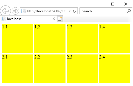
The result (IE 11 browser):

Besides, I think you could also consider to use Bootstrap Grid system, it supports IE11, Microsoft Edge, Firefox and Chrome browser.