Here you can see what I'm talking about :
.layout{
 width: 600px;
 background-color: #211d1d;
 box-shadow: inset 0 0 24px 9px black;
 display: inline-flex;
}

.square-container{
 position: relative;
 width: 300px;
 height: 260px;
}

.square {
  position: absolute;
  width: 260px;
  height: 210px;
  top: 20px;
  left: 20px;
  border: 1px solid black;
  color: white;
  background: rgb(51, 51, 101);
  background: linear-gradient(
                  153deg,
                  rgba(51, 51, 101, 0.9) 0%,
                  rgba(0, 212, 255, 0.3) 100%
  );
  transition-duration: 0.1s;
  // transition-delay: 0.1s; //helps but not radically
 }

 .square-container:hover>.square{
  transform: scale(1.06) perspective(10rem) rotateX(-1deg);
 }
<div class="layout">
<div class="square-container">
<div class="square">Switch your mouse back annd forth really really fast between me</div>
</div>
<div class="square-container">
<div class="square">and me and you'll see one of us sometimes spin crazily</div>
<div>
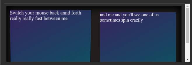
</div>What hover should look like :
What hover momentarily sometimes look like (the bug) :
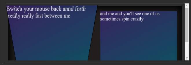
(sometimes the effect is exaggerated much much more than this)
What causes this and how could I prevent it?