Is it possible to get a child element to surpass the width of the parent element to the full extent of the browser without a horizontal scroll?
I've tried the solutions posted here Is there are way to make a child DIV's width wider than the parent DIV using CSS?
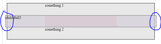
But with this particular HTML (see below) there's only one that works and yet creates an horizontal scrollbar (the extra width seen in the code snippet and the image below is causing the scrollbar to appear)
*I could always add an overflow-x: hidden; in <body> but I'd prefer not to
EDIT: There are certain css properties that even though do not make sense in the example, they should be kept in the solution (if any)
    <div class="main">
      <div class="container">
        <div class="fit">
          something 1
        </div>
        <div class="parent">
          <header class="full full5">
            child full5
          </header>
        </div>
        <div class="fit">
          something 2
        </div>
      </div>
    </div>
    body: {
      margin: 0px;
    }

    .main {
      display: flex;
      flex-direction: column;
      align-items: center;
      background: #e8e8e8;
      border: 1px solid #000;
      margin: 0px;
      box-sizing: border-box;
    }

    .container {
      display: flex;
      flex-direction: column;
      max-width: 300px;
      width: 100%;
    }

    .parent {
      display: flex;
      /* flex-direction: column; */
      width: 100%;
      background-color: #e9cccc;
      box-sizing: border-box;
      position: sticky;
      top: 0;
    }

    .fit {
      height: 50px;
    }

    .full {
      background-color: #d1ccd8a6;
      border: 1px solid #666;
      border-radius: 3px;
      height: 50px;
      padding: 0px;
      box-sizing: border-box;
    }

    .full5 {
      width: 100vw;
      position: relative;
      left: 50%;
      right: 50%;
      margin-left: -50vw;
      margin-right: -50vw;
    }
body: {
  margin: 0px;
}

.main {
  display: flex;
  flex-direction: column;
  align-items: center;
  background: #e8e8e8;
  border: 1px solid #000;
  margin: 0px;
  box-sizing: border-box;
}

.container {
  display: flex;
  flex-direction: column;
  max-width: 300px;
  width: 100%;
}

.parent {
  display: flex;
  /* flex-direction: column; */
  width: 100%;
  background-color: #e9cccc;
  box-sizing: border-box;
  position: sticky;
  top: 0;
}

.fit {
  height: 50px;
}

.full {
  background-color: #d1ccd8a6;
  border: 1px solid #666;
  border-radius: 3px;
  height: 50px;
  padding: 0px;
  box-sizing: border-box;
}

.full1 {
  position: absolute;
  width: 100%;
  left: 0px;
  top: 0px;
}

.full2 {
  width: 100vw;
  position: relative;
  left: calc(-50vw + 50%);
}

.full3 {
  position: relative;
  width: 200%;
  left: -50%;
}

.full4 {
  margin-left: calc(-50vw + 50%);
  width: 100vw;
}

.full5 {
  width: 100vw;
  position: relative;
  left: 50%;
  right: 50%;
  margin-left: -50vw;
  margin-right: -50vw;
}

.full6 {
  margin-left: calc(-50vw + 50%);
  width: 100vw;
}

.hide {
  display: none;
}
<div class="main">
<div class="container">
<div class="fit">
something 1
</div>
<div class="parent">
<header class="full full1 hide">
child full1
</header>
<header class="full full2 hide ">
child full2
</header>
<header class="full full3 hide">
child full3
</header>
<header class="full full4 hide">
child full4
</header>
<header class="full full5">
child full5
</header>
<header class="full full6 hide">
child full6
</header>
</div>
<div class="fit">
something 2
</div>
</div>
</div>EDIT2:
If the <body> has a margin:0 the posted solutions work, except if there is a vertical scrollbar (when isn't there one?)