So this is just the sample code that will generate the example visualization:
# Importing necessary libraries

import numpy as np
import pandas as pd
import matplotlib.pyplot as plt
import datetime
from dateutil.parser import parse

%matplotlib inline

# Below, I just convert date strings into an actual date object.

date_strings = ['2020-01-20 03:32:44',
'2020-03-26 05:13:07',
'2020-03-26 13:32:09',
'2020-03-26 23:57:49',
'2020-03-27 15:30:00',
'2020-03-28 00:04:32',
'2020-03-28 13:26:15',
'2020-03-29 00:11:22',
'2020-04-02 00:30:00',
'2020-04-06 14:00:00']

dates = []

for date in date_strings:
    dt = parse(date)
    print(dt.date())
    dates.append(dt.date())

# finally making the graph:

x1 = np.array([x for x in range(10)])
x = dates
y = [x+60 for x in range(10)]

plt.xticks(ticks=dates,labels=dates,rotation='30')
plt.plot(x,y)
plt.scatter(x,y)

plt.show()
What I get is this:
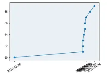
Now this is tricky, because most conventional ways of fixing this involve including random date points in the middle. E.g. there might suddenly be a tick label at 15th Feb.
However, I don't want to include tick labels where a data point wasn't actually recorded.
Essentially, for my requirements, the conditions seem a bit stringent:
- The x-axis can't have tick labels showing that don't occur in the data. (I can do this)
- The first and last dates must always be shown. (I can also do this)
- Any dates in between that can be shown without causing too much clutter in the x-axis, should be shown (this is the part where no existing solution seems to help me!)