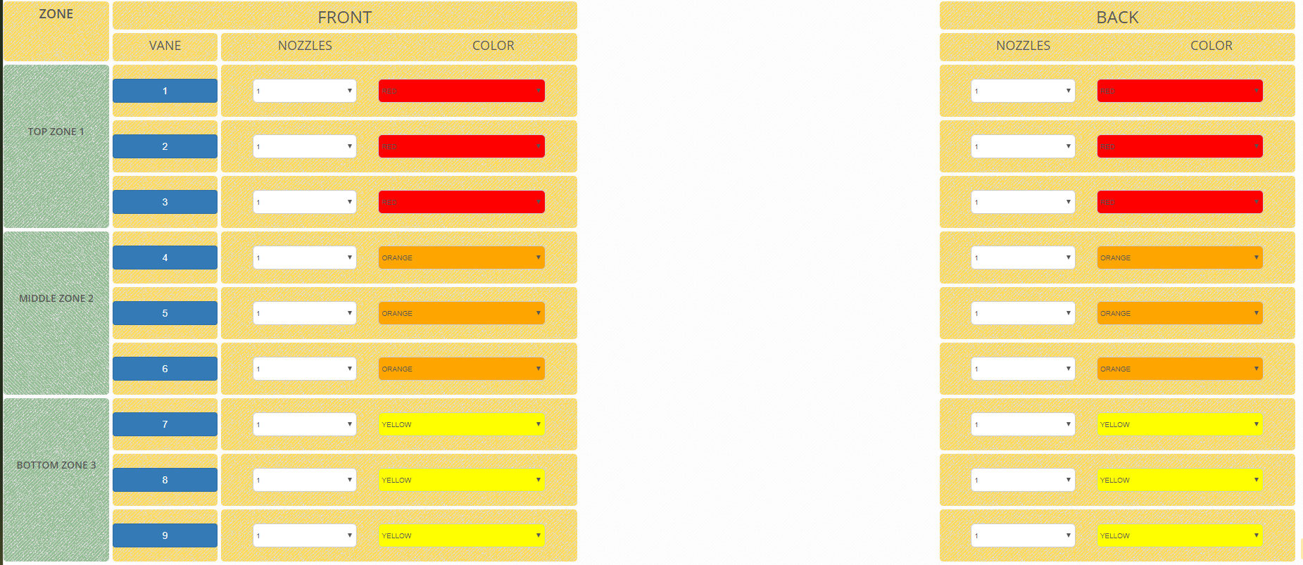
I'm using a CSS Grid layout to create a table and want to be able to hide a center column and have the remaining columns adjust to fill the void from the missing column. I'll just post a bit of code so you can see how the layout is working. I've tried various hacks, but really, I am just not the CSS master. I have a couple of images that tell the whole story. Also, the HTML is just a snip, cuz it's like a mile long.
Snip
$('.Middle').attr('style', 'visibility: hidden');.grid {
display: grid;
grid-template-columns: 8% 8% 27% 27% 27%;
grid-template-rows: 40px 40px;
grid-auto-flow: row;
grid-gap: 5px;
}
.grid--full {
grid-template-columns: 300px 300px 300px;
grid-template-rows: 200px;
grid-gap: 10px;
}
.zone-Header {
grid-column: 1;
grid-row: 1 / 3;
background: url(/assets/img/patterns/breadcrumbsAOF.png) repeat;
border-radius: 5px;
}
.Bank-Front {
grid-column: 2 / 4;
grid-row: 1;
border-radius: 5px;
background: url(/assets/img/patterns/breadcrumbsAOF.png) repeat;
}
.Bank-Middle {
grid-column: 4;
grid-row: 1;
border-radius: 5px;
background: url(/assets/img/patterns/breadcrumbsAOF.png) repeat;
}
.Bank-Back {
grid-column: 5;
grid-row: 1;
border-radius: 5px;
background: url(/assets/img/patterns/breadcrumbsAOF.png) repeat;
}<script src="https://cdnjs.cloudflare.com/ajax/libs/jquery/3.3.1/jquery.min.js"></script>
<div class="grid">
<div class="Bank-Front">
<h2 class="text-center">FRONT</h2>
</div>
<div class="Bank-Middle Middle">
<h2 class="text-center">MIDDLE</h2>
</div>
<div class="Bank-Back">
<h2 class="text-center">BACK</h2>
</div>
<div class="Bank-Front-Header-Vane">
<h4 class="text-center">VANE</h4>
</div>
<div class="zone-Header">
<h4 class="text-center text-bold">ZONE</h4>
</div>
<!--header-->
<div class="Bank-Front-Header">
<div class="row">
<div class="col-xs-6">
<h4 class="text-center">NOZZLES</h4>
</div>
<div class="col-xs-6">
<h4 class="text-center">COLOR</h4>
</div>
</div>
</div>
<div class="Bank-Middle-Header Middle">
<div class="row">
<div class="col-xs-6">
<h4 class="text-center">NOZZLES</h4>
</div>
<div class="col-xs-6">
<h4 class="text-center">COLOR</h4>
</div>
</div>
</div>
<div class="Bank-Back-Header">
<div class="row">
<div class="col-xs-6">
<h4 class="text-center"> NOZZLES</h4>
</div>
<div class="col-xs-6">
<h4 class="text-center">COLOR</h4>
</div>
</div>
</div>
<!-----ZONE 1 ------------->
<!--zone labels-->
<div class=" zone1-Orchard">
<br />
<br />
<br />
<br />
<h5 class="text-center text-bold">TOP ZONE 1</h5>
</div>
<!--Zone1 row 1-->
<div class="zone1-Orchard-Front-Vane-1">
<center> <button class="btn btn-primary rounded" style="width:100%;">1</button></center>
</div>
<div class="zone1-Orchard-Front-1">
<div class="row">
<div class="col-xs-1 no-gutter"> </div>
<div class="col-xs-4 no-gutter">
<select class="form-control-AOF" id="V1F">
<option value="0">0</option>
<option value="1">1</option>
<option value="2">2</option>
<option value="3">3</option>
</select>
</div>
<div class="col-xs-6">
<select class="form-control-AOF z1f" id="C1F">
<option value="BROWN">BROWN</option>
<option value="LIME">LIME</option>
<option value="YELLOW">YELLOW</option>
<option value="LIGHT-BLUE">LIGHT-BLUE</option>
<option value="ORANGE">ORANGE</option>
<option value="RED">RED</option>
<option value="GREY">GREY</option>
<option value="GREEN">GREEN</option>
<option value="BLACK">BLACK</option>
<option value="BLUE">BLUE</option>
</select>
</div>
</div>
</div>
<div class="zone1-Orchard-Middle-1 Middle">
<div class="row">
<div class="col-xs-1"> </div>
<div class="col-xs-4">
<select class="form-control-AOF" id="V1M">
<option value="0">0</option>
<option value="1">1</option>
<option value="2">2</option>
<option value="3">3</option>
</select>
</div>
<div class="col-xs-6 smaller">
<select class="form-control-AOF z1m" id="C1M">
<option value="BROWN">BROWN</option>
<option value="LIME">LIME</option>
<option value="YELLOW">YELLOW</option>
<option value="LIGHT-BLUE">LIGHT-BLUE</option>
<option value="ORANGE">ORANGE</option>
<option value="RED">RED</option>
<option value="GREY">GREY</option>
<option value="GREEN">GREEN</option>
<option value="BLACK">BLACK</option>
<option value="BLUE">BLUE</option>
</select>
</div>
</div>
</div>
<div class="zone1-Orchard-Back-1">
<div class="row">
<div class="col-xs-1 "></div>
<div class="col-xs-4">
<select class="form-control-AOF" id="V1B">
<option value="0">0</option>
<option value="1">1</option>
<option value="2">2</option>
<option value="3">3</option>
</select>
</div>
<div class="col-xs-6">
<select class="form-control-AOF z1b" id="C1B">
<option value="BROWN">BROWN</option>
<option value="LIME">LIME</option>
<option value="YELLOW">YELLOW</option>
<option value="LIGHT-BLUE">LIGHT-BLUE</option>
<option value="ORANGE">ORANGE</option>
<option value="RED">RED</option>
<option value="GREY">GREY</option>
<option value="GREEN">GREEN</option>
<option value="BLACK">BLACK</option>
<option value="BLUE">BLUE</option>
</select>
</div>
</div>
</div>What the full grid looks like

When I hide the center column
What I would like it to do

All suggestions are welcome - Thanks!