4

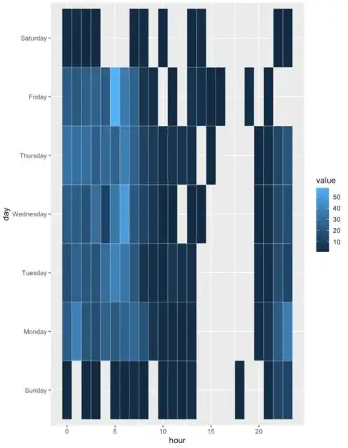
Here is a geom_tile displaying hours and days of the week, how can it made to display each hour (i.e. 00:00 through to 23:00 on the x axis)?

library(tidyverse)
df %>% 
  ggplot(aes(hour, day, fill = value)) +
  geom_tile(colour = "ivory") 

Currently it displays every fifth hour:

enter image description here

I have tried a bunch of different things, and would prefer a 'best practice' way (i.e. without manually generating labels), but in case labels are needed, here's one way to produce them hour_labs <- 0:23 %>% { ifelse(nchar(.) == 1, paste0("0", .), .) } %>% paste0(., ":00")

Data for reproducible example


df <- structure(list(day = structure(c(1L, 1L, 1L, 1L, 1L, 1L, 1L, 
1L, 1L, 1L, 1L, 1L, 1L, 1L, 1L, 2L, 2L, 2L, 2L, 2L, 2L, 2L, 2L, 
2L, 2L, 2L, 2L, 2L, 2L, 2L, 2L, 2L, 2L, 3L, 3L, 3L, 3L, 3L, 3L, 
3L, 3L, 3L, 3L, 3L, 3L, 3L, 3L, 3L, 3L, 3L, 3L, 4L, 4L, 4L, 4L, 
4L, 4L, 4L, 4L, 4L, 4L, 4L, 4L, 4L, 4L, 4L, 4L, 4L, 4L, 5L, 5L, 
5L, 5L, 5L, 5L, 5L, 5L, 5L, 5L, 5L, 5L, 5L, 5L, 5L, 5L, 5L, 5L, 
5L, 6L, 6L, 6L, 6L, 6L, 6L, 6L, 6L, 6L, 6L, 6L, 6L, 6L, 6L, 6L, 
6L, 6L, 7L, 7L, 7L, 7L, 7L, 7L, 7L, 7L, 7L, 7L, 7L), .Label = c("Sunday", 
"Monday", "Tuesday", "Wednesday", "Thursday", "Friday", "Saturday"
), class = c("ordered", "factor")), hour = c(0L, 2L, 3L, 5L, 
6L, 7L, 8L, 10L, 11L, 12L, 13L, 18L, 21L, 22L, 23L, 0L, 1L, 2L, 
3L, 4L, 5L, 6L, 7L, 8L, 9L, 10L, 11L, 12L, 13L, 20L, 21L, 22L, 
23L, 0L, 1L, 2L, 3L, 4L, 5L, 6L, 7L, 8L, 9L, 10L, 11L, 12L, 13L, 
20L, 21L, 22L, 23L, 0L, 1L, 2L, 3L, 4L, 5L, 6L, 7L, 8L, 9L, 10L, 
11L, 13L, 14L, 20L, 21L, 22L, 23L, 0L, 1L, 2L, 3L, 4L, 5L, 6L, 
7L, 8L, 9L, 10L, 11L, 12L, 13L, 15L, 20L, 21L, 22L, 23L, 0L, 
1L, 2L, 3L, 4L, 5L, 6L, 7L, 8L, 9L, 11L, 13L, 14L, 15L, 16L, 
19L, 21L, 0L, 1L, 2L, 3L, 7L, 8L, 10L, 13L, 14L, 22L, 23L), value = c(1L, 
1L, 1L, 2L, 1L, 3L, 1L, 1L, 2L, 1L, 3L, 1L, 2L, 13L, 13L, 24L, 
39L, 21L, 17L, 25L, 22L, 27L, 28L, 19L, 6L, 2L, 2L, 1L, 2L, 2L, 
7L, 23L, 38L, 18L, 26L, 21L, 20L, 31L, 40L, 35L, 22L, 5L, 3L, 
2L, 7L, 4L, 3L, 3L, 3L, 17L, 13L, 23L, 24L, 19L, 31L, 13L, 35L, 
50L, 22L, 13L, 7L, 2L, 1L, 1L, 1L, 1L, 3L, 14L, 17L, 33L, 32L, 
32L, 25L, 29L, 27L, 38L, 26L, 11L, 8L, 4L, 5L, 5L, 3L, 1L, 1L, 
3L, 14L, 21L, 24L, 22L, 25L, 26L, 23L, 58L, 36L, 26L, 6L, 3L, 
1L, 5L, 3L, 1L, 1L, 3L, 1L, 2L, 2L, 1L, 1L, 1L, 2L, 1L, 1L, 2L, 
1L, 1L)), row.names = c(NA, -116L), groups = structure(list(day = structure(1:7, .Label = c("Sunday", 
"Monday", "Tuesday", "Wednesday", "Thursday", "Friday", "Saturday"
), class = c("ordered", "factor")), .rows = structure(list(1:15, 
    16:33, 34:51, 52:69, 70:88, 89:105, 106:116), ptype = integer(0), class = c("vctrs_list_of", 
"vctrs_vctr"))), row.names = c(NA, 7L), class = c("tbl_df", "tbl", 
"data.frame"), .drop = TRUE), class = c("grouped_df", "tbl_df", 
"tbl", "data.frame"))
stevec
  • 41,291
  • 27
  • 223
  • 311

2 Answers2

2

Here's one way using sprintf to construct labels.

library(dplyr)
library(ggplot2)

df %>%
  mutate(lab = sprintf('%02d:00', hour)) %>%
  ggplot() + aes(lab, day, fill = value) +
  geom_tile(colour = "ivory") + 
  theme(axis.text.x = element_text(angle = 90, hjust = 1))

enter image description here


To complete the missing times apart from @Eric Watt's suggestion we can also use complete.

df %>%
  mutate(lab = sprintf('%02d:00', hour)) %>% 
  tidyr::complete(lab = sprintf('%02d:00', 0:23)) %>%
  ggplot() + aes(lab, day, fill = value) +
  geom_tile(colour = "ivory") + 
  theme(axis.text.x = element_text(angle = 90, hjust = 1))

enter image description here

Ronak Shah
  • 377,200
  • 20
  • 156
  • 213
  • Quick question: `df` in this case happened to contain all hours 0 - 23. Do you know how to force all labels (0 - 23) if the original df *didn't* contain all those hours? (e.g. if it was missing any values for 4am, that time won't get generated, but what if we want it to be present in the final plot?) – stevec May 06 '20 at 14:29
  • 1
    Probably you can use `complete`. Note that your data is grouped in `dput` so you might need to `ungroup` first. So something like this might help. `df %>% ungroup() %>% complete(day, hour = 0:23) %>% mutate(lab = sprintf('%02d:00', hour)) %>% rest of ggplot code....` – Ronak Shah May 06 '20 at 14:56
  • Actually, there is no data in `df` for `17:00`. Using `sprintf` as in this answer skips a tick mark and the gap at the `17:00` position. – Eric Watt May 07 '20 at 01:35
  • 1
    @EricWatt You are right. Actually, I liked your answer. I have updated mine with another alternative using `complete`. – Ronak Shah May 07 '20 at 01:47
  • Were this my data and I was trying to get a quick plot, I probably would have done a simple `paste(hour, ":00", sep = "")` to cast it into the format I wanted to plot it as, and then likely missed the missing `17:00` as well :) I've had that happen more than once, and have been trying to get in the habit of having time/date data stored and plotted as the right type for that reason. Definitely more of a pain at times though. Since the original question asked about 'best practices'... – Eric Watt May 07 '20 at 02:01
  • @EricWatt when I created the bounty it was a thank you to Ronak for giving me another solution through a comment after he'd already provided a great answer. I wanted to award the bounty immediately but was prevented from doing so due to SO's inexplicable 24 hour delay on awarding a bounty to an existing answer. It seems to have worked out since Eric you noticed something both I and Ronak missed. So I will try to award the bounty twice: once to Ronak and once to Eric. – stevec May 08 '20 at 10:40
  • Sorry for the confusion – stevec May 08 '20 at 10:40
  • Even more SO bizarreness: for some reason it only allowed me to create a bounty of 100, not 50. – stevec May 08 '20 at 10:43
  • It's all sorted now. I will leave the comments here in the hope SO will address the unnecessary 24 hour delay and confusion it causes. – stevec May 09 '20 at 14:47
2

I would suggest making sure your data type is correctly representing your data. If your hour column is representing time in hours, then it should be a time based structure. For example:

df$hour <- as.POSIXct(as.character(df$hour), format = "%H", tz = "UTC")

Then you can tell ggplot that the x axis is a datetime variable using scale_x_datetime.

ggplot(df, aes(hour, day, fill = value)) +
  geom_tile(colour = "ivory") +
  scale_x_datetime(labels = date_format("%H:%M")) + 
  theme(axis.text.x = element_text(angle = 90, hjust = 1, vjust = 0.5))

enter image description here

If you want a break for every hour, you can input that as breaks:

ggplot(df, aes(hour, day, fill = value)) +
  geom_tile(colour = "ivory") +
  scale_x_datetime(breaks = as.POSIXct(as.character(0:23), format = "%H", tz = "UTC"), 
                   labels = date_format("%H:%M")) + 
  theme(axis.text.x = element_text(angle = 90, hjust = 1, vjust = 0.5))

enter image description here

You can also use the scales package which has handy formatting options such as date_breaks:

library(scales)
ggplot(df, aes(hour, day, fill = value)) +
  geom_tile(colour = "ivory") +
  scale_x_datetime(breaks = date_breaks("1 hour"), 
                   labels = date_format("%H:%M")) + 
  theme(axis.text.x = element_text(angle = 90, hjust = 1, vjust = 0.5))

enter image description here

Eric Watt
  • 3,180
  • 9
  • 21
  • Note that your dataset did not have any rows with hour = 17. Because the datetime is numeric based, you get a x axis tick at 17:00 even though there is no data there. – Eric Watt May 07 '20 at 01:33