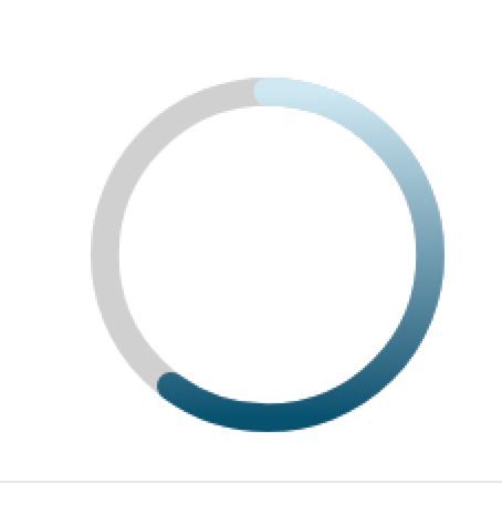
I need to make a circular progress indicator with a color gradient. I also need the 'ends' of the progress circle to be rounded. This image has everything Im trying to achieve:
This code is close but doesnt have the color gradient:
https://codepen.io/adsfdsfhdsafkhdsafjkdhafskjds/pen/OJybqza
var control = document.getElementById('control');
var progressValue = document.querySelector('.progress__value');

var RADIUS = 54;
var CIRCUMFERENCE = 2 * Math.PI * RADIUS;

function progress(value) {
  var progress = value / 100;
  var dashoffset = CIRCUMFERENCE * (1 - progress);

  console.log('progress:', value + '%', '|', 'offset:', dashoffset)

  progressValue.style.strokeDashoffset = dashoffset;
}

control.addEventListener('input', function(event) {
  progress(event.target.valueAsNumber);
});

progressValue.style.strokeDasharray = CIRCUMFERENCE;
progress(60);
.demo {
flex-direction: column;
display: flex;
width: 120px;
}
.progress {
transform: rotate(-90deg);
}
.progress__meter,
.progress__value {
fill: none;
}
.progress__meter {
stroke: grey;
}
.progress__value {
stroke: blue;
stroke-linecap: round;
}<div class="demo">
<svg class="progress" width="120" height="120" viewBox="0 0 120 120">
<circle class="progress__meter" cx="60" cy="60" r="54" stroke-width="12" />
<circle class="progress__value" cx="60" cy="60" r="54" stroke-width="12" stroke="url(#gradient)" />
</svg>
<input id="control" type="range" value="60" />
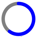
</div>It looks like this:
Ive tried adding a linear-gradient to the stroke but it has no effect:
stroke: linear-gradient(red, yellow);
I also tried stroke="url(#linearColors)", but it also has no affect.
<div class="demo">
  <svg class="progress" width="120" height="120" viewBox="0 0 120 120">
    <linearGradient id="linearColors" x1="0" y1="0" x2="1" y2="1">
      <stop offset="5%" stop-color="#01E400"></stop>
      <stop offset="25%" stop-color="#FEFF01"></stop>
      <stop offset="40%" stop-color="#FF7E00"></stop>
      <stop offset="60%" stop-color="#FB0300"></stop>
      <stop offset="80%" stop-color="#9B004A"></stop>
      <stop offset="100%" stop-color="#7D0022"></stop>
    </linearGradient>
    <circle class="progress__meter" cx="60" cy="60" r="54" stroke-width="12" />
    <circle class="progress__value" cx="60" cy="60" r="54" stroke-width="12" stroke="url(#linearColors)" />
  </svg>
  <input id="control" type="range" value="60" />
</div>