2

I'm making an Angular 9 app and I want to add a sidenav to my project.

The sidenav that I want is exactly like this Primer Angular Template --> Primer - Angular 8+ Material
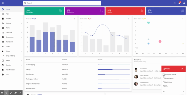
This is what I want

enter image description here

And This is what I got with my scss and html. The problem is that the content is not rezising when the sidebar is collapsed, and then, the style is breaking. For this I am looking for an answer with mat-sidenav-container and mat-sidenav

enter image description here

HTML

<mat-sidenav-container  class="app example-sidenav-container" autosize>
  <mat-sidenav #sidenav class="example-sidenav" mode="side" opened="true" [ngStyle]="{ 'width': !collapsedSidebar ? '250px':'70px' }">
    <button mat-icon-button (click)="collapsedSidebar = !collapsedSidebar">
      <mat-icon>menu</mat-icon>
   </button>
  </mat-sidenav>

  <div fxFlex  class="example-sidenav-content">
    <router-outlet></router-outlet>
  </div>
</mat-sidenav-container>

SCSS

.app { height: 100vh; }
.example-container {
  display: flex;
  flex-direction: column;
  position: absolute;
  top: 0;
  bottom: 0;
  left: 0;
  right: 0;
}
.example-sidenav-container { flex: 1; }
.example-sidenav{
  -webkit-transition: width .4s;
  transition: width .4s;
}
.mat-drawer{ background:White; }
.example-sidenav-content {
  display: flex;
  height: 100%;
  background-color: #e8ded7;
  opacity: 0.9;
}
.example-fill-remaining-space { flex: 1 1 auto; }

Please help

UPDATE Here is a Stackblitz example --> https://stackblitz.com/edit/angular-xa3n5i

Sergio Mendez
  • 1,311
  • 8
  • 33
  • 56

3 Answers3

2

I solved a similar problem in one of my apps before. I used ngClass and a boolean controlling both mat-sidenav width property and mat-sidenav-content margin-left property . Here is a stackblitz, i sliced out relevant part from that app.

https://stackblitz.com/edit/angular-mff93r

CeritT
  • 522
  • 3
  • 12
0

I'm suggesting that the bar with the icons is located outside the sidenav but with the menu items and its relevant icon is aligned.

You can then use the native functionality to toggle the sidenav visiblity.

<div class="app">
    <button mat-icon-button (click)="sidenav.toggle()">
        <mat-icon>menu</mat-icon>
   </button>
    <div style="display: grid; grid-template-columns: 48px auto;height: 100%;">
        <div class="icons">
            <div class="icon">Icon</div>
            <div class="icon">Icon</div>
        </div>
        <mat-sidenav-container autosize>
            <mat-sidenav #sidenav mode="side" opened="true">
                <div class="item">Item 1 text</div>
                <div class="item">Item 2 text</div>
            </mat-sidenav>

            <div fxFlex class="example-sidenav-content">
                a verss
            </div>
        </mat-sidenav-container>
    </div>
<div>

See stackblitz example: https://angular-cymk69.stackblitz.io

jornare
  • 2,903
  • 19
  • 27
  • Thank you, It would be an effective solution, unfortunately it does not adapt when the screen is small, also, I have a menu with modules and sub-modules in accordion mode that would be affected if the icons are in a separate div – Sergio Mendez Apr 27 '20 at 20:15
  • I see your point, although that could be solved using directives for aligning the icons to their item. – jornare Apr 27 '20 at 20:20
0

Your app-component.html

<mat-sidenav-container class="app-container">

  <mat-sidenav #sidenav             
              [mode]="mode"
              [opened]="opened">

    <button (click)="toggleSideNav()">toggle</button>

  </mat-sidenav>

  <router-outlet class="container"></router-outlet>

</mat-sidenav-container>

Your app-component.scss

.app-sidenav {
  width: 100vw;
  height: 100vh;
}

Your app-component.ts

import {Component, OnInit} from '@angular/core';
import {MediaChange, MediaObserver} from "@angular/flex-layout";

@Component({
  selector: 'app-root',
  templateUrl: './app.component.html',
  styleUrls: ['./app.component.scss']
})
export class AppComponent implements OnInit {

  mode: string;
  opened = true;

  constructor(private mediaObserver: MediaObserver) {
  }

  ngOnInit(): void {

    this.mediaObserver.asObservable().subscribe((change: MediaChange[]) => {

      const isMobileView = change[0].mqAlias === 'xs' || change[0].mqAlias === 'sm';
      this.mode = isMobileView ? 'over' : 'side';

    });

    // track auth state, something like this.
    // this.opened = hasLoggedIn && (!isMobileView);

  }

  // other code.


}
nitin
  • 3,747
  • 2
  • 24
  • 31