3

I'm using material-ui 4.9.5.

I've made a cut down example of my problem here. I have a Table which I populate with some simple JSON data. Each row data looks like this :

{
      icon: {
         {
              iconElement: FolderIcon,
              color: "red",
              hoverColor: "green"
         }
      },
      projectName: "Project1"
}

So each row can have it's own icon and its own color and hover color.

enter image description here

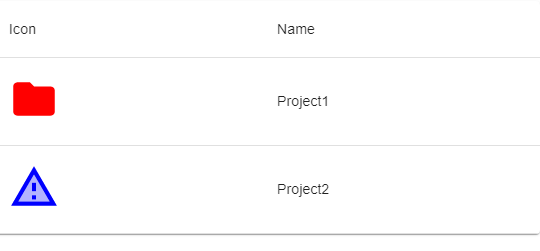
What I am really stuggling with is how to get the hover color for the individual icon to trigger when the user hovers anywhere within that row ?

I have the hover trigger for the row written and trigger a background change on hover. I cannot figure out how to get the icon to change on hover. This is what I have so far :

Edit icon-hover-color-table-row

import React from "react";
import PropTypes from "prop-types";
import { makeStyles } from "@material-ui/core/styles";
import Table from "@material-ui/core/Table";
import TableBody from "@material-ui/core/TableBody";
import TableCell from "@material-ui/core/TableCell";
import TableContainer from "@material-ui/core/TableContainer";
import TableHead from "@material-ui/core/TableHead";
import TableRow from "@material-ui/core/TableRow";
import Paper from "@material-ui/core/Paper";

const useStyles = makeStyles({
  rowIconStyle: {
    minWidth: 50,
    minHeight: 50
  },
  tableRowStyle: {
    cursor: "pointer",
    "&:hover": {
      backgroundColor: "darkGrey"
    }
  }
});

export default function MyTableComponent(props) {
  const styles = useStyles();
  const DEFAULT_TABLE_ROW_ICON_COLOR = "grey";
  return (
    <TableContainer component={Paper}>
      <Table aria-label="simple table">
        <TableHead>
          <TableRow>
            <TableCell>Icon</TableCell>
            <TableCell>Name</TableCell>
          </TableRow>
        </TableHead>
        <TableBody>
          {props.tableRowsData.map(row => {
            const RowIcon =
              row.icon && row.icon.iconElement
                ? row.icon.iconElement
                : () => <div />;
            let iconElement = (
              <RowIcon
                className={styles.rowIconStyle}
                style={{
                  color:
                    row.icon && row.icon.color
                      ? row.icon.color
                      : DEFAULT_TABLE_ROW_ICON_COLOR
                }}
              />
            );
            return (
              <TableRow key={row.name} className={styles.tableRowStyle}>
                <TableCell>{iconElement}</TableCell>
                <TableCell>{row.projectName}</TableCell>
              </TableRow>
            );
          })}
        </TableBody>
      </Table>
    </TableContainer>
  );
}

MyTableComponent.propTypes = {
  tableRowsData: PropTypes.array
};

Any suggestions hugely appreciated.

Ryan Cogswell
  • 75,046
  • 9
  • 218
  • 198
Simon Long
  • 1,310
  • 4
  • 20
  • 39
  • 1
    Do you need the solution to support IE 11? A particularly clean way of handling this would leverage [var](https://developer.mozilla.org/en-US/docs/Web/CSS/var), but CSS variables aren't supported by IE. – Ryan Cogswell Apr 27 '20 at 14:07
  • 1
    No I don't. Thankfully! – Simon Long Apr 27 '20 at 14:21

2 Answers2

1

Since you indicated that you do not need to support IE, you can leverage CSS variables. This is particularly helpful since you are managing the hover colors as data and each icon can have a different hover color.

The first step is to provide the two colors you care about for each icon as custom CSS properties (--icon-color and --hover-icon-color below):

            const RowIcon =
              row.icon && row.icon.iconElement
                ? row.icon.iconElement
                : () => <div />;
            const iconColor =
              row.icon && row.icon.color
                ? row.icon.color
                : DEFAULT_TABLE_ROW_ICON_COLOR;
            const iconHoverColor =
              row.icon && row.icon.hoverColor ? row.icon.hoverColor : iconColor;
            let iconElement = (
              <RowIcon
                className={styles.rowIconStyle}
                style={{
                  "--icon-color": iconColor,
                  "--hover-icon-color": iconHoverColor
                }}
              />

Then you can leverage these CSS properties in your CSS:

const useStyles = makeStyles({
  rowIconStyle: {
    minWidth: 50,
    minHeight: 50,
    color: "var(--icon-color)",
    "$tableRowStyle:hover &": {
      color: "var(--hover-icon-color)"
    }
  },
  tableRowStyle: {
    cursor: "pointer",
    "&:hover": {
      backgroundColor: "darkGrey"
    }
  }
});

Edit icon-hover-color-table-row

Related answer: How do you change a style of a child when hovering over a parent using material-ui jss styles

Ryan Cogswell
  • 75,046
  • 9
  • 218
  • 198
-2

Found this not sure it will solve you issue but you can try for the table

<TableBody>
{data.map((row, index) => (
     <TableRow key={index} style={{ padding: '5px 20px', height: 25, ...this.getStripedStyle(index) }}>
           ....Columns
     </TableRow>
))}
</TableBody>

Get Striped Style

  getStripedStyle(index) {
    return { background: colorArr[index] };
  }
ShobiDobi
  • 179
  • 1
  • 13
  • No, that doesn't solve my issue. That's styling the row. It's the icon in a particular TableCell on the row which I was to style on a hover anywhere in the row. – Simon Long Apr 27 '20 at 13:20