1

I have a user who is using my web app on a Surface Pro 4. The app doesn't render very well. The best way I can describe it is that it appears the browser window has been resized to a small size and it's trying to bunch stuff up. However, I believe he has his browser maximized.

Since I don't have a Surface, I've been trying to get both Chrome and Edge to emulate the rendering issues. Here's what I've tried:

Edge: Has a preset for the Surface Pro 4. I figured that once I selected this mode I would see the problem. It's actually the opposite situation. I actually have to expand the browser window to multiple displays to be able to see all the content (even the browser scrollbars). I suspect that's due to the Surface having a higher resolution than my PC.

Chrome: No preset for the Surface and I couldn't find anyone who had the specific settings. I tried 2738 x 1834 and all three of the built-in pixel ratios (1.0, 2.0, 3.0). Chrome zoomed out so that it all fit on my screen. It also had no rendering issues. Changing pixel ratio made no difference.

I'll admit that web UI development is not my strong suit. And it doesn't help that I inherited a lot of this code. But I'm really scratching my head here.

If I try to emulate with a phone preset, then I can see rendering issues because the app isn't phone friendly, nor does it really need to be. That seems to suggest the emulation in the browser is working fine. What's left? The only thing I can think is that he must be using some kind of scaling that's messing things up.

Also, I should note that I had a friend with an iPad (Sorry don't know what model) try the app out as well and he also sees the same bad rendering issues. In fact, he thinks it's rendering worse than the Surface.

Edit 1:

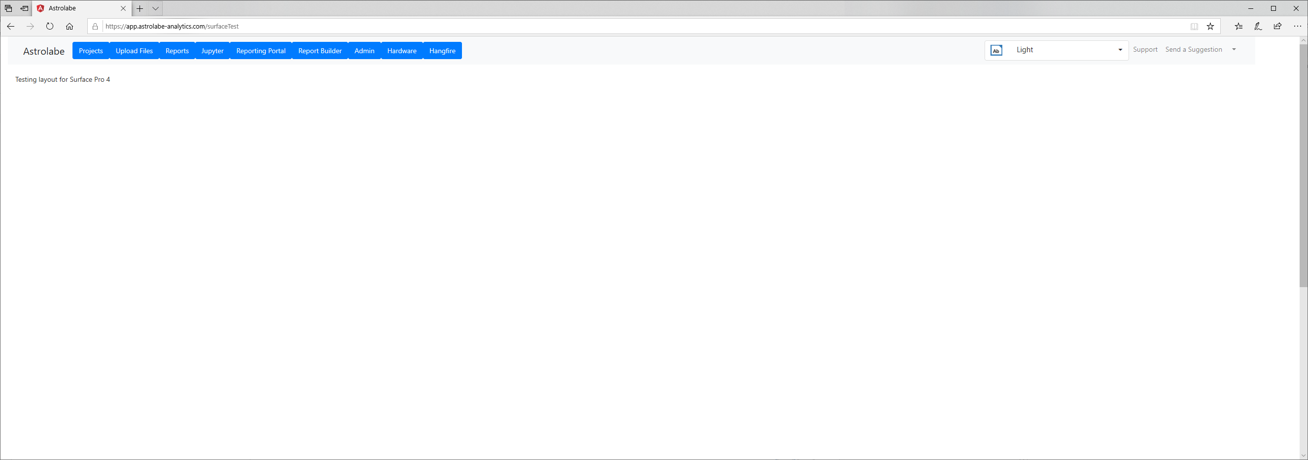
I put together a test page that shows the header from our app. It is here: https://app.astrolabe-analytics.com/surfaceTest

Here are screenshots of the various displays being tested:

Here is Surface Pro 4 Hardware - Notice buttons are wrapping Here is Surface Pro 4 Hardware - Notice buttons are wrapping

Next one is iPad Hardware (I don't believe it's the pro version) Next one is iPad Hardware (I don't believe it's the pro version)

Then here is the way I have Chrome set up to emulate the Surface Pro Then here is the way I have Chrome set up to emulate the Surface Pro

Surface Pro 4 emulation in Edge. Note that I had to extend the browser window onto my second monitor to take the screenshot. Surface Pro 4 emulation in Edge. Note that I had to extend the browser window onto my second monitor to take the screenshot.

Finally, the standard appearance in Chrome Finally, the standard appearance in Chrome

Dan
  • 533
  • 8
  • 29
  • Emulations are adapted to try and match the physical dimensions of the screens being emulated. Emulated pixels might appear compressed or expanded, and emulation is not recommended if you need to test pixel-perfect positioning of HTML elements. Emulation is, however, good for testing responsive designs and identifying larger element positioning issues. From your description, it seems that you have already know how to use the [Edge browser emulation](https://docs.microsoft.com/en-us/microsoft-edge/devtools-guide/emulation) and Chrome emulation. But, the surface pro 4 has a pixel: 2736x1824. – Zhi Lv Apr 29 '20 at 09:39
  • I don't think that really helps. Yes, I know it is 2736x1824, but why does his screenshot look more like it's at 800x600? – Dan Apr 29 '20 at 15:38
  • Do you mean in Chrome browser the emulate screenshot looks like it is resized? As you said, the Chrome browser will auto-adjust the zoom to fit the window, if you don't want to resize it, you can change the Zoom, please check [this image](https://i.stack.imgur.com/l7hsV.png). But in the legacy version of Edge browser, it will not auto-adjust the zoom, so, it will show the scrollbar. – Zhi Lv Apr 30 '20 at 07:58
  • The zoom is not what I'm having a problem with. Both browsers are NOT RENDERING the same way as the actual device. For example, I have a row of buttons at the top of the page. Some of them have multiple words in the text of the button, such as "Upload Files". The actual device is word wrapping these buttons which is what I'd expect if there's not enough vertical space. If the browsers were properly emulating, I would expect the same thing, but it's not. They render fine. Not only that, but there's plenty of extra vertical space for more buttons. – Dan Apr 30 '20 at 19:45
  • can you post the Enough code to reproduce the problem as in [Minimal, Complete, and Verifiable example](https://stackoverflow.com/help/mcve). Perhaps, since the surface pro 4's screen resolution is larger that the windows's resolution, it will not wrap the text. – Zhi Lv May 01 '20 at 07:45
  • I added a link to a test page that should show the problem as well as screenshots showing that the surface pro 4 hardware renders a lot different than the emulated version. I think you're last comment is opposite of what is happening. Yes, the surface pro 4 screen res is larger, but it's acting like it's smaller. I'm guessing this has to do with logical vs physical resolution? If so, I don't understand why Edge or Chrome emulation doesn't emulate this. – Dan May 01 '20 at 17:05

1 Answers1

0

It seems that the emulation works well on my side. please check the following screen shots:

Edge emulation for iPad, enter image description here

Edge emulation for Surface Pro 4, enter image description here Chrome emulation for iPad: enter image description here Chrome emulation for Surface Pro 4: enter image description here

Besides, I also found that if we resize the browser window (change the width property), if the width is too small, the text will wrap or disappear. Please check this image: enter image description here

So, I suppose the issue is related to the CSS style, as a workaround, you could try to set fixed width property (or using the min-width property) for the navbar-nav class, also, you could refer to the following links to use Bootstrap navbar styles:

Bootstrap Navbar

Angular Bootstrap navbar

Zhi Lv
  • 18,845
  • 1
  • 19
  • 30
  • I knew there were issues with resizing the screen smaller and it cutting off the text. I haven't worried about that yet because I'm not sure our app would be that useful at that small of a screen. It does, however raise the question... in order to properly emulate the Surface Pro, do I actually have to resize the browser in addition to specifying what device to emulate? Because if the browser is maximized on the PC, it definitely does not emulate the device, as neither of your Surface Pro screenshots match the ones I've been sent from actual hardware. – Dan May 05 '20 at 15:52
  • @Dan, I found another option which might cause the wrap text issue, if we zoom up the web page in browser, it will show this issue. So, please check your Surface Pro 4 Hardware, whether the browser zoomed up or not? Besides, please check the Surface Pro 4 Hardware, whether you [changed the screen resolution](https://support.microsoft.com/en-us/help/4026956/windows-10-change-screen-resolution) or not? – Zhi Lv May 07 '20 at 06:58
  • I've asked both the Surface user and the iPad user to check their zoom levels. They were both at 100%. The Surface user zoomed to 90% and it looked better. And then 80% appeared to make the site look like it normally does on the PC. The surface user says his resolution is 2736x1824 – Dan May 08 '20 at 16:52
  • It is very strange. you could try to use F12 developer Elements tools to check the `nav-bar` width property and the font-size property in surface pro 4 hardware, like [this](https://i.stack.imgur.com/mTKFb.png). Then compare with the value from the emulation. Besides, which kind of browser the Surface user and iPad user are using to view the web page? please make sure they are using the same browser. – Zhi Lv May 12 '20 at 09:34
  • On my PC (Chrome 81.0.4044.138) and using an emulation of 2738x1834 and DPR: 2.0 (because Chrome doesn't seem to have a Surface Pro preset), I get 14px font-size and 792.625px width. On the surface pro 4 hardware, my user is reporting Chrome 81.0.4044.138, 14px font-size and "auto" for width. So, clearly Chrome is not emulating the same as the device. – Dan May 14 '20 at 00:27
  • Yes, the issue is related to the width property. You could feedback this issue to the Developer Tools team (by clicking the Send Feedback menu (Edge browser) or [Report a DevTools issue option](https://i.stack.imgur.com/KaMB7.png)(Chrome browser) in the developer tools window). Besides, in my opinion, if you set the fixed width property or using bootstrap style, this width issue might disappear. – Zhi Lv May 15 '20 at 10:12