Something like this:
justify-content: center; gets me close, but this centers all the items in the flex container. I'd like to keep the items left-justified while centering the wrapped rows underneath those.
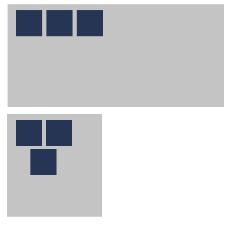
Something like this:
justify-content: center; gets me close, but this centers all the items in the flex container. I'd like to keep the items left-justified while centering the wrapped rows underneath those.
If you have fixed/known widths for the container itself, or for the flex items, you could simulate this. You just need to contain the flex-container in another element and then left-align it in some way. Then you can center justify the flex items.
ul {
  width: auto;
  max-width: 600px;
  margin: 0 auto 0 0;
  padding: 0;
  list-style: none;
  display: flex;
  flex-wrap: wrap;
  justify-content: center;
}
li {
  width: calc((100% / 3) - 20px);
  height: 80px;
  background: #333;
  margin: 10px;
}
Try margin: 0 auto; in the child element
.wrap {
  display: flex;
  flex-wrap: wrap;
  width: 120px; /* screen width  */

}

.block {
  width: 50px;
  height: 50px;
  background: red;
  margin: 0 auto;
}
<div class="wrap">
<div class="block"></div>
<div class="block"></div>
<div class="block"></div>
</div>
Since you haven't provided any code, this is one of the solutions, but in this case you need to store top and bottom rows in separate divs:
        .item{
            min-width:45%;
            min-height: 80px;
            margin-right: 10px;
            background-color: black;
        }
        .top-row,.bottom-row{
            display: flex;
            justify-content: space-between;
            width: 30%;
            margin-bottom: 1em;
        }
        .bottom-row{
            justify-content: center;
        }
<div class="top-row">
<div class="item"></div>
<div class="item"></div>
</div>
<div class="bottom-row">
<div class="item"></div>
</div>