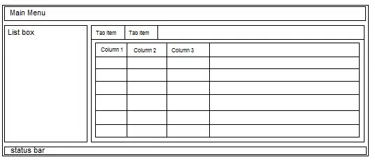
How do I fix the CSS so that the resolution is not lost when I scale down?
Here is the HTML:
<span class="image main small"><img src="images/example.png" alt="" /></span>
CSS for the <img> :
.image.main img {
    width: 100%;
}
.image img {
    border-radius: 0px;
    display: block;
}
CSS for the <span>:
.image.small {
    padding: 2.5em 6em 0.8em 6em;
    max-width: 100%;
}
.image.main {
    display: block;
    margin: 0 0 1.5em 0;
    max-width: 100%;
}
.image {
    border-radius: 4px;
    border: 0;
    display: inline-block;
    position: relative;
}
(there are multiple classes because the original code was from a template, and I'm just modifying it. If you know how to make this simpler, please let me know!)
screenshot of the demo is below. Notice how the image resolution is bad. The original example.png is quite crisp and resolution is high.
How do I fix the CSS so that the resolution is not lost when I scale down?

I have also looked at a Similar Question Here, but it didn't help much.
I also tried using Picturefill, I couldn't completely understand how to use it with my situation.