0

I drew this in microsoft paint and wanted to make this in html/css

enter image description here

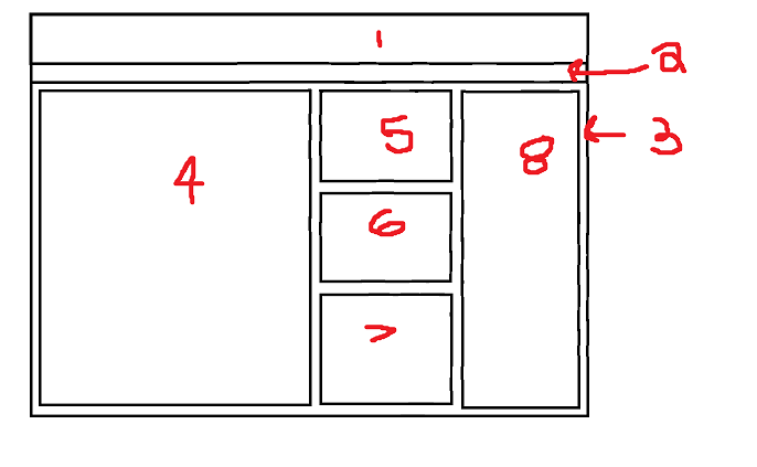
The numbers labeled are the box numbers

This is what I've done to try to achieve this

html file

<!DOCTYPE html>
<html lang='en'>

<head>
  <meta charset="utf-8">
  <title>test</title>
  <link rel="stylesheet" type="text/css" href="box.css">

</head>

<body>
  <div id="box1"></div>
  <div id="box2"></div>
  <div id="box3">
    <div id="box4"></div>
    <div id="box5"></div>
    <div id="box6"></div>
    <div id="box7"></div>
    <div id="box8"></div>
  </div>

</body>

</html>

css file

html, body {
    margin: 0px;
    height: 100%;
    width: 100%;
}

#box1 {
    border: solid black 3px;
    height: 10%;

}

#box2 {
    border: solid black 3px;
    height: 3%;
}

#box3 {
    border: solid black 3px;
    height: 84%;
}

#box4 {
    border: solid black 1px;
    width: 50%;
    height: 95%; 
    float: left;
    margin: 5px;
}

#box5 {
    border: solid black 1px;
    width: 23%;
    height: 25%;
    float:left;
    margin-left: 10px;
    margin-top: 6px;
}

#box6 {
    border: solid black 1px;
    width: 23%;
    height: 30%;
    float:left;
    margin-top: 10px;
    margin-left: 10px;
}

#box7 {
    border: solid black 1px;
    width: 23%;
    height: 30%;
    float:left;
    margin-top: 10px;
    margin-left: 10px;
}

How it looks

enter image description here

I couldn't get box8 to show up on the right side I tried float right it messes it up. Also the boxes inside box3 are all inconsistent. If I full screen the boxes go right side. I used percentages for responsiveness but it didn't work. Anyone know how to do this ?

bobby
  • 183
  • 1
  • 1
  • 10
  • you should use flexboxes to make this happen - see https://css-tricks.com/snippets/css/a-guide-to-flexbox/ for a detailed guide to use flexboxes. – Homungus May 12 '20 at 09:43
  • Another option is to use grid system, although its not supported by [IE browser](https://developer.mozilla.org/en-US/docs/Web/CSS/grid#Browser_compatibility). here is a [fiddle](https://jsfiddle.net/mamounothman/g450283u/1/) – ROOT May 12 '20 at 10:13
  • Through the vagaries of SO - I was able to post my solution 0 and for what its worth - i don;t think it was right to close the question - given the complexity of the layout with flex riection changing for the different elements. – gavgrif May 12 '20 at 10:19

1 Answers1

0

This can be achieved with flexbox - but note that you will need to use wrapper divs and apply different flex-directions to each in order to make the grid layout work.

body, html {
height: 100%;
width: 100%;
overflow: hidden;
}

.box-wrapper { 
  height: 100vh; 
  width: 100vw; 
  display: flex; 
  flex-direction: column;
}

#box1 {
  padding:10px;
  height:30px; 
  line-height:30px;
  border: solid 1px red
}

#box2 { 
  height: 15px;
  padding: 8px;
  border: solid 1px blue
}

#box3 { 
  padding: 10px;
  flex-grow:1; 
  display: flex;
  flex-direction: row;
  border: solid 1px green
} 

#box4 {
  flex-grow:2; 
  border: solid 1px orange
} 

.middle-column {
  flex-grow:1; 
  display: flex; 
  flex-direction: column;
  
} 

.middle-column div{ 
  flex-grow:1;
  margin: 0 8px;
  border: solid 1px #6e6e6e;
} 

.middle-column div + div { 
  margin-top: 8px
} 

#box8 { 
  flex-grow:1;
  border: solid 1px black
}
<div class="box-wrapper">
  <div id="box1">1</div>
  <div id="box2">2</div>
  <div id="box3">
    <div id="box4">4</div>
    <div class="middle-column"> 
      <div id="box5">5</div>
      <div id="box6">6</div>
      <div id="box7">7</div>
    </div> 
    <div id="box8">8</div> 
  </div>
</div

enter image description here

gavgrif
  • 15,194
  • 2
  • 25
  • 27