0

I have made the following code:

ggplot() + 
  geom_histogram(test, mapping = aes(reading_test), alpha = 0.3, colour = "Blue") +
  geom_histogram(test, mapping = aes(math_test), alpha = 0.3, colour = "Red") + 
  geom_histogram(test, mapping = aes(science_test), alpha = 0.3, colour = "Orange") +
  labs(title = "Reading Test Score Histogram",
       x = "Reading Test Score Frequency",
       y = "Count") + 
  theme_minimal() +

And I want to add a legend, for the colours blue, red and orange. But these are all seperate plots in one plot, so I don't know how to do it. I tried using colors and scale_color_manual but I can't seem to figure it out.
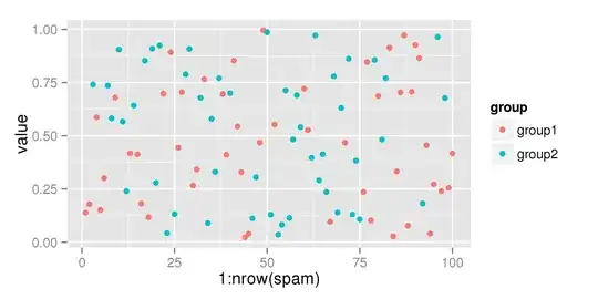
Image of the plot:

KenHBS
  • 6,756
  • 6
  • 37
  • 52
Luc
  • 7
  • 1
  • 5
  • Try putting the `colour` argument in the call to `aes`. It would be better if you could include your data or a sample of your data `dput(test)` to make your question reproducible. I suspect you would be better off putting your data into "longer" format. See [mre] and [ask] for guidance on questions. – Peter May 17 '20 at 14:36
  • 1
    Include the colour variable in the mapping, like `mapping = aes(reading_test, colour = "Reading Test")`, and then use `scale_colour_manual(values = c("blue", ...))` – teunbrand May 17 '20 at 14:36
  • Have a look at: https://stackoverflow.com/questions/36919465/how-to-add-a-legend-to-the-multiple-histograms-with-ggplot – Peter May 17 '20 at 14:40
  • Does this answer your question? [Add legend to ggplot2 line plot](https://stackoverflow.com/questions/10349206/add-legend-to-ggplot2-line-plot) – tjebo May 17 '20 at 16:31

2 Answers2

1

You can reconfigure your code a bit, and add a scale_fill_manual call at the end. I made up some fake score data to use, but this should also work with your dataset.

test %>%
  ggplot() + 
  geom_histogram(aes(reading_test, fill = "reading_test"), alpha = 0.3) +
  geom_histogram(aes(math_test, fill = "math_test"), alpha = 0.3) + 
  geom_histogram(aes(science_test, fill = "science_test"), alpha = 0.3) +
  labs(title = "Reading Test Score Histogram",
       x = "Reading Test Score Frequency",
       y = "Count") + 
  theme_minimal() +
  scale_fill_manual(values = c(reading_test = "Blue",
                               math_test = "Red",
                               science_test = "Orange")) +
  theme(legend.position = "bottom")

This gives us:

dput:

structure(list(reading_test = c(60.9495483106002, 71.8601936940104, 
95.1541648479179, 30.5743511533365, 72.3029835382476, 17.7527688443661
), math_test = c(83.0534904962406, 82.9689418431371, 6.6111684544012, 
2.75105258915573, 1.65001957211643, 24.1968155838549), science_test = c(89.833056833595, 
34.2541499296203, 19.2088180920109, 35.5643856106326, 78.7074614549056, 
16.7371726129204)), row.names = c(NA, 6L), class = "data.frame")
Matt
  • 7,255
  • 2
  • 12
  • 34
0

As mentioned in the comments and the linked SO question, the easiest way is to reshape the data.

test2 <- test %>%
  pivot_longer( contains("_test"), names_to="test_type", values_to="test_score" )

And then for the plot

test2 %>%
  ggplot() +
  geom_histogram( aes(x=test_score, color=test_type), alpha=0.3 )

And the chosen color scale may be suitable for your needs. If not, then simply using scale_color_manual with a named values vector should get you what you want.

statstew
  • 301
  • 1
  • 6