I'm new in R, I have to plot a data.frame containing 50 time series, the columns names are the names of each series and the rows names are the references dates; for each series I have 373 observations. The data.frame is called data
I tried with plot(data) but i get the error Error in plot.new() : figure margins too large
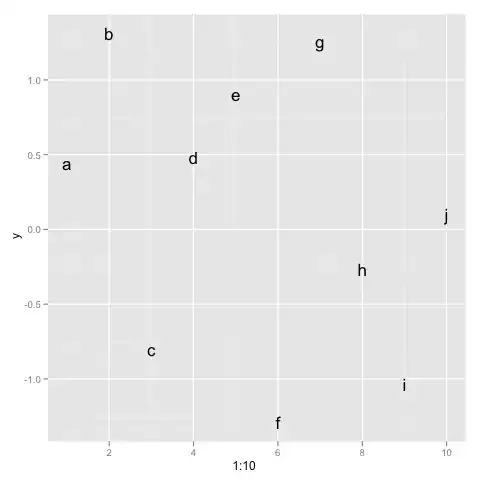
so I tried with ggplot(data) this time i'm not getting errors, but it returns a blank white figure:

I'm trying to have a graph with the dates (so the row names) on the x-axixs, and each column of the data.frame (so each time series), as a different line with the level on the y axixs.
Thanks in advance!