1

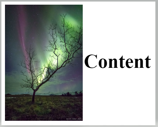
This is what I want:

https://i.stack.imgur.com/WTTMA.png

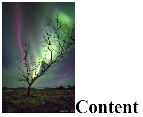
This is what I have:

https://i.stack.imgur.com/V7X6m.png

Here is my code:

<!DOCTYPE HTML>
<html>
<head>
<meta charset="utf-8">
<title>Index</title>
<meta name="viewport" content="width=device-width, initial-scale=1.0">

</head>
<body>
    <header>

    </header>
    <main>
    <ul class="ul">
      <li class="li"><img src="https://apod.nasa.gov/apod/image/1703/AuroraTree_Wallace_960.jpg" 
      alt="pic">Content</li>    
    </ul>
    </main>
    <footer>

    </footer>


</body>
</html>

CSS

.ul{
display: table;
margin: 0 auto;
list-style: none;
}

.li{
font-weight: bold;
font-size: 50px;
}

img{
width: 200px;
}

I've tried vertical align middle but it didn't do anything then I tried to center it with margins but it didn't work out as I wanted and I also tried flex and absolute position.

Renan Araújo
  • 3,533
  • 11
  • 39
  • 49
Victor25
  • 13
  • 3
  • check if your answer is here: https://stackoverflow.com/questions/8856680/centering-text-vertically-and-horizontally-in-same-table-cell-with-image-floated – OAH May 21 '20 at 11:55

4 Answers4

1

Try using flex box

.li{
font-weight: bold;
font-size: 50px;
display: flex;
align-items: center;
}
Jake Lam
  • 3,254
  • 3
  • 25
  • 44
1

Using a flexbox would be a better solution. Prerequisite is to put "content" inside a separate HTML element. In this case I used a span.

.ul {
  /* display: table; */
  margin: 0 auto;
  list-style: none;
}

.li {
  font-weight: bold;
  font-size: 50px;
  display: flex; /* Added */
  align-items: center; /* Added */
}

img {
  width: 200px;
}
<header>
</header>
<main>
  <ul class="ul">
    <li class="li">
      <img src="https://apod.nasa.gov/apod/image/1703/AuroraTree_Wallace_960.jpg" alt="pic">
      <span>Content</span></li>
  </ul>
</main>
<footer>
</footer>
Gerard
  • 15,418
  • 5
  • 30
  • 52
0

Use vertical-align: middle:

.selector {
    vertical-align: middle    
}

The vertical-align CSS property sets vertical alignment of an inline, inline-block or table-cell box.

Roy
  • 1,612
  • 2
  • 12
  • 38
0

First of all I would like to welcome you to the Stackoverflow Community.

You can achieve the required result by using flexbox in your CSS. I am putting the same HTML over here, just putting that "content" inside a span.

<!DOCTYPE HTML>
<html>
<head>
<meta charset="utf-8">
<title>Index</title>
<meta name="viewport" content="width=device-width, initial-scale=1.0">

</head>
<body>
    <header>

    </header>
    <main>
    <ul class="ul">
      <li class="li"><img src="https://apod.nasa.gov/apod/image/1703/AuroraTree_Wallace_960.jpg" 
      alt="pic"><span>Content</span></li>    
    </ul>
    </main>
    <footer>

    </footer>


</body>
</html>

Add display:flex; and align-items: center; to your .li selector as shown below.


.ul{
display: table;
margin: 0 auto;
list-style: none;
}

.li{
font-weight: bold;
font-size: 50px;
display:flex;
align-items: center;
}

img{
width: 200px;
}

Hoping that my answer is helpful to you.

Ashutosh Kumar
  • 830
  • 7
  • 19