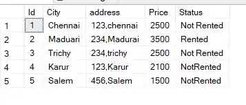
I have a dataframe called df_plot, I am trying to create a dumbbell plot sorted by a column (medium age 2020), with the axis assigned a color based on another category). This is very close but can someone explain to me why the colors in the axis do not match? As you can see from the dataframe the Solomon Islands are supposedly Red but they are being outputted as Green?
Really grateful for any tips
df_plot<-df_plot %>% arrange(Median.Age.2020)


ggplot(df_plot,aes(x=Median.Age.2020,xend=Median.Age.2030,y=reorder(Country,Median.Age.2020))) +
  geom_dumbbell( size=1.4,color="#5E5E5E",
                 colour_x = "#6E0019", colour_xend = "#FF5179",
                dot_guide = T,
                dot_guide_size = 0.4,
                size_x=3.5,
                size_xend=3.5)+
  geom_point(aes(x=Median.age.2025,y=Country),size=3.5,color="#A50026")+
  xlab("Median Age")+
  xlim(14,26) +
  theme_classic()+
  theme(axis.text.y = element_text(colour=fct_reorder(df_plot$color, df_plot$Median.Age.2020)),
        axis.ticks.y=element_blank())+
  ylab("")
(I am unsure how you add a dataframe into stackoverflow, so copied the header here - picture explains the structure. Only difference is that I have changed color to hex codes)
"Country"   "HMTC.Region"   "Median.Age.2020"   "Median.age.2025"   "Median.Age.2030"   "Population_2020"   "Population_2030"   "id"    "color"
"Niger" "Africa"    15.2    15.6    16.1    24075000    34994000    1   "#00B0F0"
"Mali"  "Africa"    16.3    17  17.8    20284000    27057000    2   "#00B0F0"
"Chad"  "Africa"    16.6    17.2    18  16285000    21460000    3   "#00B0F0"
"Uganda"    "Africa"    16.7    17.8    19.1    47188000    63842000    4   "#00B0F0"
"Angola"    "Africa"    16.7    17.2    17.9    32827000    44712000    5   "#00B0F0"
"Burundi"   "Africa"    17.3    17.8    18.7    11939000    15799000    6   "#00B0F0"


