5

I have private messaging functionality on my website. The message window is a fixed element:

position: fixed;
bottom: 0;

On iOS, when opening the input located at the very bottom of the messaging window, the keyboard simply pushes the whole website to the top so that you can still see what you are typing.

iOS

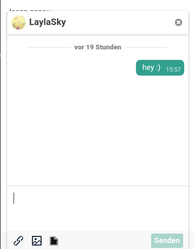
However, on Android, the keyboard simply overlaps everything so you don't see the input element any longer:

Android

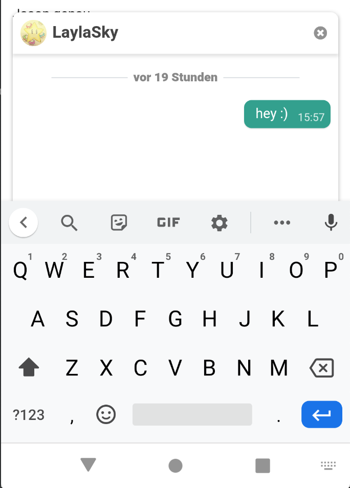
What can I do to make it work on both iOS and Android?

Hillcow
  • 890
  • 3
  • 19
  • 48
  • Try researching from the "application" point of view, maybe you'll find answer there ! Keep us informed. https://stackoverflow.com/questions/16788959/is-there-any-way-in-android-to-get-the-height-of-virtual-keyboard-of-device – Martin Jun 10 '20 at 10:41

2 Answers2

0

One way to do it is store the initial window(viewport) height and compare it on window resize event. Assuming that window size won't change on the smartphone in like 99% of situations, you can assume that the keyboard is being shown. But, for me, it's kinda hacky

  • That doesn't really help. I can catch the event already, my problem is that I don't know how to display it properly using css. As far as I know there is no way to detect the height of the keyboard for example. – Hillcow Jun 10 '20 at 10:14
  • 1
    As I said - store the original height value. It's the overall height of devices screen. Then, as soon as you see the change in the window size - overall height minus new height equals keyboard height – Igor Vinogradov Jun 10 '20 at 11:13
  • Okay, thanks. There is a big problem though. Some browsers actually push the content (like intended) by themselves. Some don't. How would I detect that? – Hillcow Jun 10 '20 at 13:54
0

Once you get the actual size of the viewport, you only need to update the bottom:x value of your element.

If you're asking if you could detect it only with css, then you might want to look into css media queries.

CSS media queries: max-width OR max-height

Martin
  • 552
  • 4
  • 16
  • Okay so what you are saying is that I should listen to viewport height changes on mobile devices, get the updated viewport size and set the bottom attribute accordingly, right? That actually sounds like a good idea. – Hillcow Jun 10 '20 at 12:34
  • There is a big problem though. Some browsers actually push the content (like intended) by themselves. Some don't. How would I detect that? – Hillcow Jun 10 '20 at 13:54