1

I have a problem. I have to cards (please see the picture ) picture

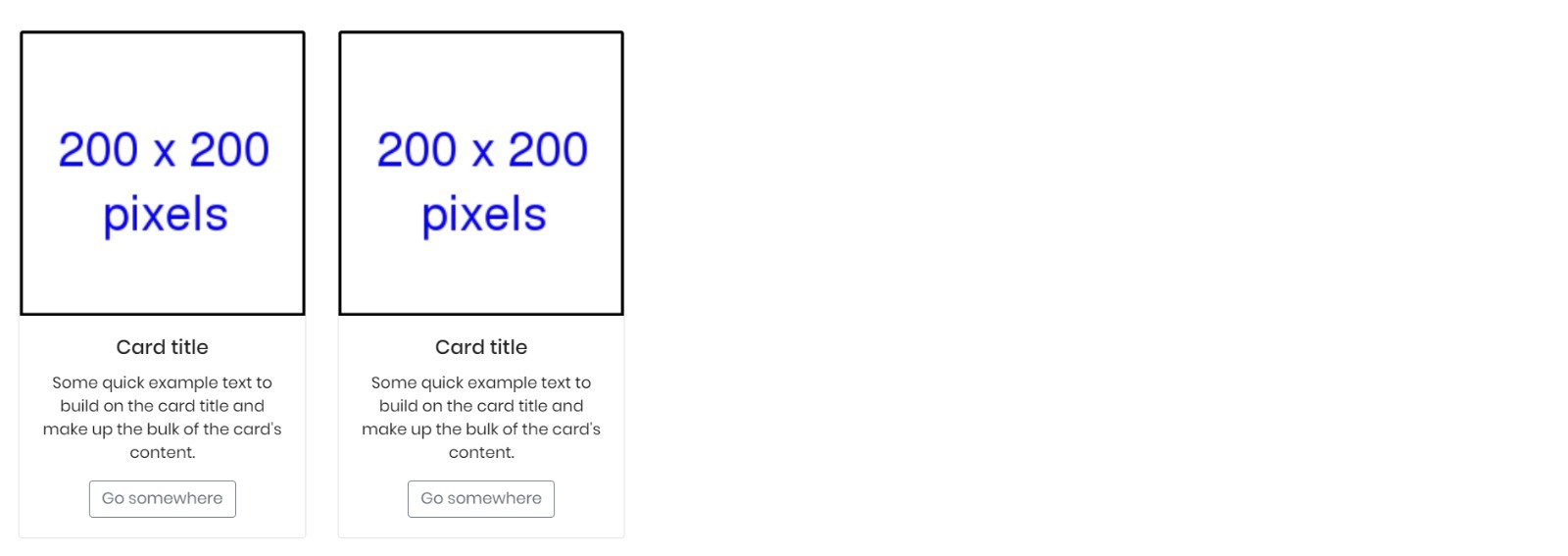
As you can see, the two card boxes are not in the middle. I tried something, please see the code below. I hope you can help me out! Thank you in advance!

 <div class="test" style="margin-left: auto; margin-right:auto; text-align: center; position: relative;">
        <div class="container-fluid padding" style="margin-left: auto; margin-right:auto;">
            <div class="row padding">
                <div class="cold-md-4" style="margin-right: 1%; margin-left: 1%; margin-top: 1%; margin-bottom: 1%;">
                    <div class="card" style="width: 18rem; margin-left: 1%; ">
                        <img class="card-img-top" src="img\festival-tickets\ticket3.png">
                        <div class="card-body">
                          <h5 class="card-title">Card title</h5>
                          <p class="card-text">Some quick example text to build on the card title and make up the bulk of the card's content.</p>
                          <a href="#" class="btn btn-outline-secondary">Go somewhere</a>
                        </div>
                      </div>
                </div>
                <div class="cold-md-4" style="margin-right: 1%; margin-left: 1%; margin-top: 1%; margin-bottom: 1%;">
                    <div class="card" style="width: 18rem;">
                        <img class="card-img-top" src="img\festival-tickets\ticket3.png">
                        <div class="card-body">
                          <h5 class="card-title">Card title</h5>
                          <p class="card-text">Some quick example text to build on the card title and make up the bulk of the card's content.</p>
                          <a href="#" class="btn btn-outline-secondary">Go somewhere</a>
                        </div>
                      </div>
                </div>
            </div>
        </div>
    </div>

1 Answers1

1

Just add a justify-content: center; to the parent element (that .row .padding) of the elements you want to center (the cards, in this case).

.center {
  justify-content: center;
}
<div class="test" style="margin-left: auto; margin-right:auto; text-align: center; position: relative;">
  <div class="container-fluid padding" style="margin-left: auto; margin-right:auto;">
    <div class="row padding center">
      <div class="cold-md-4" style="margin-right: 1%; margin-left: 1%; margin-top: 1%; margin-bottom: 1%;">
        <div class="card" style="width: 18rem; margin-left: 1%; ">
          <img class="card-img-top" src="img\festival-tickets\ticket3.png">
          <div class="card-body">
            <h5 class="card-title">Card title</h5>
            <p class="card-text">Some quick example text to build on the card title and make up the bulk of the card's content.</p>
            <a href="#" class="btn btn-outline-secondary">Go somewhere</a>
          </div>
        </div>
      </div>
      <div class="cold-md-4" style="margin-right: 1%; margin-left: 1%; margin-top: 1%; margin-bottom: 1%;">
        <div class="card" style="width: 18rem;">
          <img class="card-img-top" src="img\festival-tickets\ticket3.png">
          <div class="card-body">
            <h5 class="card-title">Card title</h5>
            <p class="card-text">Some quick example text to build on the card title and make up the bulk of the card's content.</p>
            <a href="#" class="btn btn-outline-secondary">Go somewhere</a>
          </div>
        </div>
      </div>
    </div>
  </div>
</div>

<link rel="stylesheet" href="https://maxcdn.bootstrapcdn.com/bootstrap/4.0.0/css/bootstrap.min.css" integrity="sha384-Gn5384xqQ1aoWXA+058RXPxPg6fy4IWvTNh0E263XmFcJlSAwiGgFAW/dAiS6JXm" crossorigin="anonymous">
Balastrong
  • 4,336
  • 2
  • 12
  • 31
  • 1
    Thank you! It worked perfectly, I'd give you in 9 minutes the like. Stackoverflow is a bit strange :D –  May 24 '20 at 09:31