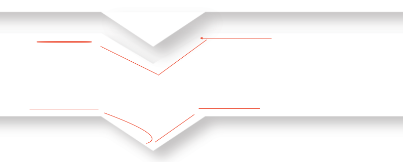
I’m trying to realise a couples of element with this design :

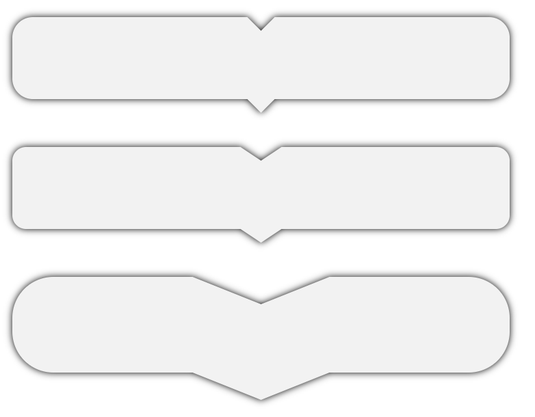
I also want to have a border radius like this :

What I managed to do :
For the first div, I didn’t managed to do inner box shadow for the ::before arrow and box shadow for the ::after arrow
For the last div, I managed to do it but when I try to change the size of the arrow to make it larger, the box-shadows is not working anymore...
body {
  background-color: white;
}
.test{
  margin-top: -30px!important;
}
.test2{
  z-index:13;
}
.test3{
  z-index:12;
}
.test4{
  z-index:11;
}
.test5{
  z-index:10;
}
.triangle {
  position: relative;
  margin: 3em;
  padding: 1em;
  box-sizing: border-box;
  background: white;
  box-shadow: 0px 3px 10px 0 black;
}
.triangle::before{
    content: "";
    position: absolute;
    width: 0;
    height: 0;
    margin-left: -0.5em;
    top: 0;
    left: 40%;
    width: 0;
    height: 0;
    border-style: solid;
    border-width: 20px 50px 0 50px;
    border-color: lightgrey transparent transparent transparent;
    //box-shadow: 0px 3px 10px 0 black;

  }
.triangle::after{
    content: "";
    position: absolute;
    width: 0;
    height: 0;
    margin-left: -0.5em;
    bottom: -20px;
    left: 40%;
    width: 0;
    height: 0;
    border-style: solid;
    border-width: 20px 50px 0 50px;
    border-color: lightgrey transparent transparent transparent;
    //box-shadow: 0px 3px 10px 0 black;

  }


.toto::after{
    content: "";
    position: absolute;
    width: 0;
    height: 0;
    margin-left: -0.5em;
    bottom: -2em;
    left: 50%;
    box-sizing: border-box;

    border: 1em solid black;
    border-color: transparent transparent lightgrey lightgrey;

    transform-origin: 0 0;
    transform: rotate(-45deg);

    box-shadow: -3px 3px 3px 0 rgba(0, 0, 0, 0.4);
  }
<div class="triangle test2">Inner box shadow for before content not working</div>
<div class="triangle test test3">box shadow for after content not working</div>
<div class="triangle test test4">Content 3</div>
<div class="triangle test test5">Content 4</div>
<div class="triangle toto">Managed to do it but the arrow is not editable(I want to make it longer)</div>Anyone already had this issue or know how to solve this problem?