1

I'm making a press page on a website, and I have the headlines/articles set in rectangles using

.press-blocks{
    column-count: 4;
    column-gap: 2em;
    padding-left: 10%;
    padding-right: 10%;
}
.press-item{ 
    display: inline-block;
    margin: 0 0 5em;
    width: 100%;
    text-align: justify;
}

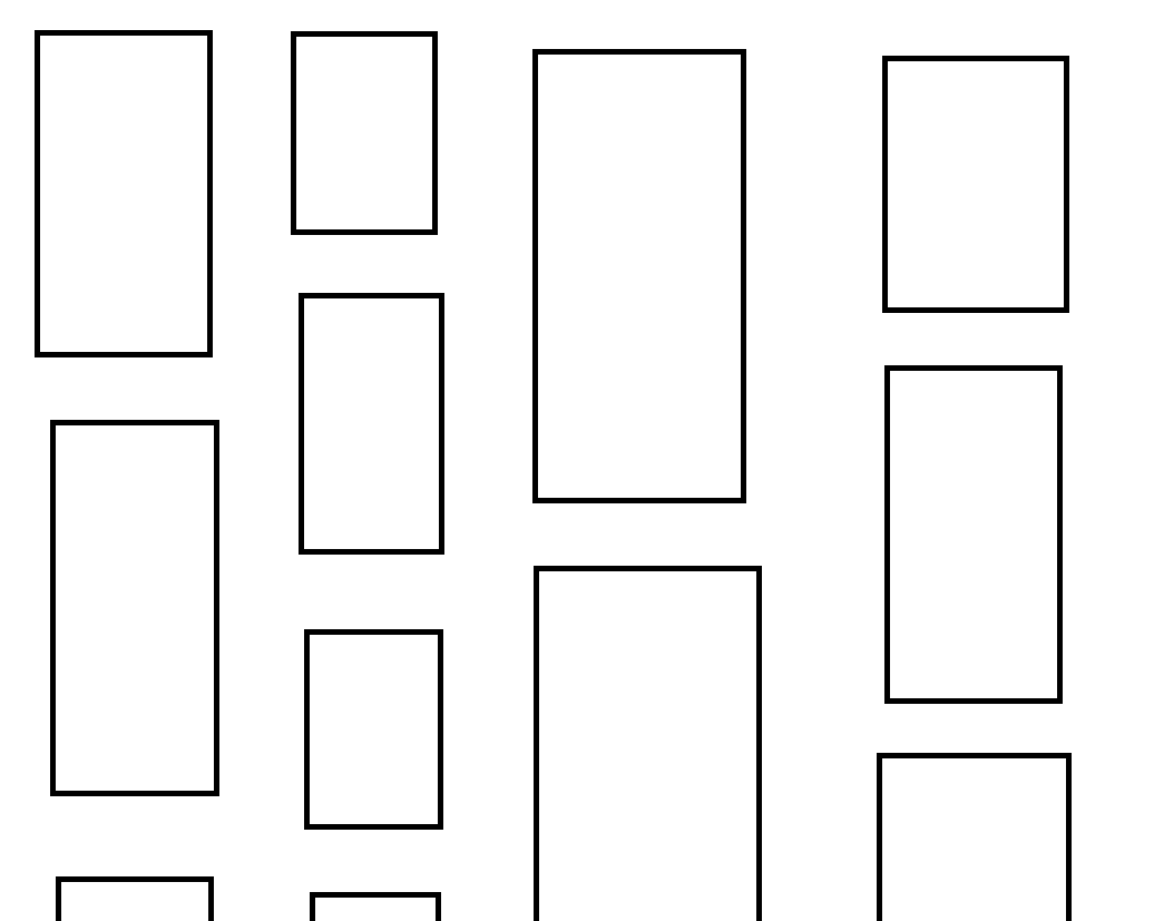
The whole "press" section area of the page is in one big press-blocks section, and each individual article is in its own press-item. This way, when a new article is written I can just place it at the beginning of the page and all the articles will be in chronological order. However, the chronological order is top to bottom, left to right, like this:

1    5    9    13
2    6    10   14
3    7    11   15
4    8    12   16

Is there a way to change it to left to right, top to bottom?

1    2    3    4
5    6    7    8
9    10   11   12
13   14   15   16

I looked at the W3Schools tutorial for display: inline-block, and theirs is horizontal, but the difference is they don't have a set number of columns. I want this to always have exactly 4 columns, and to just extend further downwards when I add new ones, like it does now. I also want to maintain the vertical distance between items.

Imagine these rectangles are all evenly spaced and have the same distance between them both horizontally and vertically. A crudely drawn version of how the rectangles currently look.

Community
  • 1
  • 1
  • flex-box would probably help. flex-direction in particular – user120242 May 26 '20 at 02:32
  • @user120242 From what I know about flex-box, doesn't it line everything up by row? The problem is that I only want them to line up in the very first row, and then each column to have its next item just 5em below the one above, not lining up with the other columns. – TimGraupner May 26 '20 at 02:39
  • I'm not sure what you mean, but I'd be surprised if Flexbox couldn't solve your problem. If Cristian's answer doesn't fix it for you, please explain, maybe more visually, what you mean. – user120242 May 26 '20 at 02:53
  • 1
    @user120242 I added an image showing what I mean about them not lining up cleanly in rows. I think flexbox would force them to do that, but I like the somewhat chaotic modernist appearance. – TimGraupner May 26 '20 at 03:00
  • Thanks! I've gotten a lot of positive feedback so far, they said "the layout with the columns look like a newspaper, which is a cool concept for press". That's what I'm trying to preserve. – TimGraupner May 26 '20 at 03:04
  • +1 I like news sites that do that. Especially when it creates contrast on content or highlights activity. – user120242 May 26 '20 at 03:05

4 Answers4

2

There are two ways you could go about this. By the sounds of your comment on your question, you are going to be wanting to make a masonry grid which uses javascript (first solution), but I'll also include a flex-box solution which, while it wont be exactly what your looking for, it doesn't use javascript.


Javascript

This way uses javascript to generate the masonry grid as CSS cant do it alone.

Example:

<div class="masonry">
    <div class="masonry-brick">...</div>
    <div class="masonry-brick">...</div>
    <div class="masonry-brick">...</div>
    <div class="masonry-brick">...</div>
    <div class="masonry-brick">...</div>
    <div class="masonry-brick">...</div>
    <div class="masonry-brick">...</div>
    <div class="masonry-brick">...</div>
</div>
.masonry { 
    display: flex;
    flex-flow: column wrap;
    max-height: 800px; /* Or whatever you want the height to me */
    margin-left: -8px; /* Adjustment for the gutter */
    width: 100%;
}

.masonry-brick {
    margin: 0 8px 8px 0; /* Some gutter */
}
/**
 * @param grid       Object  The Masonry Element 
 * @param gridCell   Object  The Masonry bricks
 * @param gridGutter Integer The Vertical Space between bricks 
 * @param gridCol    Integer Number of columns
 */

function masonry(grid, gridCell, gridGutter, gridCol) {
    let g = document.querySelector(grid),
    gc = document.querySelectorAll(gridCell),
    gcLength = gc.length, // Total number of cells in the masonry
    gHeight = 0, // Initial height of our masonry
    i; // Loop counter

    // Calculate the net height of all the cells in the masonry
    for(i=0; i<gcLength; ++i) {
        gHeight+=gc[i].offsetHeight+parseInt(gridGutter);
    }

    // Calculate and set the masonry height
    g.style.height = gHeight/gridCol + gHeight/(gcLength+1) + "px";
}

masonry(".masonry", ".masonry-brick", 8, 4);

Flex Box

This way uses display: flex; and flex-wrap: wrap; on the parent div of the blocks, and then set each block to have a width of 25% of the parent.

Example:

<div class="parent">
    <div class="child"></div>
    <div class="child"></div>
    <div class="child"></div>
    <div class="child"></div>
    <div class="child"></div>
    <div class="child"></div>
    <div class="child"></div>
    <div class="child"></div>
</div>
.parent {
    display: flex;
    flex-wrap: wrap;
    width: 100%;
}
.child {
    height: 200px;
    width: 25%;
    background-color: red;
}

Both ways would achieve the left to right, top to bottom look you are wanting. But only the javascript script way would have each "cell" individually positioned with custom heights.

Mr. Simmons
  • 448
  • 3
  • 14
  • That first one seems perfect. I'm building this site in Wordpress, which makes everything just a little more confusing. Can I just throw all of that javascript in the header and have it run it if it's the right page? – TimGraupner May 26 '20 at 04:00
  • @TimGraupner I havent used Wordpress before, so maybe? Usually you want to add javascript at the bottom of the page so that it gives time for the content of the page to load fist, but I'm not sure if wordpress messes with any of that, – Mr. Simmons May 26 '20 at 04:33
  • Putting it in the header is entering the script, but setting gcLength to 0. I think that's because the content of the page isn't loaded. I'll try it in the footer. – TimGraupner May 26 '20 at 04:44
  • I figured out why it wasn't working, and now it loads the content and then runs through the javascript. Through all that, it still orders it top to bottom, left to right, so I'm just back at the beginning. – TimGraupner May 26 '20 at 05:05
  • @TimGraupner Whoops. i got the masonry bit working, but i forgot about the left to right part. Give me a few mins, ill make a new answer – Mr. Simmons May 26 '20 at 05:14
1

EDIT: Added code to calculate height and adjust using filler .size elements. Unfortunately it is not responsive and may have issues with image heights. Will probably need to use the resize observers and image onload event hooks used in the other examples.
And I don't think this approach levels out the heights as well as one of the examples in the css-tricks list.
On the plus side it's probably pretty performant.
I would recommend using one of the masonry libraries at the bottom of the css-tricks page https://css-tricks.com/piecing-together-approaches-for-a-css-masonry-layout/
The link also has probably every approach to the problem you can possibly think of in their complete forms.

I've created a solution that doesn't require JavaScript, but requires kind of a nasty hack of inserting a "break4" element to force wrapping. It works by using flex-direction: column, using nth-child to manipulate order, and using order to inject line breaks to force wrapping.
Also unfortunately requires a fixed height larger than the content.

I think there might be a way to use last-nth-child or first so that the extra element isn't required, but I still haven't figured it out yet. Feels like it's possible.

Note: the JavaScript is just to generate the HTML, because I'm lazy. It doesn't need to be inserted using JS.

for(i=0;i<20;i++)document.querySelector('.container').innerHTML+=`<div style="height:${Math.floor(Math.random()*100+10)}px" class="item">${i+1}</div>`
document.querySelector('.container').innerHTML+=`
<div class="size" style="flex-grow:1;order:1"></div>
<div class="size" style="flex-grow:1;order:2"></div>
<div class="size" style="flex-grow:1;order:3"></div>
<div class="size" style="flex-grow:1;order:4"></div>
<div class="break4"></div>` // break4 force wrap, .size elements to calculate space between bottom of container and bottom of columns

// find smallest .size element and use to calculate size
document.querySelector('.container').style.height=(document.querySelector('.container').offsetHeight-[...document.querySelectorAll('.size')].reduce((acc,{offsetHeight})=>Math.min(acc,offsetHeight),Infinity))+'px'
.container {
  display: flex;
  flex-flow: column wrap;
  align-content: space-between;
height:1000px;
}

.item {
  border: 1px solid blue;
  width: 24%;
}

.item:nth-child(4n+1) { order: 4; border:1px solid red }
.item:nth-child(4n+2) { order: 1; border:1px solid blue}
.item:nth-child(4n+3) { order: 2; border:1px solid yellow}
.item:nth-child(4n)   { order: 3; border:1px solid green}

.container::before,
.container::after {
  content: "";
  flex-basis: 100%;
  width: 0;
  order: 2;
}
.break4 {
  content: "";
  flex-basis: 100%;
  width: 0;
  order: 3;
}
<div class="container"><div>
user120242
  • 14,918
  • 3
  • 38
  • 52
  • 1
    For the container's fixed height, I'd have to be changing it constantly because as new articles get added, the tallest column would get taller, but if I just put some huge number in, there would be a lot of empty space between the end of the content and the site's universal footer. This is an interesting answer though! – TimGraupner May 26 '20 at 05:20
  • 1
    Sigh, I tried. Short of using JS and then adjusting height later, I don't think it can be done any better :\ FYI there's a good (JS) library called Masonry. And this article covers a lot of methods: https://css-tricks.com/piecing-together-approaches-for-a-css-masonry-layout/ Gotta thank Mr Simmons for the keyword masonry. – user120242 May 26 '20 at 05:42
  • @user120242 haha yeah its a bit of a weird word – Mr. Simmons May 26 '20 at 08:01
1

Javascript method V2

While this also uses javascript, it uses CSS Grid to construct the masonry grid.

<div class="masonry">
    <div class="masonry-brick">...</div>
    <div class="masonry-brick">...</div>
    <div class="masonry-brick">...</div>
    <div class="masonry-brick">...</div>
    <div class="masonry-brick">...</div>
    <div class="masonry-brick">...</div>
    <div class="masonry-brick">...</div>
    <div class="masonry-brick">...</div>
</div>
.masonry {
    display: grid;
    grid-gap: 1em;
    grid-template-columns: repeat(auto-fill, minmax(200px, 1fr)); /* Make columns adjust according to the available viewport */
    grid-auto-rows: 0;
}
function resizeAllMasonryItems(){
    // Get all item class objects in one list
    let allItems = document.querySelectorAll(".masonry-brick");

    // Get the grid object, its row-gap, and the size of its implicit rows
    let grid = document.querySelector(".masonry"),
    rowGap = parseInt(window.getComputedStyle(grid).getPropertyValue("grid-row-gap")),
    rowHeight = parseInt(window.getComputedStyle(grid).getPropertyValue("grid-auto-rows"));

    // Loop through each masonry-brick
    for (let i = 0; i < allItems.length; i++){
        // Calulate the correct height of the brick, and apply the correct gird value
        let rowSpan = Math.ceil((allItems[i].getBoundingClientRect().height + rowGap) / (rowHeight + rowGap));

        // Set the spanning as calculated above
        allItems[i].style.gridRowEnd = "span " + rowSpan;
    }
}

You may have to tweak some of the grid values to get the look you are going for, but this should do a trick.

Mr. Simmons
  • 448
  • 3
  • 14
  • Is there any CSS I need for masonry-brick? Currently, with this code, it stacks all the items on top of each other. So each column has like 5 or so items in the same place on top of each other. – TimGraupner May 26 '20 at 06:01
  • So I've been looking at this and trying to figure it out. Does the grid-template-columns code create a different number of columns based on the size of the window? Also, I don't really understand the loop. I know it looks at each brick individually, but for me the rowSpan is just 1 every single time. I guess the let rowSpan math is wrong, but I don't really understand what it's trying to do. Every column has all the items at the same height on the page. – TimGraupner May 26 '20 at 06:35
  • @TimGraupner https://css-tricks.com/piecing-together-approaches-for-a-css-masonry-layout/#article-header-id-5 but with .resize responsive code. Also code to fix image sizing that looks like could break the layout. He explains how it works, and links the other guy who walks through how to derive it. – user120242 May 26 '20 at 07:21
  • @TimGraupner Yeah masonry-brick is just there as a handy selector to use in the javascript. And the rowSpan is for how tall each bright is supposed to be (bad variable naming, sorry). Here is an example of it in action https://w3bits.com/labs/css-grid-masonry-images/ You may be able to get some more info from inspecting the elements on the page – Mr. Simmons May 26 '20 at 08:00
  • @Mr.Simmons Thank you for that link. I think the reason I'm getting an issue is because each "brick" is formatted with two sections of text, an image, then two more sections of text. That's a lot longer and more complicated than all the examples that just use an image or something I guess. – TimGraupner May 26 '20 at 09:01
  • @Mr.Simmons Using several alerts, my code makes it to just before when we calculate rowSpan, but an alert after it never shows up. – TimGraupner May 26 '20 at 09:16
0

You can use CSS Flexbox.

Just add: display: flex and flex-wrap: wrap to .press-blocks.

And width: 25% to .press-item.

flex-wrap: wrap is for linebreak

width: 25% for 4 columns (width: 33% for 3 columns, etc)

<style>
.press-blocks {
    display: flex;
    flex-wrap: wrap;
    column-gap: 2em;
    padding-left: 10%;
    padding-right: 10%;
}
.press-item { 
    margin: 0 0 5em;
    width: 25%;
    text-align: justify;
}
  • That sort of works, but lines them all up in the row. I want to preserve the varying heights and the consistent vertical gap between items. I edited the question with an image of how it looks. – TimGraupner May 26 '20 at 02:58