Disclaimer: I don't have any formal programming background, and I've been trying to mess with front-end design recently. Excuse me if my questions are trivial or misplaced (at least I didn't find clear answers in other posts)
I've been using Outsystems with responsive design framework to develop a web page. In order to profit from the responsive framerwork, I'm trying to make a web block that will look something like this.
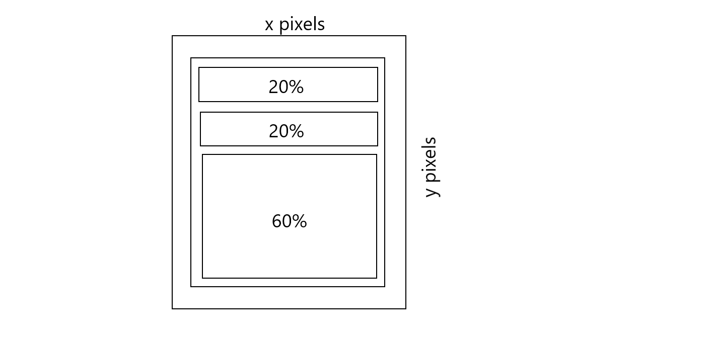
Inside a container with defined dimensions, I would insert a container (which will fit perfectly this parent container), containing other containers of its own. These 3 containers will always fill the parent horizontally, but will have heights according to the proportions I draw there (merely illustrative).
In order to fill the fixed-size parent, the main container would have to be set with height and width equal to 100% (at least I think so). However, the last child container (60%) may have its contents bigger than the appointed size (I put search results in there), so I tried setting 'overflow-y: auto'. However, that doesn't seem to work. From what I understood, that doesn't work because its parent has its height set to 100%, which isn't a defined size, so it ends up being considered as an undefined size when calculating the child containers size, and it ends up setting its height to 'auto' by default, which leads to visible overflow. I ended up changing the first two containers to have fixed sizes at the end (since they're inputs and they need to be at least visible for typing), however I just can't manage to make the last one fill the rest of the parent's container, while creating a scroll when necessary if its content overflow. What works is setting the parent container with 'overflow-y: auto', but I don't want it to work like this.
Is it possible to set chains of relative sized elements within another with .css or does it need to be alternated between fixed-size/relative-size to work? Would I need to use javascript to make calculations and set their heights at runtime?