Agreeing on terms
By responsive images I mean techniques for picking a source image with optimal file size for a given screen (viewport size and DPI).
By responsive context I mean RWD: page components changing their layout based on viewport width.
The problem
These two goals are fairly easy to achieve independenlty. For responsive images we have <img srcset sizes> and <picture>, for responsive context we have the min-width and max-width media queries.
But how do I use both at once?!
Problem example
Let's say I have a component displaying three images and responding to viewport width like this:
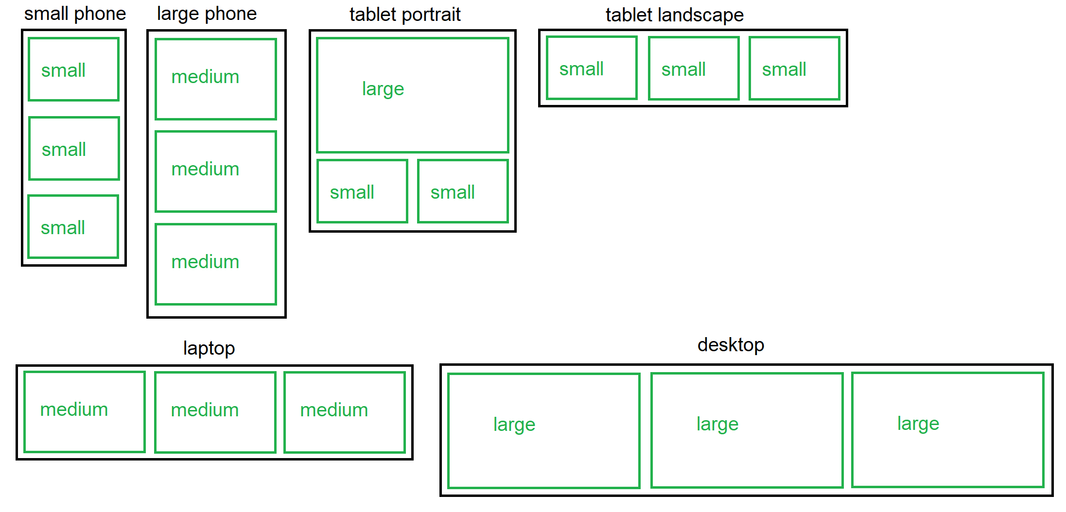
You can see that as viewport size growth, image size does not grow linearly. It varies back and forth.
Ideally, different file sizes should be picked should load depending on CSS dimensions of each image, not screen width.
Examples:
- for the "tablet portrait" viewport, the first image should pick a larger source than the other two;
- "tablet landscape" viewport should load smaller images than "large phone" viewport, despite having a larger width.
Since responsive images are an HTML technique and RWD is a CSS technique, I don't see a graceful way to make them work together.
Hypothetical solution 0
Ideally, in order to achieve that, the sizes HTML attribute should vary depending on each image element width. But RWD is not capable of that.
I could imagine something like this:
/* full-width image and single-column grid */
.responsive-image {
   sizes: 100vw;
}

/* 1+2 column grid aka "tablet portrait" layout */
@media (min-width: 400px) and (max-width: 767px) {
  .grid .responsive-image {
     sizes: 50vw;
  }
  .grid .responsive-image:first-child {
     sizes: 100vw;
  }
}

/* 3 column grid */
@media (min-width: 768px) {
  .grid .responsive-image {
     sizes: 33vw;
  }
}
Boy, would this be awesome! A fully responsive grid, fully responsive images aware of their own context, compact CSS.
Unfortunately, that does not work. It is not possible to manipulate sizes from CSS.
This example is here only to demonstrate the desired outcome.
Potential solution 1: JavaScript magic
An obvious solution would be to use a JavaScript library to make the decision based on image element's own width (similar to the element query approach).
Pros:
- Once set up, it just works! Very easy to add new images.
- This approach is fully dynamic. Components are aware of their own width and pick correct file size regardless of context (size of the parent component).
Cons:
- The images will start loading too late.
I have a single-page app with server-side pre-rendering. The server must provide an
srcfor each image without knowing the viewport size.On the one hand, this resolves the previous problem.
On the other hand, this will result in loading two sets of images when JS takes over. :(
Potential solution 2: CSS custom properties aka var()
I came up with the following idea, and I doubt I'm the first one to think about it.
- Put all available image sources into CSS custom properties.
- Use CSS
var()inside media queries to pick the right one.
Example:
<div
  class="responsive-image"
  style="
    --image-250: url('http://exmaple.com/image-250.jpg');
    --image-500: url('http://exmaple.com/image-500.jpg');
    --image-1000: url('http://exmaple.com/image-1000.jpg');
    --image-1500: url('http://exmaple.com/image-1500.jpg');
    --image-2000: url('http://exmaple.com/image-2000.jpg');
    --image-5000: url('http://exmaple.com/image-5000.jpg');
>
.responsive-image {
   background-image: var(--image-250);
}

@media (min-device-pixel-ratio: 1.5) and (max-width: 399px) {
  /* full-width image */
  .responsive-image {
     background-image: var(--image-500);
  }

  /* single column grid layout */
  .grid .responsive-image {
     background-image: var(--image-500);
  }
}

@media (min-device-pixel-ratio: 1.5) and (min-width: 400px) and (max-width: 767px) {
  .responsive-image {
     background-image: var(--image-1000);
  }

  /* 1+2 column "tablet portrait" grid layout */
  .grid .responsive-image:first-child{
     background-image: var(--image-1000);
  }
  .grid .responsive-image:not(:first-child){
     background-image: var(--image-500);
  }
}

/* ... */
Pros:
- Works with pure CSS, no JS required.
- Works well with server pre-rendering.
Cons:
- Using
<div>to render all images. - Nested responsive contexts are a lot of trouble. Media query rules can only be applied based on viewport width, not element width, but responsive images should be picked based on child element widths. As a result, the complexity of CSS rules grows exponentially as the depth of nesting grows. With one level of nesting (as in the example above), it's already unreasonably complicated. I don't even want to think about two levels of nesting.
Question
What are available solutions to this problem?
Of course, I'm hoping for a well-established approach without sub-optimal drawbacks.
But I want to gather here all less optimal ways of solving this as well: best practices, JS libraries, CSS techniques, anything.
Bonus question
Is it even worth doing?
Have there been any tendencies lately, e. g. articles advocating for not using responsive images, e. g. to avoid overhead and build for modern retina screens and 4G internet? After all, it's only a question of extra (milli)seconds of loading time, not denial of service.