0

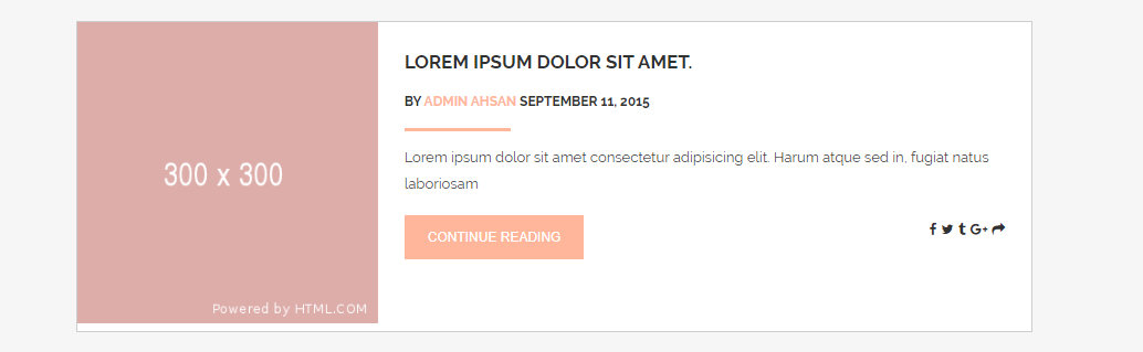
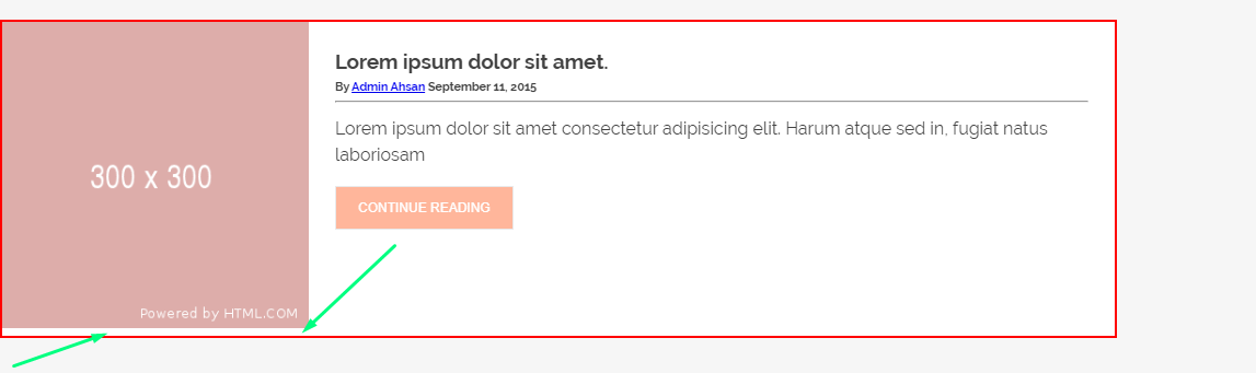
I am facing a problem with image height. I want to make that image 100% height without hard coding. But i can't do that. Every time some margin goes bottom to the image. I have changed the image width, height, font size but nothing works.

Here is an example of the image not filling the height:

* {
  margin: 0;
  padding: 0;
  outline: none;
  box-sizing: border-box;
}
html {
  font-size:16px;
}
body {
  font-family: Raleway, "Times New Roman", Times, serif;
  background-color: #f6f6f6;
  line-height: 1.5rem;
  width: 100%;
  color: #424242;
}

.flexbox {
  display: flex;
  justify-content: space-between;
}

.img-responsive {max-width:100%;max-height:100%;}
.card {
  background-color: #ffffff;
  border: 2px solid red;
  margin: 1.5rem 0rem 0rem;
  width: 75%;
}

.post-card-body {
  padding: 1.5rem;
}

.post-card-heading {
  margin: 0 0 0.75rem;
}

.btn-section {
  margin-top: 1rem;
}
.continue-btn {
  background-color: #ffb69b;
  border-color: #ffb69b;
}

.btn {
  font-size: 0.75rem;
  text-transform: uppercase;
  color: #ffffff;
  padding: 0.75rem 1.25rem;
  border: 0.0625rem solid #e9e9ea;
}
<div class="flexbox card">
  <div class="post-card-img">
    <img src="http://via.placeholder.com/300x300/DDaDaa/FFFFFF" alt="" class="img-responsive" />
  </div>
  <div class="post-card-body">
    <div class="post-card-heading">
      <h3>Lorem ipsum dolor sit amet.</h3>
      <h6>By <a href="#">Admin Ahsan</a> September 11, 2015</h6>
      <hr />
    </div>
    <p>
      Lorem ipsum dolor sit amet consectetur adipisicing elit. Harum
      atque sed in, fugiat natus laboriosam
    </p>
    <div class="btn-section">
      <button class="btn continue-btn">Continue Reading</button>
    </div>
  </div>
</div>

codepen link: click here Screenshot: click here

Jackson
  • 801
  • 10
  • 22

3 Answers3

2

Add display:block to your image. It's being treated as an inline element which doesn't have a height.

Avadriel
  • 46
  • 1
  • 3
0

Two possible solutions:

.post-card-img img {
  display: block;
}

or

.post-card-img {
  line-height: 0;
}
Zbyszek
  • 1,420
  • 18
  • 23
0

When using images to fill areas, I like to use the object-fit css property, as it will fit no matter the dimentions of the container it is in.

.img-responsive {
  object-fit: cover;
  width: 100%;
  height: 100%;
}

This code will tell the image to cover the continer it is in with 100% of the containers height and width.

This may not work if you don't want any of the image to be cut off. For more resources you can look into the other properties you can use with object-fit to get your desired result. Here is a good resource: object-fit | CSS-Tricks

See here for example with your code:

* {
  margin: 0;
  padding: 0;
  outline: none;
  box-sizing: border-box;
}

html {
  font-size:16px;
}

body {
  font-family: Raleway, "Times New Roman", Times, serif;
  background-color: #f6f6f6;
  line-height: 1.5rem;
  width: 100%;
  color: #424242;
}

.flexbox {
  display: flex;
  justify-content: space-between;
}

.img-responsive {
  object-fit: cover;
  width: 100%;
  height: 100%;
}
 
.card {
  background-color: #ffffff;
  border: 2px solid red;
  margin: 1.5rem 0rem 0rem;
  width: 75%;
}

.post-card-body {
  padding: 1.5rem;
}

.post-card-heading {
  margin: 0 0 0.75rem;
}

.btn-section {
  margin-top: 1rem;
}
.continue-btn {
  background-color: #ffb69b;
  border-color: #ffb69b;
}

.btn {
  font-size: 0.75rem;
  text-transform: uppercase;
  color: #ffffff;
  padding: 0.75rem 1.25rem;
  border: 0.0625rem solid #e9e9ea;
}
<div class="flexbox card">
  <div class="post-card-img">
    <img src="http://via.placeholder.com/300x300/DDaDaa/FFFFFF" alt="" class="img-responsive" />
  </div>
  <div class="post-card-body">
    <div class="post-card-heading">
      <h3>Lorem ipsum dolor sit amet.</h3>
      <h6>By <a href="#">Admin Ahsan</a> September 11, 2015</h6>
      <hr />
    </div>
    <p>
      Lorem ipsum dolor sit amet consectetur adipisicing elit. Harum
      atque sed in, fugiat natus laboriosam
    </p>
    <div class="btn-section">
      <button class="btn continue-btn">Continue Reading</button>
    </div>
  </div>
</div>
Jackson
  • 801
  • 10
  • 22