something strange is happening in my css.
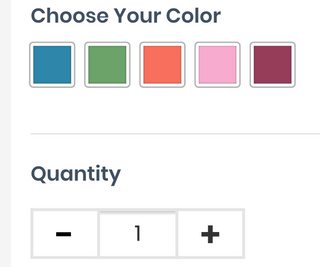
I'm working on a custom view for the Quantity Box on a WooCommerce product page. It renders fine on Chrome Developer tools for both mobile/desktop but when I look on my actual phone I get a strange shadow near the top border above the quantity number.
This is my code
#smntcswcb{
        height:35px;
        width:60px;
        padding: 8px 18px 8px 18px !important;
        border:2px solid !important;
        border-radius: 0px !important;
        color:#333 !important;
        font-size: 15px !important;
        border-color: #e5e5e5 !important;
}
When I remove the border color line it goes away, but I would like to keep the gray border without the shadow. Please help.
Edit:
Here is the HTML code for the elements
<div class="quantity">
    <label class="screen-reader-text" for="smntcswcb">Quantity </label>
    <input class="minus" type="button" value="-">
    <input type="number" id="smntcswcb" step="1" min="1" name="quantity" value="1" title="Qty" class="input-text qty text" inputmode="numeric">
    <input class="plus" type="button" value="+">
</div>
Here is the CSS code for class="minus"
.minus{
    background: none;
    text-align: center;
    width:48px !important;
    height:35px;
    padding: 2px 0px 0px 0px !important;
    background-color: #fff !important;
    border:2px solid transparent !important;
    border-radius: 0px !important;
    border-color: #e5e5e5 !important;
    color:#333 !important;
    margin-right: -4px;
    color:#000 !important;
    font-size: 24px !important;
    font-weight:900 !important;
    position: relative;
}
Here is the CSS code for the class "plus"
.plus{
    height:35px !important;
    width:48px !important;
    padding: 2px 0px 0px 0px !important;
    background-color: #fff !important;
    border:2px solid transparent !important;
    border-radius: 0px !important;
    border-color: #e5e5e5 !important;
    color:#333 !important;
    margin-left: -4px;
    font-size: 24px !important;
    font-weight:900 !important;
}
Here is the code for the parent class "quantity". I am using flex to make the items on the same height
.single_variation_wrap .quantity{
    display: flex;
}