I have a table on which I want to highlight a number of successive rows (TR's) by applying a box-shadow around them.
My strategy was to apply a class called "selected-top" to the first row of the selection, classes "selected-middle" for the middle part, and "selected-bottom" for the last row.
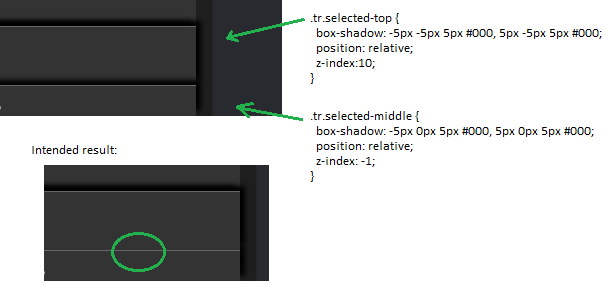
However, the shadows of the middle rows bleed over. I tried to rectify this by using z-index (I know that I have to add a relative property with that, so I did), but they seem to have no effect:
Here's the code:
  tr.selected-top {
    box-shadow: -5px -5px 5px #000, 5px -5px 5px #000;
    position: relative;
    z-index:10;
  }
  tr.selected-middle {
    box-shadow: -5px 0px 5px #000, 5px 0px 5px #000;
    position: relative;
    z-index: -1;
  }
The table is just a regular table:
<table>
<tr><td>stuff</td></tr>
<tr class="selected-top"><td>highlighting starts</td></tr>
<tr class="selected-middle"><td>highlighting middle</td></tr>
<tr class="selected-bottom"><td>highlighting end</td></tr>
<tr><td>other stuff</td></tr>
</table>
What am I doing wrong?
By the way, I did try to only apply a shadow to only the sides for the middle rows, but that way the shadow is not continuous.
Update: @Aditya Toke, like so: (left is wrong shading, right is correct shading)
