I don't know the configuration you are using with Photoshop but the values returned by darken() are correct.
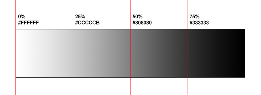
Below I made a gradient from white to black and it's not the same as the one you are showing and if you pick colors from it you will get the value returned by darken()
img {
  max-width:100%;
  margin-bottom:200px;
}

body {
  margin:0;
  background:linear-gradient(to right,white,black);
}
<img src="https://i.stack.imgur.com/2gljG.png">
And if we make the calculation we can also find the same:
darken(white, 25%) == hsl(0,0%,(100% - 25%)) == hsl(0,0%,75%) == #bfbfbf
darken(white, 75%) == hsl(0,0%,(100% - 75%)) == hsl(0,0%,25%) == #404040
Related: How to create color shades using CSS variables similar to darken() of SASS?
After few tests I found that your grayscale isn't linear but follow a non linear function that can explain the issue.
To illustrate this here is a basic animation of two elements not having the same ease function that animate from white to black. Notice how both will start at the same position, end at the same position and meet in the middle but will have different position on the road. So the 25% and the 75% of each animation won't be the same but the 50% will be.
img {
  max-width:100%;
  margin-bottom:200px;
}
body {
  margin:0;
}

body::before,
body::after{
  content:"";
  position:fixed;
  left:0;
  top:150px;
  width:10px;
  height:20px;
  border:2px solid green;
  background:#fff;
  animation:move 10s infinite alternate ease-in-out;
}
body::after {
  top:170px;
  animation:move 10s infinite alternate linear;
}
@keyframes move{
  from {
    left:0;
    background:#fff;
  }
  to {
    left:100%;
    background:#000;
  }
}
<img src="https://i.stack.imgur.com/2gljG.png">
I don't have access to photoshop but I am pretty sure this is the issue. If you check the configuration you will probably find how you can define the function and if you make it linear you will have the same result.