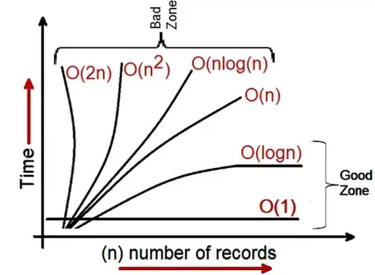
I want to create this kind of plot

My focus is to draw automatically an arrow and his lenght, based on input data.
I am stuck on how to create a function that automatically get x1,y1,y2 coordinates and returns:
- the arrow that connects the two points
- the text with the value of the difference (the distance)
Something like this:
def draw_arrow(x,y,yy,shift=0):
  tform = blended_transform_factory(ax.transAxes, ax.transAxes)
  x_end=x.iloc[-1]+shift
  y_end=y.iloc[-1]
  yy_end=yy.iloc[-1]
  half=(y_end+yy_end)/2
  diff=str(abs(y_end-yy_end))
  annotation=plt.annotate('', xy  = (x_end, y_end),  xycoords = tform, \
    xytext = (x_end, yy_end), textcoords = tform, fontsize = 7, \
    color = '#303030', arrowprops=dict(edgecolor='black', arrowstyle = '<->', shrinkA = 0, shrinkB = 0),)
  text=plt.text(x_end*1.10,half,str())
  return annotation,text
This is the code that I created for this question:
retention_dict= {'Month':[0,1,2,3,4,5,6],
                 'Ret_30':[1000, 1300, 1390, 1417, 1425, 1428, 1428],
                 'Ret_40':[1000, 1400, 1560, 1624, 1650, 1660, 1664],
                 'Ret_50':[1000, 1500, 1750, 1875, 1938, 1969, 1984]}
ret_df=pd.DataFrame(retention_dict)

def draw_arrow(x,y,yy,shift=0):
  tform = blended_transform_factory(ax.transAxes, ax.transAxes)
  x_end=x.iloc[-1]+shift
  y_end=y.iloc[-1]
  yy_end=yy.iloc[-1]
  half=(y_end+yy_end)/2
  diff=str(abs(y_end-yy_end))
  annotation=plt.annotate('', xy  = (x_end, y_end),  xycoords = tform, \
    xytext = (x_end, yy_end), textcoords = tform, fontsize = 7, \
    color = '#303030', arrowprops=dict(edgecolor='black', arrowstyle = '<->', shrinkA = 0, shrinkB = 0),)
  text=plt.text(x_end*1.10,half,str())
  return annotation,text
fig, ax =plt.subplots(facecolor='lightgray')

formatter = ticker.FormatStrFormatter('%1.0f')
ax.yaxis.set_major_formatter(formatter)
plt.grid(True)

figure_title = "Retention Rate tells us \n % of customers that did not shop again \n after the first puchase"
figure_expl = "Hp. Every 10$ we invest in marketing(FB ads/Google) \n we acquire one new customer"

ax=plt.plot(ret_df['Month'], ret_df['Ret_30'],
            ret_df['Month'], ret_df['Ret_40'],
            ret_df['Month'], ret_df['Ret_50']
            )
plt.text(3,2050, figure_title,
         horizontalalignment='center',
         fontsize=10,
         )

plt.text(3,970, figure_expl,
         horizontalalignment='center',
         fontsize=10,
         )
#draw_arrow(ret_df['Month'],ret_df['Ret_30'],ret_df['Ret_40'])

plt.title('Retention Rate ', pad=50)
plt.xlabel('Months')
plt.ylabel('Customers')
plt.show()
I have viewed also:
This question "Adding arrows to parametric plots in matplotlib"
This question "Is it possible to anchor a matplotlib annotation to a data coordinate in the x-axis, but to a relative location in the y-axis?"
This chapter of the documentation using complex coordinatewith annotation
But I am still having trouble
