0

I have a completion message that would look a lot better if the paragraph below it was bound by the width of its title.

Currently it looks like this

Current appearance

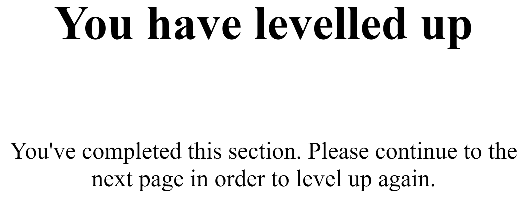
Which is an issue because the paragraph flows larger than the width of the title.

Outlined appearance

.site-complete-message {
    width: 95%;
    margin-left: auto;
    margin-right: auto;
}

.complete-title-wrap {
    width: 100%;
    padding-bottom: 10px;
    text-align: center;
}

.complete-text-wrap {
    width: 60%;
    margin-left: auto;
    margin-right: auto;
    padding-top: 10px;
    text-align: center;
}

h1 {
  margin: 0;
}

p {
  margin: 0;
}
<div class="site-complete-message">
   <div class="complete-title-wrap">
      <h1>You have levelled up</h1>
   </div>
   <div class="complete-text-wrap">
      <p>You've completed this section. Please continue to the next page in order to level up again.</p>
   </div>
</div>

This would need to work no matter the title or the text because they may differ. The title will occasionally be across two lines but this already wraps because of the DIV it is within.

Any solutions are welcome. I saw this question but it isn't taking the same initial approach as mine because I'm not using inline styles or floating. Also, this is not the same as this question about matching text to the size of an image because this is text & text so isn't comparable as it won't always have a fixed width.

  • are you using bootstrap? – mh-firouzjah Jun 16 '20 at 05:43
  • `%` Defines the width in percent of the containing block. so you have to define a limit for the parent, then define a width which is larger for the title and another shorter for the paragraph. `

    Title will be set here and looks fine

    the message body is going to be shown here and it must be the same width as the Title

    `
    – mh-firouzjah Jun 16 '20 at 05:58
  • This may help, i think. https://stackoverflow.com/questions/1582534/calculating-text-width/15302051#15302051 – yochanan sheinberger Jun 16 '20 at 06:10
  • 1
    Please don't repeat questions. There is an **exact** answer for this in the linked duplicate. - [How to match width of text to width of dynamically sized image?](https://stackoverflow.com/a/55041133) - "Example with text defining the size of another text:" – Paulie_D Jun 16 '20 at 08:30
  • @Paulie_D you're wrong entirely and have closed this twice now despite the fact that the question linked is for sizing with images. Your closure was incorrect and I cannot see how you don't understand that. – learningtoanimate Jun 16 '20 at 09:02
  • 2
    As I said, there is an **exact** answer to this in the linked duplicate which includes text as well as images...you just have to read the answer more carefully. – Paulie_D Jun 16 '20 at 09:05
  • That doesn't work for how I've wrapped it though. And my question is different than the one asked so it's not a duplicate question based on an answer someone gave. @Paulie_D – learningtoanimate Jun 16 '20 at 21:36

2 Answers2

-1

Here is the shortest solution by using pure css and less line of code and responsive as well, there are other solutions also. But I changed a bit HTML to make CSS image, because if you want paragraph of same with of title then you must put in the title container.

I hope this will help your problem.

.site-complete-message {
    text-align:center;
    margin: 0 auto;
}
h1{
  display:inline-block;
}

.complete-text-wrap {
    width:280px;
    margin:0 auto;
}
<div class="site-complete-message">
   <div class="complete-title-wrap">
      <h1>You have levelled up</h1>
      <div class="complete-text-wrap">
        <p>You've completed this section. Please continue to the next page in order to              level up again.
        </p>
      </div>
   </div>
   
</div>
-2

I think you can't do it with pure CSS, you would need to use some javascript or jquery. See my javascript example below (just copy and paste it in your code below the divs)

<script>
const element = document.querySelector(".complete-title-wrap"), // find the title div element
      style = window.getComputedStyle(element), // get it's current style values
      width = style.getPropertyValue('width'); // get the width value
document.querySelector(".complete-text-wrap").style.width = `${width}px` // assign the same width to text dive element
</script>

This would always have the paragraph width exactly the same width as the title. It's not responsive, but I think adding responsiveness is outside the scope of this question.

Smlok
  • 598
  • 6
  • 19