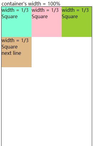
I devide the div into two parts, and achieve with Flex Box in each part.
<!--My Trials-->
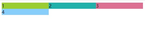
<body>
<div>
<div class="container1" style="display: flex;">
<div class="item1" style="flex:1;background-color: yellowgreen;">1</div>
<div class="item1" style="flex:1;background-color: lightseagreen;">2</div>
<div class="item1" style="flex:1;background-color: palevioletred">3</div>
</div>
<div class="container2" style="display: flex;">
<div class="item2" style="flex:1;background-color: lightskyblue;">4</div>
<div class="item2" style="flex:2;visibility: hidden;">5</div><!-- hide the 5th div -->
</div>
</div>
</body>
I wonder how to turn each div into a square.
And Is there anyway can achive the layout without the help of the 5th div?