I'm trying to put 4 images in a flexbox div in a parent flexbox, with total height 100%, without stretching out of the parent flexbox. I've searched a lot, but I didn't found something useful.
I have made a minimum example:
        html {
            height: 100%;
        }
        body {
            height: 100%;
            margin: 0;
            display: flex;
        }
        main {
            flex: 1;
            display: flex;
            flex-direction: column;
            align-items: center;
            background-color: yellowgreen;
        }
        .imgs {
            flex: 1;
            display: flex;
            justify-content: center;
            align-items: center;
        }
        .img100 {
            max-width: 100%;
            max-height: 100%;
            vertical-align: middle;
        }
<main>
<!--
Weird. Chromium (Chrome & new Edge) usually renders height 100%,
but not height-responsive; sometimes renders scroll bar.
Firefox always renders the scroll bar result.
-->
<div class="imgs">
<img class="img100" src="https://imgur.com/ruE1EBV.jpg">
</div>
<div class="imgs">
<img class="img100" src="https://imgur.com/ruE1EBV.jpg">
</div>
<div class="imgs">
<img class="img100" src="https://imgur.com/ruE1EBV.jpg">
</div>
<div class="imgs">
<img class="img100" src="https://imgur.com/ruE1EBV.jpg">
</div>
</main>When opening this example, chromium-based browsers(Chrome, new Edge) usually render height 100%, the desired result, but it is not "height-responsive": the max height of the images remains fixed once the page is fully loaded. What even worse is, sometimes they give the stretched result with scrollbar; and Firefox always give me the stretched result with scrollbar, which is not what I want.
Try opening this S.O. page in Chromium & Firefox, and run the snippet. The results are different, too.
Chromium (almost always left, rarely right):
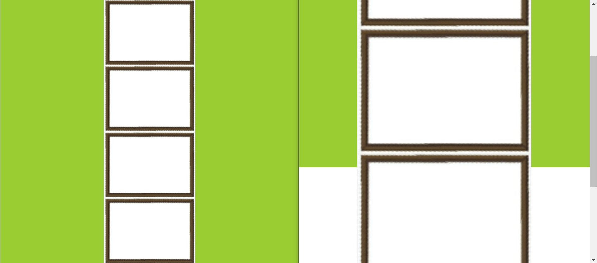
Firefox (always):

Any way to achieve what I want? The wrapping div and parent div may be something other than flexbox. I just want the images staying in the div, with width-responsive & height-responsive.
Also, any reason why Chromium browsers' rendering results are not consistent? Is my example missing something?
I know I can use the background image technique, so I can put image in div without changing layout at all. But I want only the image part clickable, so there must be an image element there corresponding to the clickable area.
background-image example:
html {
    height: 100%;
}
body {
    height: 100%;
    margin: 0;
    display: flex;
}
main {
    flex: 1;
    display: flex;
    flex-direction: column;
    background-color: yellowgreen;
}
a {
    flex: 1;
    background-image: url('https://imgur.com/ruE1EBV.jpg');
    background-repeat: no-repeat;
    background-size: contain;
    background-position: center;
    border: 5px solid red;
}
<main>
<a href="https://stackoverflow.com"></a>
<a href="https://stackoverflow.com"></a>
<a href="https://stackoverflow.com"></a>
<a href="https://stackoverflow.com"></a>
</main>Edit:
Equal row heights in flex-direction: column is okay when the content inside doesn't contain any images. I think the tricky part is the images. They just stretch...
html {
    height: 100%;
}
body {
    height: 100%;
    margin: 0;
    display: flex;
}
main {
    flex: 1;
    display: flex;
    flex-direction: column;
    align-items: center;
    background-color: yellowgreen;
}
.imgs {
    flex: 1;
    display: flex;
    justify-content: center;
    align-items: center;
    border: 5px solid red;
}
.img100 {
    max-width: 100%;
    max-height: 100%;
    vertical-align: middle;
}
<main>
<div class="imgs">
hello
</div>
<div class="imgs">
hello
</div>
<div class="imgs">
hello
</div>
<div class="imgs">
hello
</div>
</main>