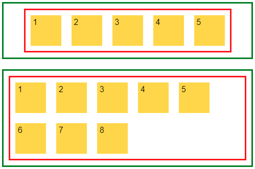
I need a flexbox-layout for unknown number of elements, which wraps to next line when there is no more space available. But I need the whole layout (red border) to be centered inside container (green border), but I don't want items (yellow boxes) to be centered if they wraps.
After the items wraps to second line (items 6-8), outer red box does not center any more, because it takes all space that is available, leaving big whitespace around item number 5 and right edge of red line.
Is there any way to force the red box to only consume space it needs, and then gets centered?
.container {
  margin: 50px 10px;
  padding: 10px;
  display: flex;
  justify-content: center;
  border: 3px solid green;
}

.flex-container {
  padding: 0;
  margin: 0;
  list-style: none;
  border: 1px solid silver;
  display: flex;
  border: 3px solid red;
}

.wrap {
  flex-wrap: wrap;
}

.wrap li {
  background: gold;
}

.flex-item {
  background: tomato;
  padding: 5px;
  width: 50px;
  height: 50px;
  margin: 10px;
}
<div class="container">
<ul class="flex-container wrap">
<li class="flex-item">1</li>
<li class="flex-item">2</li>
<li class="flex-item">3</li>
<li class="flex-item">4</li>
<li class="flex-item">5</li>
<li class="flex-item">6</li>
<li class="flex-item">7</li>
<li class="flex-item">8</li>
</ul>
</div>