I've looked into this a fair bit but can't seem to find a good, solid answer to find how to make a responsive circle around a div element of variable height.
It's easy to make a simple responsive circle using vw units.
<div style="height:20vw; width:20vw"></div>
However, I'm looking to use a min-height of an element and have a circle around this div.
Another way to create a responsive circle is using something like the snippet below, but again I can't adapt this to work for a variable height (again, I can't use vh units as the div will change in height.
.square {
  position: relative;
  width: 10%;
  background: gray;
  border-radius: 50%;
}

.square:after {
  content: "";
  display: block;
  padding-bottom: 100%;
}

.content {
  position: absolute;
  width: 100%;
  height: 100%;
}
<div class="square">
<div class="content">
</div>
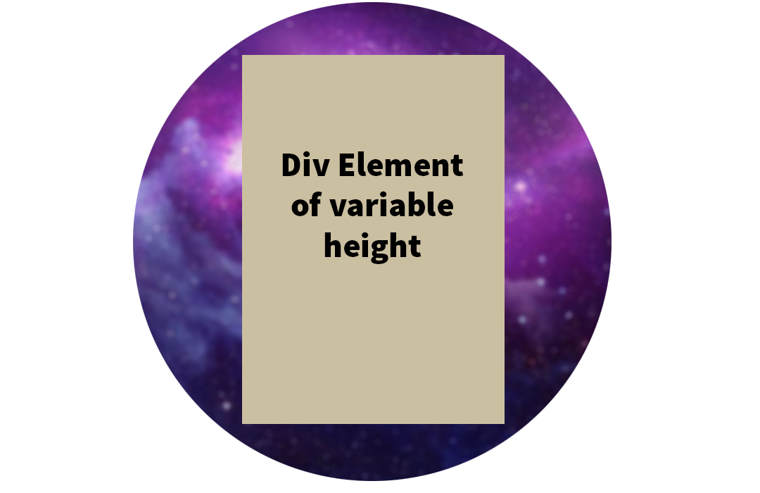
</div>I am trying to create something like the below, where the circle will never cut into the corners of the div (with around a 10px padding). I personally was trying to avoid javascript and would have preferred a css only approach, but it seems it's unavoidable. Maybe the only solution is to use a jquery to calculate the height of the element in order to apply this to a wrapper element?
I was playing around with this:
.square {
  position: absolute;
  top: 50%;
  display: inline-block;
  left: 50%;
  transform: translate(-50%, -50%);
  min-height: 100px;
  border-radius: 50%;
  background: url('https://i.imgur.com/2dxaFs9_d.webp?maxwidth=640&shape=thumb&fidelity=medium');
  background-size: 100% 100%;
  padding: 20px;
}

.content {
  width: 300px;
  min-height: 100px;
  background: tomato;
}
<div class="square">
<div class="content">
Hello!<br>
<br><br><br>This has a variable height but fixed width<br><br><br>Hello
</div>
</div>