So as I wrote in the comments, it seems like when using grid-gap with grid-template-areas, the template-row is being rendered even if there is no content in it, which makes grid-gap apply on it anyways.
After digging a bit in the documentation and in the Editor's draft and I didn't see anything we can manipulate how grid-gap works and make it responsive to unused row tracks.
I guess grid-gap need some work, so you can open an issue to w3.org or at least bring it up.
My suggestions for now are:
Option 1
Best solution I can suggest (while still using areas names and grid-template-areas):
There are great alternatives for grid-gap, you can use padding or margin for each cell content, that will result exactly what you want:
*{
margin: 0;
padding: 0px;
}
.name {
grid-area: name;
margin: 0px 20px 20px 0px
}
.lastname{
grid-area: lastname;
margin: 0px 20px 20px 0px
}
.phone {
grid-area: phone;
margin: 0px 20px 20px 0px
}
.email {
grid-area: email;
margin: 0px 20px 20px 0px
}
.somethingelse {
grid-area: somethingelse;
margin: 0px 20px 20px 0px
}
.wrapper {
display: grid;
grid-template-areas:
'name name name lastname lastname lastname'
'somethingelse somethingelse somethingelse . . .'
'phone phone phone phone phone phone'
'email email email email email email';
}
<div class="wrapper">
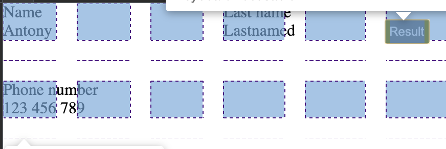
<div class="field name">
<div class="titile">Name</div>
<div class="description">Antony</div>
</div>
<div class="field lastname">
<div class="titile">Last name</div>
<div class="description">Lastnamed</div>
</div>
<div class="field phone">
<div class="titile">Phone number</div>
<div class="description">123 456 789</div>
</div>
</div>
Option 2
Using grid-gap as you want, but without using template-areas, instead render rows and cols depends on the elements that should be rendered.
Notice that in this solution, the position of the divs are important.
*{
margin: 0;
padding: 0px;
}
.name {
grid-row: 1fr;
grid-column: 1 / 2;
}
.lastname{
grid-row: 1fr;
grid-column: 2 / 3;
}
.phone {
grid-row: 1fr;
grid-column: 1 / 2;
}
.email {
grid-row: 1fr;
grid-column: 1 / 2;
}
.somethingelse {
grid-row: 1fr;
grid-column: 1 / 2;
}
.wrapper {
display: grid;
grid-template-columns: repeat(2, 1fr);
grid-gap: 20px;
}
<div class="wrapper">
  <div class="field name">
    <div class="titile">Name</div>
    <div class="description">Antony</div>
  </div>
  <div class="field lastname">
    <div class="titile">Last name</div>
    <div class="description">Lastnamed</div>
  </div>


  <div class="field phone">
    <div class="titile">Phone number</div>
    <div class="description">123 456 789</div>
  </div>


</div>
Option 3
This will not behave exactly as you want, but it is something you can check:
I thought about using the grid gap with units relative to the size of the grid (if more rows were generated, the gap between them will be bigger, and if no row will be generated, then the gap will "shrink" relatively).
So you could use percentage as a unit for grid-gap, instead of a fixed gap size.
*{
margin: 0;
padding: 0;
}
.name {
grid-area: name;
}
.lastname{
grid-area: lastname;
}
.phone {
grid-area: phone;
}
.email {
grid-area: email;
}
.somethingelse {
grid-area: somethingelse;
}
.wrapper {
display: grid;
grid-gap: 20px;
grid-template-areas:
'name name name lastname lastname lastname'
'somethingelse somethingelse somethingelse . . .'
'phone phone phone phone phone phone'
'email email email email email email';
}
<div class="wrapper">
  <div class="field name">
    <div class="titile">Name</div>
    <div class="description">Antony</div>
  </div>
  <div class="field lastname">
    <div class="titile">Last name</div>
    <div class="description">Lastnamed</div>
  </div>


  <div class="field phone">
    <div class="titile">Phone number</div>
    <div class="description">123 456 789</div>
  </div>


</div>
Hope it helped you out somehow.