Newly trying to do stuff with Bootstrap for a responsive banner. I did some researching last night and this morning. If this has already been answered (like I suspect), please let me know where I might be able to find the answer. I set up a 4 column, 1 row grid. I put some content in each column. However, when I reduce the size of the browser window enough, it turns into something that looks like it has 4 rows instead of one. Please check the linked video capture of my browser (chrome) being resized. The code I'm using is at the pastebin below. How do i keep it all in one row, all of the time?
Partial Code:
<div class="container touchpointContainer">
<div class="row tall">
<div class="col-sm-1 bootCol">
<a onclick="advanceReview(-1)">
<img class="prev" src="leftArrow.png"/>
</a>
</div>
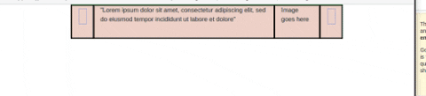
<div class="col-sm-8 bootCol">
"Lorem ipsum dolor sit amet, consectetur adipiscing elit, sed do eiusmod tempor incididunt ut labore et dolore"
</div>
<div class="col-sm-2 bootCol">
Image goes here
</div>
<div class="col-sm-1 bootCol">
<a onclick="advanceReview(1)">
<img class="next" src="rightArrow.png"/>
</a>
</div>
</div>
Complete Code:
Gif of resizing: