1. X-ticklabels not working
I'm using Matplotlib to generate a histogram from some measurements:
import matplotlib
matplotlib.use('Agg')
import matplotlib.pyplot as pyplot
...
fig = pyplot.figure()
ax = fig.add_subplot(1,1,1,)
n, bins, patches = ax.hist(measurements, bins=50, range=(graph_minimum, graph_maximum), histtype='bar')

ax.set_xticklabels([n], rotation='vertical')


for patch in patches:
    patch.set_facecolor('r')

pyplot.title='Foobar'
#pyplot.grid(True)
pyplot.xlabel('X-Axis')
pyplot.ylabel('Y-Axis')
pyplot.savefig(output_filename)
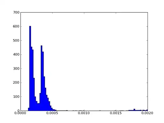
The resulting PNG looks good, except for two issues:
- The title ('Spam and Ham') is missing from the PNG. The x and y-axis labels are both present (although I didn't turn them on for the sample below).
- The x-tick-lables seems completely broken - instead of showing along the bottom underneath all the bars, it's rendered as a single line of numbers underneath the bottom left of the graph, which is cut off. It also seems to disable my Y-axis label.
2. Unit and SI Prefixes
NB: Not Matplotlib specific.
The histogram has time measurements along the x-axis. These range from the microsecond range through to the millisecond and second range. At the moment, the graph is rendering the x-axis labels as seconds in standard notation.
I'd like to friendly-format I'd rather the time was given in milliseconds/microsecond values, with the units showing. So that means I'd like something to friendly format a time value, with an awareness of SI prefixes.
In fact, it's probably be quite similar to the sample program here:
http://diveintopython3.org/your-first-python-program.html
I did notice there's some Python libraries that do handle units:
- http://juanreyero.com/open/magnitude/index.html
- http://home.scarlet.be/be052320/Unum.html
- http://pypi.python.org/pypi/units/
However, from what I've read, it doesn't seem like any of the above handle SI prefixes, or do this sort of friendly formatting. Any suggestions/alternatives?