0

I am trying to adjust 2 buttons side by side to the right side of a flex container. I have found a solution using margin-left auto since floats do not work in flex containers. The problem with margin-left auto is it give a space between the two buttons that I do not want. I need both buttons to float to the right side of the container, but still be side by side. Can anyone help? Here is the HTML


                <div className="task-list-item">
                  <ul>
                    <li className="li-title" key={key}>
                      {x.title}
                    </li>
                    <li className="li-desc" key={key}>
                      {x.description}
                    </li>
                  </ul>
                  <button className="task-btns">Complete</button>
                  <button className="task-btns">Delete</button>
                </div>
              

and Here is the CSS

.task-list-item {
  list-style-type: none;
  background-color: rgb(204, 200, 200);
  width: 60%;
  display: flex;
  margin-bottom: 5px;
}

.task-btns {
  width: 100px;
  height: 25px;
  margin-left: auto;
}

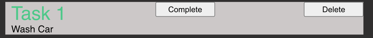
Here is what the container looks like.

https://i.stack.imgur.com/ekMs9.png

Jayg713
  • 327
  • 3
  • 14

2 Answers2

0

Put your buttons in a wrapper div and set your justify-content property:

<style>
    .task-list-item {
        list-style-type: none;
        background-color: rgb(204, 200, 200);
        width: 60%;
        display: flex;
        margin-bottom: 5px;
        justify-content: space-between;
    }

    .task-btns {
        width: 100px;
        height: 25px;
    }
</style>

<div className="task-list-item">
    <ul>
        <li className="li-title" key={key}>
            {x.title}
        </li>
        <li className="li-desc" key={key}>
            {x.description}
        </li>
    </ul>
    <div>
        <button className="task-btns">Complete</button>
        <button className="task-btns">Delete</button>
    </div>
</div>
Dan Mullin
  • 4,285
  • 2
  • 18
  • 34
0

You can add your button into a div tag. then remove margin-left: auto; from your buttons and add style "display: inline-flex;margin-left: auto;" to your div. Your code result will be:

.task-list-item {
  list-style-type: none;
  background-color: rgb(204, 200, 200);
  width: 60%;
  display: flex;
  margin-bottom: 5px;
}

.btns {
    display: inline-flex;
    margin-left: auto;
}

.task-btns {
  width: 100px;
  height: 25px;
}
<div className="task-list-item">
  <ul>
    <li className="li-title" key={key}>
      {x.title}
    </li>
    <li className="li-desc" key={key}>
      {x.description}
    </li>
  </ul>
  <div className="btns">
    <button className="task-btns">Complete</button>
    <button className="task-btns">Delete</button>
  </div>
</div>

I hope this will be useful.