1

I have an array of images, between other properties, and I am trying to get this result:

enter image description here

When it reach the end of the container (on a desktop is 4 images and it must addapt to smaller screens) it should create another div and insert the images inside it.

If I was working with static data I would do something like this:

<div>
   <div className="d-flex products-container justify-content-between mt-5">
      <div className="border">
         <img src={require('../../assets/images/Products/molde.png')} alt="Produto" />
      </div>
      <div className="border">
         <img src={require('../../assets/images/Products/molde.png')} alt="Produto" />
      </div>
      <div className="border">
         <img src={require('../../assets/images/Products/molde.png')} alt="Produto" />
      </div>
      <div className="border">
         <img src={require('../../assets/images/Products/molde.png')} alt="Produto" />
      </div>
   </div>
</div>

However the data is coming dynamically from an API and I am using a loop to create the elements:

props.products.map(product => {
   return <div className="border">
             <img src={product.img} alt="Produto" />
          </div>
})

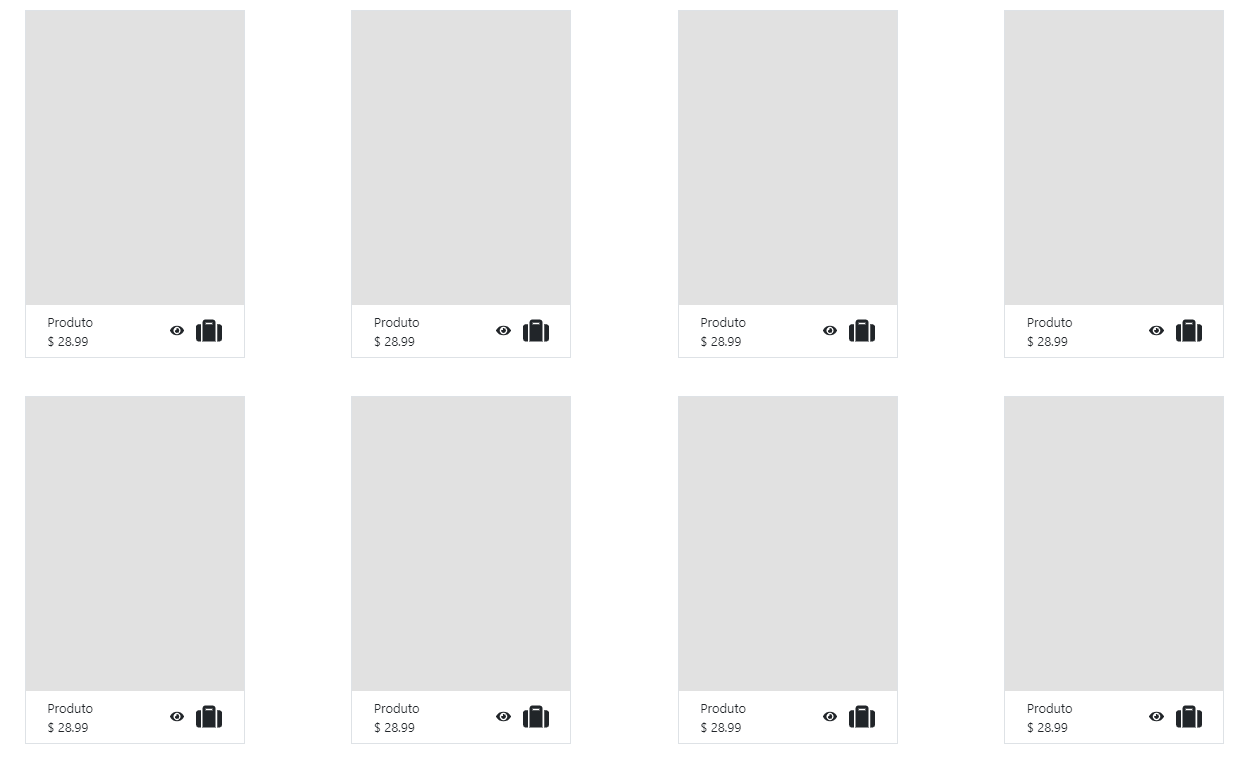
Because of that I am getting this:

enter image description here

I tried to use a if else statement based on the index to determine the behavior but without success.

Any idea how to do that?

Berg_Durden
  • 1,531
  • 4
  • 24
  • 46
  • 2
    is the bootstrap grid out of question? – Dev Man Aug 19 '20 at 19:14
  • 1
    Why don't use just use something like this for your classes? `col-xs-6 col-sm-3` This will do 2 columns on mobile and everything above that will have 4 columns. You don't need to separate them into rows as that is automatically handled with the CSS. https://getbootstrap.com/docs/4.0/layout/grid/ – imvain2 Aug 19 '20 at 19:19
  • 1
    Looping through and working with the index value is a good approach. Please revise to show that attempt. – isherwood Aug 19 '20 at 20:12
  • @imvain2 I did that, however I forgot to set the class `row`. Noob mystakes :) . If you want to transform your comment into an answer I'd be glad to accept it. Thank you very much! – Berg_Durden Aug 19 '20 at 20:31

3 Answers3

3

You can use Bootstrap's built in grid classes that will automatically create columns depending on what classes you use.

Using col-xs-6 col-sm-3 will do 2 columns on mobile and everything above that will have 4 columns.

You don't need to separate them into rows as that is automatically handled with the CSS.

https://getbootstrap.com/docs/4.5/layout/grid/

isherwood
  • 58,414
  • 16
  • 114
  • 157
imvain2
  • 15,480
  • 1
  • 16
  • 21
  • 1
    Just to clarify (and it is in the bootstrap documentation) the col-xs-6 col-sm-3 should be a class in the div. So
    and just loop through all images.
    – user3520445 Aug 19 '20 at 20:40
  • 1
    @user3520445, each image should be wrapped in a div with those classes. And you don't have to worry about grouping 4 images together and wrapping by a div with `row`. – imvain2 Aug 19 '20 at 20:42
  • It's worth mentioning that this may restrict the use of some flexbox features that Bootstrap offers. – isherwood Aug 19 '20 at 21:10
1

There may be a more elegant way, but working with index seems like a good approach. Something like this might work:

props.products.map((product, index) => {
   if (index + 1 % 4 === 0) { // index plus one is evenly divisible by 4
       return <div className="border">
             <img src={product.img} alt="Produto" />
          </div>
       </div>

       <div className="d-flex products-container justify-content-between mt-5">
    } else {
       return <div className="border">
             <img src={product.img} alt="Produto" />
          </div>
    }
})
isherwood
  • 58,414
  • 16
  • 114
  • 157
-1

Maybe make one of your CSS class settings style="display:inline-block".

Try this to provide inline CSS in every block: style="display:block".

isherwood
  • 58,414
  • 16
  • 114
  • 157