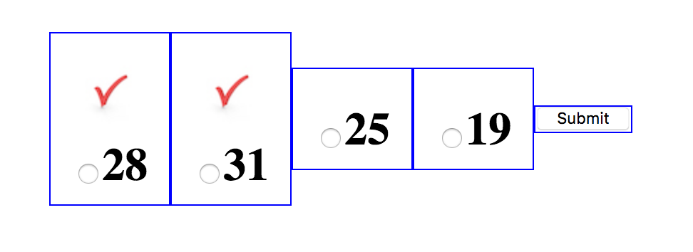
Can you provide a screenshot of the desired output, please?
Also, I was able to achieve this result by making few changes am not sure if this is the result you wanted... But I hope it can be of any help.
.flex-container {
  height: 100%;
  padding: 0;
  margin: 0;
  display: -webkit-box;
  display: -moz-box;
  display: -ms-flexbox;
  display: -webkit-flex;
  display: flex;
  align-items: center;
  justify-content: center;
}

.row {
  width: auto;
}

.flex-item {
  margin: 10px 30px;
  padding: 5px;
  line-height: 36px;
  color: black;
  font-weight: bold;
  font-size: 2em;
  text-align: center;
  align-items: center;
}

.flex-item img {
  display: block;
  margin: 0 auto;
}

.second-flex {
  display: flex;
}
<div class="flex-container">
  <div class="row">
    <div class="flex-item">
      <img src="https://picsum.photos/40" />
    </div>
    <div class="flex-item">
      <input type="radio" id="radio0" name="choice"><span>Text1</span>
    </div>
  </div>
  <div class="row second-flex">
    <div class="flex-item">
      <img src="https://picsum.photos/40" />
    </div>
    <div class="flex-item">
      <input type="radio" id="radio1" name="choice"><span>Text2</span>
    </div>
  </div>
  <div class="row">
    <input type="button" value="Submit" id="submitAnswer" />
  </div>
</div>
Is this the result you are looking for? if not please provide me an image and I will adjust the code according to it. And I will try my best to help you out.
Edited
So to make them appear on a different row give the .flex-item class the following properties. display: flex; flex-direction: column;
I left the .flex-item with the **text2** as it is so you can see the difference between them.
PS: you can download an extension called Pesticide for Chrome it will draw an outline for each element on the page it makes designing easier.
**
EDITED
**
Ok, So which one do you really want from these?
Option one:
CSS:
.flex-container {
    height: 100%;
    padding: 0;
    margin: 0;
    display: -webkit-box;
    display: -moz-box;
    display: -ms-flexbox;
    display: -webkit-flex;
    display: flex;
    align-items: center;
    justify-content: center;
    flex-direction: column;
}

.row {
    width: auto;
}

.flex-item {
    margin: 10px 30px;
    padding: 5px;
    line-height: 36px;
    color: black;
    font-weight: bold;
    font-size: 2em;
    text-align: center;
    align-items: center;
}

.flex-item img {
    display: block;
    margin: 0 auto;
}

.second-flex {
    display: flex;
}
HTML:
<div class="flex-container">
        <div class="row">
            <div class="flex-item">
                <img src="assets/images/image.jpg" height="40" />
            </div>
            <div class="flex-item third-flex">
                <input type="radio" id="radio0" name="choice"><span>Text1</span>
            </div>
        </div>
        <div class="row second-flex">
            <div class="flex-item">
                <img src="assets/images/image.jpg" height="40" />
            </div>
            <div class="flex-item">
                <input type="radio" id="radio1" name="choice"><span>Text2</span>
            </div>
        </div>
        <div class="row">
            <input type="button" value="Submit" id="submitAnswer" />
        </div>
    </div>
Option Two:
It has the same CSS as option one.
HTML changes:
<div class="flex-container">
        <div class="row second-flex">
            <div class="flex-item">
                <img src="assets/images/image.jpg" height="40" />
            </div>
            <div class="flex-item third-flex">
                <input type="radio" id="radio0" name="choice"><span>Text1</span>
            </div>
        </div>
        <div class="row second-flex">
            <div class="flex-item">
                <img src="assets/images/image.jpg" height="40" />
            </div>
            <div class="flex-item">
                <input type="radio" id="radio1" name="choice"><span>Text2</span>
            </div>
        </div>
        <div class="row">
            <input type="button" value="Submit" id="submitAnswer" />
        </div>
    </div>
Option three:
This one has the same HTML and CSS as option 2 but with a small change in CSS
.flex-container {
    height: 100%;
    padding: 0;
    margin: 0;
    display: -webkit-box;
    display: -moz-box;
    display: -ms-flexbox;
    display: -webkit-flex;
    display: flex;
    align-items: center;
    justify-content: center;
    /* flex-direction: column; remove this line */
}
option four:

HTML:
 <div class="flex-container">
        <div class="row ">
            <div class="flex-item">
                <img src="assets/images/image.jpg" height="40" />
            </div>
            <div class="flex-item third-flex">
                <input type="radio" id="radio0" name="choice"><span>Text1</span>
            </div>
        </div>
        <div class="row ">
            <div class="flex-item">
                <img src="assets/images/image.jpg" height="40" />
            </div>
            <div class="flex-item">
                <input type="radio" id="radio1" name="choice"><span>Text2</span>
            </div>
        </div>
        <div class="row">
            <input type="button" value="Submit" id="submitAnswer" />
        </div>
    </div>
CSS
.flex-container {
    height: 100%;
    padding: 0;
    margin: 0;
    display: -webkit-box;
    display: -moz-box;
    display: -ms-flexbox;
    display: -webkit-flex;
    display: flex;
    align-items: center;
    justify-content: center;
}

.row {
    width: auto;
}

.flex-item {
    margin: 10px 30px;
    padding: 5px;
    line-height: 36px;
    color: black;
    font-weight: bold;
    font-size: 2em;
    text-align: center;
    align-items: center;
    display: flex;
    flex-direction: column;
}

.flex-item img {
    display: block;
    margin: 0 auto;
}

.second-flex {
    display: flex;
}
option 5:
HTML:
 <div class="flex-container">
        <div class="row ">
            <div class="flex-item">
                <img src="assets/images/image.jpg" height="40" />
            </div>
            <div class="flex-item third-flex">
                <input type="radio" id="radio0" name="choice"><span>Text1</span>
            </div>
        </div>
        <div class="row ">
            <div class="flex-item">
                <img src="assets/images/image.jpg" height="40" />
            </div>
            <div class="flex-item">
                <input type="radio" id="radio1" name="choice"><span>Text2</span>
            </div>
        </div>
        <div class="row">
            <input type="button" value="Submit" id="submitAnswer" />
        </div>
    </div>
CSS:
.flex-container {
    height: 100%;
    padding: 0;
    margin: 0;
    display: -webkit-box;
    display: -moz-box;
    display: -ms-flexbox;
    display: -webkit-flex;
    display: flex;
    align-items: center;
    justify-content: center;
    flex-direction: column;
}

.row {
    width: auto;
}

.flex-item {
    margin: 10px 30px;
    padding: 5px;
    line-height: 36px;
    color: black;
    font-weight: bold;
    font-size: 2em;
    text-align: center;
    align-items: center;
    display: flex;
    flex-direction: column;
}

.flex-item img {
    display: block;
    margin: 0 auto;
}

.second-flex {
    display: flex;
}


