0

I am using Bootstrap and I want to have the top-right side of the red background always sit to the top right corner of the blue section in the visible section regardless of how window resized as it is responsive.

Red should be position fixed as it should not be moved by scrolling but always should sit on the right-top side of the visible blue background section.

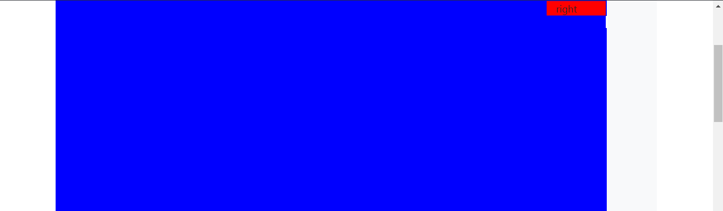
as the picture it should be like this : enter image description here If I scroll ( I did it with windows paint now)

enter image description here

Please check the link or see the below codes :

.row {
  background: #f8f9fa;
  margin-top: 20px;
}

.col {
  border: solid 1px #6c757d;
  padding: 10px;
}

.left {
  background-color: blue;
  width: 100%;
  height: 4000px;
}

.right {
  background-color: red;
  width: 100%;
  position: fixed;
  right: 18%;
}
<link href="https://stackpath.bootstrapcdn.com/bootstrap/4.5.2/css/bootstrap.min.css" rel="stylesheet" />
<div class="container">
  <div class="row">
    <div class="col-11 left">left

    </div>
    <div class="col-1 right">right
    </div>
  </div>
</div>
disinfor
  • 10,865
  • 2
  • 33
  • 44
Sami
  • 17
  • 8
  • Does this answer your question? [Fixed position but relative to container](https://stackoverflow.com/questions/6794000/fixed-position-but-relative-to-container) – disinfor Aug 29 '20 at 12:35
  • No that is different. In my case the position that the red layer needs to be fixed is dynamic to the visible area. It is easy to have it always in the left side or on top but not in the right side. At least I still do not know how to do it – Sami Aug 29 '20 at 12:48
  • The reason you are getting answers that are not what you want is because it's not clear exactly what you are trying to do. Your js fiddle looks like what you have described, but obviously it isn't so can you explain what it is doing that is wrong? Or if you had an example, it would be easier to understand if we could see what you mean. – FluffyKitten Aug 29 '20 at 14:26
  • Hi, you changed the my code and actually it was not what I wanted. In your revision the result was not what I wanted. When you scroll the page the red element disappear and I wanted to be fixed regardless of the window size and position in the top right side of the blue size ( which depends on the window size) – Sami Aug 29 '20 at 14:29
  • I didn't actually change your code, I just wrapped the code in snippet tags. Part of the reason you are having problems is because you are using columns in a layout that doesn't have columns - you are moving the last column out. Do you need the column layout? – FluffyKitten Aug 31 '20 at 08:25

2 Answers2

0

If you want to set the element at the top of the right, and it should be outside the another element without scrolling, you can use position: absolute property Try this solution:

.right{
  background-color: red;
  width: '100%';
  position: absolute;
  right: 15%;
  top: 30px;
}
  • Thanks but no it does not work like that. It still could go of from the visible top right corner of the blue – Sami Aug 29 '20 at 12:46
  • Sorry, forgot to add, please add **position: relative** for _.row_ class – andriib Aug 29 '20 at 13:46
  • This does not solve the problem. You can check it your self in the link that I provided – Sami Aug 29 '20 at 14:02
0

You're looking for position: sticky in this case. There's a few things you need to do to make this work:

  1. Set the position: relative on the the element's parent (the .row in this case)
  2. Set a top value on the sticky element. This is needed so when the element switches to sticky, it knows where to position it.
  3. I added another class to the .right element, because Bootstrap's col classes were more specific. Adding class .sticky to that element, makes sure the position property is applied.

.row {
  background: #f8f9fa;
  margin-top: 20px;
  align-items: flex-start;
  position: relative;
}


.left {
  background-color: blue;
  width: 100%;
  height: 4000px;
}

.right.sticky {
  background-color: red;
  width: 100%;
  position: sticky;
  right: 18%;
  top: 0;
}
<link href="https://stackpath.bootstrapcdn.com/bootstrap/4.5.2/css/bootstrap.min.css" rel="stylesheet" />
<div class="container">
  <div class="row">
    <div class="col-11 left">left

    </div>
    <div class="col-1 right sticky">right
    </div>
  </div>
</div>
disinfor
  • 10,865
  • 2
  • 33
  • 44
  • Thanks disinfor, but still there is a problem. If I shrink the browser width the red will be disappeared ( I want to red part be visible not only when you scroll vertically but also when you shrink the browser width. Thanks – Sami Aug 31 '20 at 15:17
  • @Sami I don't see that happening. Run my snippet full screen and you can test it. Do you have other code on your site hiding the `.right` element? – disinfor Aug 31 '20 at 15:50
  • @disninfor no basically I resize browser in here and I see when I shrink the browser the red could not be seen. – Sami Aug 31 '20 at 17:05
  • Yeah, because the red element is dropping below. Do you need columns? Why not start with the red element INSIDE of the blue column? – disinfor Aug 31 '20 at 17:41