I have an experiment with 10 participants and 96 accuracies collected for each. acc_i represents the participant's overall accuracy at timestep i. Therefore, I have a 10x96 numpy matrix which looks like this:
[[acc_0,acc_1,acc_2,...acc_95]
 [acc_0,acc_1,acc_2,...acc_95]
 [acc_0,acc_1,acc_2,...acc_95]
            .
            .
            .
 [acc_0,acc_1,acc_2,...acc_95]]
I want to plot a line of the average accuracy among all participants at each timestep, along with an error band that shows the average +- 1 standard deviation. I can calculate the average and standard deviations separately using pd.Series(np.average(human_accuracies, axis=0)) and pd.Series(np.std(human_accuracies, axis=0)). However, this gives me two separate lines on a graph when I use:
sns.lineplot(data=avg_accuracies)
sns.lineplot(data=sd_accuracies)
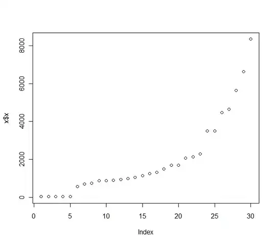
This is shown below:
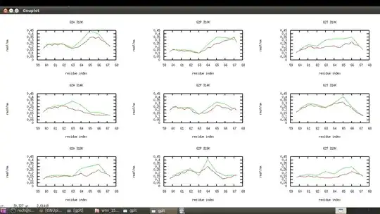
How can I make my plot into something more like what is shown here:
I'd like the error band to be calculated using the standard deviation at each time step i +- the average accuracy at each time step i.


