-1

So I have this button i am styling and I want it like this - If you can see it is red in color but has different shade of red starting from the bottom half of this element.

enter image description here

I wanted to enquire what exactly do I do to achieve this effect.

I currently have this after a few attempts:
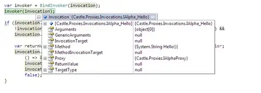
enter image description here

Qasim
  • 39
  • 1
  • 5
  • This helps you [linear-gradient](https://developer.mozilla.org/en-US/docs/Web/CSS/linear-gradient)for this. – Rayees AC Sep 04 '20 at 04:49

3 Answers3

1

Sometimes a gradient is all you need.

.button {
    display: inline-block;
    border-radius: 10px;
    color: white;
    padding: 5px 10px;
    box-shadow: 1px 1px 3px rgba(0,0,0,0.4);
    background: rgb(255,0,0);
    background: linear-gradient(180deg, rgba(255,0,0,1) 0%, rgba(255,0,0,1) 50%, rgba(200,0,0,1) 50.1%, rgba(200,0,0,1) 100%);
    cursor:pointer;
}
/* Hover state */
.button:hover {
    background: linear-gradient(180deg, rgba(255,50,50,1) 0%, rgba(255,50,50,1) 50%, rgba(200,50,50,1) 50.1%, rgba(200,50,50,1) 100%);
    box-shadow: 0px 0px 1px rgba(0,0,0,0.4);
}
<div class="button">SUBMIT▶</div>
ippi
  • 9,857
  • 2
  • 39
  • 50
1

To do this, just use background: linear-gradient()

.button {
  display: flex;
  align-items: center;
  justify-content: center;
  width: 100px;
  height: 50px;
  color: white;
  background: linear-gradient(to top, green 50%, red 50%);
}
<div class="button">
  submit
</div>
s.kuznetsov
  • 14,870
  • 3
  • 10
  • 25
1

That can be done using linear-gradient for more info about Linear gradient

Example:

button {
  background: linear-gradient(to bottom, #e66465 50%, #9198e5 50%);
}
<button>
    click me
</button>
Ahmad Dalao
  • 1,968
  • 1
  • 8
  • 14