2

I'm building a To-Do List with only HTML and CSS, I want only the content of the main section of the site to be moved by the side scroll.

The page is divided into 3 sections, which are contained within a flexbox container, and a header. In the image you can see a model representing the idea. Page Layout

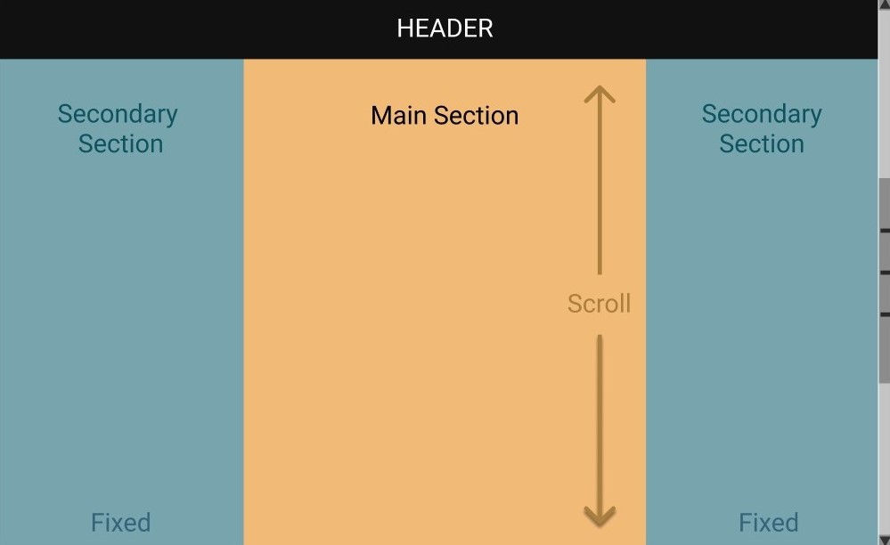
The main section is the one in the middle, the vertical scroll must be allowed only for it, all other elements such as the header and the secondary sections must remain fixed on the screen.

I made a reduced version of the code to simplify my situation and make it easier to understand:

HTML CODE:

 <!DOCTYPE html>
    <html lang="en">
      <head>
        <meta charset="UTF-8" />
        <meta name="viewport" content="width=device-width, initial-scale=1.0" />
        <link rel="stylesheet" href="style.css" />
        <title>To-do list</title>
      </head>
      <body>
        <header>
          <h1>To-Do List</h1>
        </header>
        <div class="flex-container">
          <section class="secondary-section">
            <h2>Secondary Section</h2>
          </section>
          <section class="main-section">
            <h2>Main Section</h2>
          </section>
          <section class="secondary-section">
            <h2>Secondary Section</h2>
          </section>
        </div>
      </body>
    </html>

CSS CODE

 * {
      margin: 0;
      padding: 0;
      box-sizing: border-box;
    }
    
    header {
      background-color: black;
      width: 100%;
      padding: 20px;
      text-align: center;
      color: white;
    }
    
    .flex-container {
      display: flex;
      flex: 1 1 0;
      text-align: center;
      height: 1000px;
    }
    
    .flex-container h2 {
      margin-top: 30px;
      font-size: 2rem;
    }
    
    .main-section {
      background-color: rgb(255, 222, 144);
      width: 100%;
    }
    
    .secondary-section {
      background-color: rgb(114, 181, 245);
      width: 100%;
    }

I've been trying to use "position: fixed" and configure the sections overflow, but I was not successful, what would be the correct way to keep these flex elements fixed on the screen without the scroll moving them?

Guilherme
  • 35
  • 5
  • 1
    Does this answer your question? [Make just one section scrollable, not the entire page](https://stackoverflow.com/questions/36847545/make-just-one-section-scrollable-not-the-entire-page) – Vega Sep 09 '20 at 13:47
  • Thanks for the answer, it was useful to understand, but I need the scroll bar to be in the right corner of the screen, but probably with some adjustments I can solve this. – Guilherme Sep 09 '20 at 14:50

4 Answers4

1

You can use position: sticky for this example. I have made the two secondary section full height as the screen (height: 100vh) and added position property to it.

Like so -

 * {
      margin: 0;
      padding: 0;
      box-sizing: border-box;
    }
    
    header {
      background-color: black;
      width: 100%;
      padding: 20px;
      text-align: center;
      color: white;
    }
    
    .flex-container {
      display: flex;
      flex: 1 1 0;
      text-align: center;
      height: 1000px;
    }
    
    .flex-container h2 {
      margin-top: 30px;
      font-size: 2rem;
    }
    
    .main-section {
      background-color: rgb(255, 222, 144);
      width: 100%;
    }
    
    .secondary-section {
      background-color: rgb(114, 181, 245);
      width: 100%;
      /* added */
      height: 100vh;
      position: sticky;
      top: 0;
    }
 <!DOCTYPE html>
    <html lang="en">
      <head>
        <meta charset="UTF-8" />
        <meta name="viewport" content="width=device-width, initial-scale=1.0" />
        <link rel="stylesheet" href="style.css" />
        <title>To-do list</title>
      </head>
      <body>
        <header>
          <h1>To-Do List</h1>
        </header>
        <div class="flex-container">
          <section class="secondary-section">
            <h2>Secondary Section</h2>
          </section>
          <section class="main-section">
            <h2>Main Section</h2>
          </section>
          <section class="secondary-section">
            <h2>Secondary Section</h2>
          </section>
        </div>
      </body>
    </html>
Debsmita Paul
  • 1,442
  • 9
  • 22
1

   body{
        overflow: hidden;
      }
      * {
      margin: 0;
      padding: 0;
      box-sizing: border-box;
    }
    
    header {
      background-color: black;
      width: 100%;
      padding: 20px;
      text-align: center;
      color: white;
    }
    
    .flex-container {
      display: flex;
      flex: 1 1 0;
      text-align: center;
      height: 1000px;
    }
    
    .flex-container h2 {
      margin-top: 30px;
      font-size: 2rem;
    }
    
    .main-section {
      background-color: rgb(255, 222, 144);
      width: 100%;
      height: 700px;
      max-height: 900px;
      overflow: auto;
    }
    
    .secondary-section {
      background-color: rgb(114, 181, 245);
      width: 100%;
    }
<!DOCTYPE html>
    <html lang="en">
      <head>
        <meta charset="UTF-8" />
        <meta name="viewport" content="width=device-width, initial-scale=1.0" />
        <link rel="stylesheet" href="style.css" />
        <title>To-do list</title>
      </head>
      <body>
        <header>
          <h1>To-Do List</h1>
        </header>
        <div class="flex-container">
          <section class="secondary-section">
            <h2>Secondary Section</h2>
          </section>
          <section class="main-section">
              <div>
                <h2>Main Section</h2>
                Hi there Need to add content to this to get the scroll

                Hi there Need to add content to this to get the scroll
                Hi there Need to add content to this to get the scroll
                Hi there Need to add content to this to get the scroll
                Hi there Need to add content to this to get the scroll
                Hi there Need to add content to this to get the scroll
                Hi there Need to add content to this to get the scroll
                Hi there Need to add content to this to get the scroll
                Hi there Need to add content to this to get the scroll
                Hi there Need to add content to this to get the scroll
                Hi there Need to add content to this to get the scroll
                Hi there Need to add content to this to get the scroll

                Hi there Need to add content to this to get the scrollHi there Need to add content to this to get the scrollHi there Need to add content to this to get the scrollHi there Need to add content to this to get the scrollHi there Need to add content to this to get the scrollHi there Need to add content to this to get the scrollHi there Need to add content to this to get the scrollHi there Need to add content to this to get the scrollHi there Need to add content to this to get the scrollHi there Need to add content to this to get the scrollHi there Need to add content to this to get the scrollHi there Need to add content to this to get the scrollHi there Need to add content to this to get the scrollHi there Need to add content to this to get the scrollHi there Need to add content to this to get the scrollHi there Need to add content to this to get the scrollHi there Need to add content to this to get the scrollHi there Need to add content to this to get the scrollHi there Need to add content to this to get the scrollHi there Need to add content to this to get the scrollHi there Need to add content to this to get the scrollHi there Need to add content to this to get the scrollHi there Need to add content to this to get the scrollHi there Need to add content to this to get the scrollHi there Need to add content to this to get the scrollHi there Need to add content to this to get the scrollHi there Need to add content to this to get the scrollHi there Need to add content to this to get the scroll
              </div>

          </section>
          <section class="secondary-section">
            <h2>Secondary Section</h2>
          </section>
        </div>
      </body>
    </html>
Makyen
  • 31,849
  • 12
  • 86
  • 121
Deeksha Gupta
  • 317
  • 2
  • 8
1

Try this instead,

For fixed header by adding

header {
  position: fixed;
  height:80px;
  top: 0;
}

Fixed secondary-section

.secondary-section {
  width: calc(100% / 3);
  height: 100vh;
  position: fixed;
  top: 80px; // height of header
}

Scrollable main-section

.main-section {
  width: calc(100% / 3);
  position:absolute;
  bottom:0;
  right:calc(100% / 3);
  left:calc(100% / 3);
  top: 80px; // height of header
  height: inherit;
  z-index: -1;
}

* {
  margin: 0;
  padding: 0;
  box-sizing: border-box;
}
header {
  background-color: black;
  width: 100%;
  padding: 20px;
  text-align: center;
  color: white;
  position: fixed;
  top: 0;
  height:80px;
}

.flex-container {
  display: flex;
  flex: 1 1 0;
  text-align: center;
  height: 1000px;
  top:80px;
}

.flex-container h2 {
  margin-top: 30px;
  font-size: 2rem;
}

.main-section {
  background-color: rgb(255, 222, 144);
  width: calc(100% / 3);
  position:absolute;
  bottom:0;
  right:calc(100% / 3);
  left:calc(100% / 3);
  top: 0px;
  height: inherit;
  z-index: -1;
  top:80px;
}

.secondary-section {
  background-color: rgb(114, 181, 245);
  width: calc(100% / 3);
  height: 100vh;
  position: fixed;
  top:80px;
}
.secondary-section.right{
  right:0;
}
<!DOCTYPE html>
<html lang="en">
  <head>
    <meta charset="UTF-8" />
    <meta name="viewport" content="width=device-width, initial-scale=1.0" />
    <link rel="stylesheet" href="style.css" />
    <title>To-do list</title>
  </head>
  <body>
    <header>
      <h1>To-Do List</h1>
    </header>
    <div class="flex-container">
      <section class="secondary-section">
        <h2>Secondary Section</h2>
      </section>
      <section class="main-section">
        <h2>Main Section</h2>
        <p>Lorem ipsum dolor sit amet, consectetur adipisicing elit, sed do eiusmod
tempor incididunt ut labore et dolore magna aliqua. Ut enim ad minim veniam,
quis nostrud exercitation ullamco laboris nisi ut aliquip ex ea commodo
consequat. Duis aute irure dolor in reprehenderit in voluptate velit esse
cillum dolore eu fugiat nulla pariatur. Excepteur sint occaecat cupidatat non
proident, sunt in culpa qui officia deserunt mollit anim id est laborum.</p>
      </section>
      <section class="secondary-section right">
        <h2>Secondary Section</h2>
      </section>
    </div>
  </body>
</html>
Rayees AC
  • 4,426
  • 3
  • 8
  • 31
-1

* {
  margin: 0;
  padding: 0;
  box-sizing: border-box;
}

body {
  text-align: center;
}

h1 {
  font-size: 20px;
}

h2 {
  font-size: 16px;
}

header {
  color: white;
  width: 100%;
  height: 50px;
  padding: 10px;
  background: black;
  position: fixed;
  left: 0;
  top: 0;
  z-index: 1;
}

.flex-container {
  display: flex;
  justify-content: center;
  min-height: 100vh;
}

.flex-container [class$="-section"] {
  width: 33.33%;
  height: 100%;
  padding: 60px 10px 10px;
}
.secondary-section {
  background: #78a4ad;
  height: 100%;
  position: fixed;
  top: 0;
  left: 0;
}

.secondary-section ~ .secondary-section {
  left: auto;
  right: 0;
}

.main-section {
  background: #f1ba77;
}
<header>
  <h1>HEADER</h1>
</header>
<div class="flex-container">
  <section class="secondary-section">
    <h2>Secondary Section</h2>
  </section>
  <section class="main-section">
    <h2>Main Section</h2>
    <p>Contrary to popular belief, Lorem Ipsum is not simply random text. It has roots in a piece of classical Latin literature from 45 BC, making it over 2000 years old. Richard McClintock, a Latin professor at Hampden-Sydney College in Virginia, looked up one of the more obscure Latin words, consectetur, from a Lorem Ipsum passage, and going through the cites of the word in classical literature, discovered the undoubtable source. Lorem Ipsum comes from sections 1.10.32 and 1.10.33 of "de Finibus Bonorum et Malorum" (The Extremes of Good and Evil) by Cicero, written in 45 BC. This book is a treatise on the theory of ethics, very popular during the Renaissance. The first line of Lorem Ipsum, "Lorem ipsum dolor sit amet..", comes from a line in section 1.10.32.

The standard chunk of Lorem Ipsum used since the 1500s is reproduced below for those interested. Sections 1.10.32 and 1.10.33 from "de Finibus Bonorum et Malorum" by Cicero are also reproduced in their exact original form, accompanied by English versions from the 1914 translation by H. Rackham.</p>
  </section>
  <section class="secondary-section">
    <h2>Secondary Section</h2>
  </section>
</div>
TrickyUI
  • 1
  • 4