I am trying to visualize a network analysis chart, using Networks and Plotly. I have two datasets:
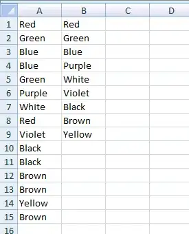
EdgeList, containing all the edge information; 2. NodeList having all node information. EdgeLst of example (Not full data):

NodeList example (Not full data):
 I have only visualized the basic network chart, shown as the code below, but only had location and simple information. I wish to show the other columns in the network chart when mouse moves to each node, showing other hover text/information in the dataset. Unfortunately I don't know how to attach or add other fields into the dict or list or tuple in the network. Really appreciate if anyone can help!
Here is my current code below:
import plotly.graph_objects as go
import networkx as nx
import pandas as pd


node_list = pd.read_csv("nodelist1.csv")
edge_list = pd.read_csv("edgelist1.csv")

nodes = list(node_list['node'])

edge_list['edge_conn'] = edge_list[['tail', 'head']].apply(tuple, axis=1)
edges = list(edge_list['edge_conn'])

G = nx.Graph()

G.add_nodes_from(nodes)
G.add_edges_from(edges)

pos = nx.layout.spring_layout(G)


edge_x = []
edge_y = []

for loc_idx in pos:
  # print (loc_idx, pos[loc_idx])
  x0, y0 = pos[loc_idx]
  edge_x.append(x0)
  edge_y.append(y0)

edge_trace = go.Scatter(
    x=edge_x, y=edge_y,
    line=dict(width=0.5, color='#888'),
    hoverinfo='none',
    mode='lines')

node_x = []
node_y = []

for node_loc in pos:
  x, y = pos[node_loc]
  node_x.append(x)
  node_y.append(y)

node_trace = go.Scatter(
    x=node_x,
    y=node_y,
    mode='markers',
    marker=dict(
        showscale=True,
        colorscale='YlGnBu',
        reversescale=True,
        color=[],
        size=10,
        colorbar=dict(
            thickness=15,
            title='Node Connections',
            xanchor='left',
            titleside='right'
        ),
    line_width=2
))
node_adjacencies = []
node_text = []
for node, adjacencies in enumerate(G.adjacency()):
    node_adjacencies.append(len(adjacencies[1]))
    node_text.append('# of connections: '+str(len(adjacencies[1])))

node_trace.marker.color = node_adjacencies
node_trace.text = node_text

fig = go.Figure(data=[edge_trace, node_trace],
             layout=go.Layout(
                title='<br>Network graph made with Python',
                titlefont_size=16,
                showlegend=False,
                hovermode='closest',
                margin=dict(b=20,l=5,r=5,t=40),
                annotations=[ dict(
                    showarrow=False,
                    xref="paper", yref="paper",
                    x=0.005, y=-0.002 ) ],
                xaxis=dict(showgrid=False, zeroline=False, showticklabels=False),
                yaxis=dict(showgrid=False, zeroline=False, showticklabels=False))
                )
fig.show()