2

I'm trying to draw this output with css (or svg). For me, the tough part is the half-arc at the left and right side of the circle. Should I stick to pure css or is it better using images?

Any help is appreciated...

Graphic with fadeout border on the bottom

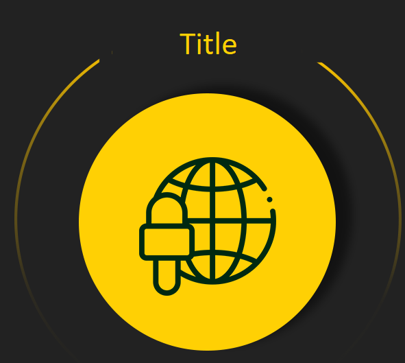
This is what I managed to make :

my design

Here is the code :

body {
  background-color: #002911 !important;
}

h3 {
  color: #ffd004;
}

#actions-container {
  margin-top: 30px;
}

#actions-container .action-icon {
  width: 200px;
  height: 200px;
  background-color: rgb(255, 208, 4);
  border-radius: 50%;
  box-shadow: 5px -2px 6px 3px #0000004a;
  /* center contents*/
  display: flex;
  justify-content: center;
  align-items: center;
}

.right-arc {
  position: relative;
  display: inline-block;
  font-size: 30px;
  color: lightgreen;
  margin: 40px;
}

.right-arc::after {
  content: '';
  position: absolute;
  right: -150px;
  top: 57px;
  height: 300px;
  width: 300px;
  border-radius: 50% 50% 50% 50%;
  border-width: 0px 1px 0px 0px;
  border-style: solid;
  /*border-top: outset;*/
}


/*svg {
            width: 33%;
            height: auto;
        }*/
<link href="https://maxcdn.bootstrapcdn.com/bootstrap/4.5.2/css/bootstrap.min.css" rel="stylesheet" />
<div class="container" id="actions-container">
  <div class="d-flex justify-content-between">

    <div class="action-icon-box text-center ">
      <div class="right-arc">

      </div>


      <h3 class="text-center">Title</h3>

      <div class="p-1 action-icon text-center mt-4">
        <a href="#"><img class="center" src="/Content/images/lp-homepage/microphone.png" height="100" /></a>
      </div>
    </div>

  </div>
</div>
web-tiki
  • 99,765
  • 32
  • 217
  • 249
TheMah
  • 378
  • 5
  • 19

3 Answers3

5

You could use a pseudo element with an inset box-shadow to create the fade out border on the bottom like this :

body {
  background: #232323;
}

.wrap {
  box-sizing: border-box;
  position: relative;
  width: 50%;
  border: 3px solid #ffd004;
  border-radius: 50%;
}

.wrap::before {
  content:'';
  display:block;
  padding-bottom:100%;
}

.wrap::after {
  content: '';
  position: absolute;
  bottom: -3px;
  left: -3px;
  right: -3px;
  height: 100%;
  z-index: 1;
  box-shadow: inset 0px -270px 70px -100px #232323;
}

.title {
  color: #ffd004;
  margin: 0;
  position: absolute;
  top: -3px;
  left: 0;
  width: 100%;
  text-align: center;
  z-index: 2;
  background: #232323;
}

.circle {
  position: absolute;
  top:15%;
  left:15%;
  width: 70%;
  height: 70%;
  border-radius: 50%;
  background: #ffd004;
  z-index: 2;
}
<div class="wrap">
  <h2 class="title">Title</h2>
  <div class="circle"></div>
</div>

Be aware that this will only work on plain color background. If you need to display this over a gradient or image, I highly suggest using SVG.

The aspect ratio of the circle is kept using the "padding technique" from this answer : Maintain the aspect ratio of a div with CSS

web-tiki
  • 99,765
  • 32
  • 217
  • 249
4

If you need transparency, you can use a mask-image with a linear-gradient.

/* based on @web-tiki's implementation */
body {
  background: #232323;
}

.wrap {
  box-sizing: border-box;
  position: relative;
  width: 50%;
  padding: 60px;
}

/* the border */
.wrap::before {
  content:"";
  position: absolute;
  top: 0;
  left: 0;
  width: 100%;
  height: 100%;
  border: 3px solid #ffd004;
  border-radius: 50%;
  -webkit-mask-image: linear-gradient(transparent 10%, black 10%, transparent 80% );
          mask-image: linear-gradient(transparent 10%, black 10%, transparent 80% );
}

/* the circle */
.wrap::after {
  content:"";
  display:block;
  background: #ffd004;
  padding-top: 100%;
  border-radius: 50%;
  box-shadow: 6px 0px 10px black;
}

.title {
  color: #ffd004;
  margin: 0;
  position: absolute;
  top: -3px;
  left: 0;
  right: 0;
  text-align: center;
}


body:hover {
  /* CSS checkerboard stolen from https://drafts.csswg.org/css-images-4/#example-2de97f53 */
  background: repeating-conic-gradient(rgba(0,0,0,0.1) 0deg 25%, white 0deg 50%);
  background-size: 2em 2em;
}
<div class="wrap">
  <h2 class="title">Title</h2>
</div>
Kaiido
  • 123,334
  • 13
  • 219
  • 285
1

Try this

body {
  background-color: #002911 !important;
}

h3 {
  color: #ffd004;
}

#actions-container {
  margin-top: 30px;
}

#actions-container .action-icon {
  width: 200px;
  height: 200px;
  background-color: rgb(255, 208, 4);
  border-radius: 50%;
  box-shadow: 5px -2px 6px 3px #0000004a;
  /* center contents*/
  display: flex;
  justify-content: center;
  align-items: center;
}
.action-icon-box{
  position: relative;
}
#actions-container .action-icon-box::after,#actions-container .action-icon-box::before{
  position: absolute;
  content: '';
  width: 300px;
  height:300px;
  border-radius: 50%;
  z-index:-1;
  top:0px;
  border: 2px solid;
  border-color:transparent;
}
#actions-container .action-icon-box::before{
  border-right-color: green;
  right: -60px;
}
#actions-container .action-icon-box::after{
  border-left-color: green;
  left: -60px;
}
<link href="https://cdnjs.cloudflare.com/ajax/libs/twitter-bootstrap/4.5.0/css/bootstrap.min.css" rel="stylesheet"/>
<div class="container" id="actions-container">
  <div class="d-flex justify-content-between">

    <div class="action-icon-box text-center ">
      <h3 class="text-center">Title</h3>

      <div class="p-1 action-icon text-center mt-4">
        <a href="#"><img class="center" src="/Content/images/lp-homepage/microphone.png" height="100" /></a>
      </div>
    </div>

  </div>
</div>
Gnanavel
  • 740
  • 6
  • 18
  • Thanks, but I want to the bottom part of the arc is going to fade out, just like a first image I sent. – TheMah Sep 30 '20 at 07:30