I am trying to align the header, body, footer, and div's vertically in one column such that the web design is responsive (looks good on different screen sizes): ConfluenceInfinite.org or see dev subdomain below.
For people who are new to html and css (like me) this is a pure css/html implementation/markup including the menu.
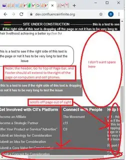
You can go to my development subdomain to see the issue first-hand: my development subdomain: dev.confluenceinfinite.org
I have done LOT of research on this. Here is some of that research:
I don't believe this question/answer applies to my issue because my issue is vertical alignment (correct me if I am wrong). It uses fixed px values, which won't work for cell phones, and I tried the display: inline-block, but it didn't work. Here is the link to the SO question:
click here
This question/answer (which got via searching OS tag vertical-alignment) also has a fixed width that I do not want to do because I want the <div>s to be fully dynamic for all screen sizes: click here
I don't think this helps either because it aligns elements within a container, but I want the containers/div's aligned. Am I missing something?: click here
This solution has the correct title/heading, but aligns things on the "right" vertically, which don't seem applicable to my issue: Click here
I used to use a website or program that allowed a developer to test/visualize website design on multiple screen sizes. I can no longer find that site. If you know the location of that site, please comment or put it in your answer. Thanks!
Here is my index/home page html markup:
<!DOCTYPE html>
<html lang="en">
<head>
<meta name="generator"
content="HTML Tidy for HTML5 (experimental) for Windows https://github.com/w3c/tidy-html5/tree/c63cc39" />
<link rel="icon" type="/images/png" href="/images/CII - favicon for website - 2020-09-17 0435.png" />
<meta charset="UTF-8" />
<meta name="viewport" content="width=device-width, initial-scale=1.0" />
<meta http-equiv="X-UA-Compatible" content="ie=edge" />
<link rel="stylesheet" href="/StylePage.css" />
<link rel="stylesheet" href="/StyleMenu.css" />
<title>CII - Optimizing change for the benefit of all.</title>
</head>
<body>
<header>
<!-- start ============================================================================ menu (goes in header) ============================== start -->
<div class="menu-wrap">
<input type="checkbox" class="toggler" />
<div class="hamburger">
<div class="ClassForTidy"></div>
</div>
<div class="menu">
<div>
<div>
<ul>
<li>
<a href="Index.html">Home</a>
</li>
<li>
<a href="Team.html">Team</a>
</li>
<li>
<a href="AboutUs.html">About Us</a>
</li>
<li>
<a href="Definitions.html">Definitions</a>
</li>
<li>
<a href="HaveDoubts.html">Have Doubts?</a>
</li>
<li>
<a href="ContactUs.html">Contact Us</a>
</li>
<li>
<a href="DonateToday.html">Donate Today</a>
</li>
<li>
<a href="GetInvolved.html">Get Involved</a>
</li>
<li>
<a href="TheMovement.html">The Movement</a>
</li>
<li>
<a href="c11.html">c11</a>
</li>
<li>
<a href="TheCeosStory.html">The CEO's Story</a>
</li>
<li>
<a href="News.html">News</a>
</li>
</ul>
</div>
</div>
</div>
</div>
<!-- end ============================================================================ menu (goes in header) ============================== end -->
<!-- start ============================================================================ header text ============================== start -->
<p id="HeaderText">-------------------- SITE UNDER CONSTRUCTION -------------------- this is a test to see if the right side of this text is dropping off the page or not it has to be very long to test the issue</p>
<!-- end ============================================================================ header text ============================== end -->
</header>
<div class="site-wrap">
<!-- start ============================================================================ logo region ============================== start -->
<figure class="fig_logo_reg">
<img src="/images/CII_Logo.PNG" class="img_logo_reg" />
</figure>
<!-- end ============================================================================ logo region ============================== end -->
<!-- start ============================================================================ start page content ============================== start -->
<!-- start ============================================================================ paste content below ============================== start -->
<div class="container showcase-inner">
<br />
<br />
<h1 style="font-size:30px; color: black; padding: 10px 0 0 0; margin: 30px 0; line-height: 30px;">Why doesn't the system favor "the good guy"? Let's rig the system in your
favor.</h1>
<h1 style="font-size:30px; color: black; padding: 10px 0 0 0; margin: 30px 0; line-height: 30px;">We know how to fund the "unicorn" and tame the "machine" whilst compelling
people to change how they think, work, and have fun so it benefits good people, without breaking any laws. Truly.</h1>
<br />
<p>The world is focused on money, getting people’s attention, and offering goods and service at an equilibrium price
where both the lowest financial cost and highest financial gain are at. CII is focused on destroying this “machine”
and system of values in a legal, ethical, and morally sound way. CII has created technology that will facilitate,
perpetuate, and maintain the new system by optimizing change for the benefit of all that will connect good people,
produce optimal “humanitarian value” output, and simultaneously destroy the old system over time. CII will facilitate
this with the help of good people in a way that will protect individuals and their livelihood achieving a better system
for society.</p>
<a href="AboutUs.html" class="btn">Read More this is a test to see if the right side of this text is dropping off the page or not it has to be very long to test the issue</a>
</div>
<!-- end ============================================================================ paste content above ============================== end -->
</div>
<!-- start =============================================================== footer ============================================= end -->
<footer>
<div class="navLeftFooter nav-globe" id="navFooter">
<a href="#top" id="navBackToTop">
<div class="navFooterBackToTop">
<span class="navFooterBackToTopText">Go Back to Top of Page - this is a test to see if the right side of this text is dropping off the page or not it has to be very long to test the issue</span>
</div>
</a>
<div class="navFooterVerticalColumn navAccessibility" role="presentation">
<div class="navFooterVerticalRow navAccessibility" style="display: table-row;">
<div class="navFooterLinkCol navAccessibility">
<div class="navFooterColHead">Get to Know Us</div>
<ul>
<li class="nav_first">
<a href="GetInvolved.html" class="nav_a">Careers & Volunteer</a>
</li>
<li>
<a href="TheCeosStory.html" class="nav_a">Blog</a>
</li>
<li>
<a href="AboutUs.html" class="nav_a">About CII</a>
</li>
<li>
<a href="AboutUs.html#TargetSusCsr" class="nav_a">Sustainability</a>
</li>
<li>
<a href="News.html" class="nav_a">News & Press Center</a>
</li>
<li>
<a href="ContactUs.html" class="nav_a">Donor Relations</a>
</li>
</ul>
</div>
<div class="navFooterColSpacerInner navAccessibility"></div>
<div class="navFooterLinkCol navAccessibility">
<div class="navFooterColHead">Get Involved with CII's Platform</div>
<ul>
<li class="nav_first">
<a href="ContactUs.html" class="nav_a">Become an Affiliate</a>
</li>
<li>
<a href="ContactUs.html" class="nav_a">Become a Strategic Partner</a>
</li>
<li>
<a href="ContactUs.html" class="nav_a">Offer Your Product or Service/"Advertise"</a>
</li>
<li>
<a href="ContactUs.html" class="nav_a">Submit an Ideology for Consideration</a>
</li>
<li>
<a href="ContactUs.html" class="nav_a">Submit an Idea for Consideration</a>
</li>
<li>
<a href="ContactUs.html" class="nav_a">Submit a Core Value for Consideration</a>
</li>
<li>
<a href="ContactUs.html" class="nav_a">Submit a Concept for Consideration</a>
</li>
<li>
<a href="ContactUs.html" class="nav_a">Submit a Core Change for Consideration</a>
</li>
<li>
<a href="ContactUs.html" class="nav_a">Submit Anything Else</a>
</li>
</ul>
</div>
<div class="navFooterColSpacerInner navAccessibility"></div>
<div class="navFooterLinkCol navAccessibility">
<div class="navFooterColHead">Connect with People</div>
<ul>
<li class="nav_first">
<a href="TheMovement.html" class="nav_a">The Movement</a>
</li>
<li>
<a href="c11.html" class="nav_a">c11</a>
</li>
<li>
<a href="ContactUs.html" class="nav_a">CII</a>
</li>
</ul>
</div>
<div class="navFooterColSpacerInner navAccessibility"></div>
<div class="navFooterLinkCol navAccessibility">
<div class="navFooterColHead">Help People</div>
<ul>
<li class="nav_first">
<a href="c11.html" class="nav_a">c11 - this is a test to see if the right side of this text is dropping off the page or not it has to be very long to test the issue</a>
</li>
<li>
<a href="ContactUs.html" class="nav_a">Report Something</a>
</li>
<li>
<a href="ContactUs.html" class="nav_a">Pay Something Forward</a>
</li>
<li>
<a href="ContactUs.html" class="nav_a">Report a "Do-gooder"</a>
</li>
<li>
<a href="ContactUs.html" class="nav_a">Report a High Humanitarian Value Output Organization</a>
</li>
<li>
<a href="ContactUs.html" class="nav_a">Report a High Humanitarian Value Output Business</a>
</li>
<li>
<a href="ContactUs.html" class="nav_a">Report a High Humanitarian Value Output nonprofit</a>
</li>
<li>
<a href="ContactUs.html" class="nav_a">Report a High Humanitarian Value Output Government/Country</a>
</li>
<li class="nav_last">
<a href="ContactUs.html" class="nav_a">Help</a>
</li>
</ul>
</div>
</div>
</div>
<div class="nav-footer-line"></div>
<div class="navFooterLine navFooterLinkLine navFooterPadItemLine">
<div class="navFooterLine navFooterLogoLine">
<figure id="FigLogoTiny">
<img src="/images/CII%20-%20favicon%20for%20website%20-%202020-09-17%200435.png" />
</figure>
</div>
<div class="navFooterLine"></div>
</div>
</div>
</footer>
<!-- end ============================================================================ footer ============================== end -->
</body>
</html>
Here is the style.css:
/* imports see https://medium.com/@elad/normalize-css-or-css-reset-9d75175c5d1e#_=_    */
@import "resets/normalize.css";
@import "resets/reset.local.css";
@import "resets/typography.css";

/* CORE STYLES */
:root {
  --primary-color: rgba(255, 255, 255, 0.75);
  --overlay-color: rgba(24, 39, 51 , 0.85);
  --menu-speed: 0.75s;
}

* {
  margin: 0;
  padding: 0;
  box-sizing: border-box;
    -moz-box-sizing: border-box;
    -webkit-box-sizing: border-box;
    box-sizing: border-box;
}

body {
  font-family: 'Roboto', sans-serif;
  line-height: 1.4;
}

header {

    transition-timing-function: cubic-bezier(0.2, 0, 0.38, 0.9);
    background: var(--cds-ui-background, #fff);
    border: none;
    max-width: 100vw; /*99rem;*/
    margin-left: 0;
    margin-right: 0;
    margin-bottom: 1px;
    position: relative;
    z-index: 5999;
    position: fixed;
    top: 0;
    right: 0;
    left: 0;
    display: flex;
    align-items: center;
    height: 3rem;
    background-color: #161616;
    border-bottom: 1px solid #393939;
    color: white;
    text-align: center;
    display: block;
}

#HeaderText {
        margin-bottom: auto;
        margin-top: auto;
        margin-left: 0;
        margin-right: 0;
        color: white;
        padding-top: 12px;
}

#SharePopup {
  position: absolute;
  top: 0;
  right: 0;
  z-index: 1;
  width: 60px;
  /* height: 60px; */
  padding: 1rem;
  /* background: var(--primary-color); */
  display: flex;
  align-items: center;
  justify-content: center;
  box-sizing: inherit;
  height: 3rem;
  color: white;
  text-align: right;
  cursor: pointer;
  background: #06D85F;
  -moz-border-radius: 50px;
    -webkit-border-radius: 50px;
    border-radius: 50px;

}
#SharePopup:hover {
  background: white;
  color: black;
}

h1 {
        line-height: 35px;
        font-size: 23px;
        padding-bottom: 0;
        padding-top: 15px;
        text-align: center;
}
h2 {
    line-height: 35px;
    font-size: 23px;
    padding-bottom: 0;
    padding-top: 0px;
    text-align: left;
}
.container {
  max-width: 100vw;
  margin: auto;
  overflow: hidden;

  /*removed on 2020-09-28 to get text to spread accross screen more and not be so scrunched/narrow in the div/tall etc*/
  /* padding: 0 3rem; */
}

.showcase {
  background: var(--primary-color);
  color: #fff;
  height: 100vh;
  position: relative;
}

.showcase:before {
  content: '';
  /* background: url('https://images.pexels.com/photos/533923/pexels-photo-533923.jpeg?auto=compress&cs=tinysrgb&dpr=2&h=750&w=1260') no-repeat center center/cover;*/
  position: absolute;
  top: 0;
  left: 0;
  width: 100vw;
  height: 100vh;
  z-index: -1;
}

.showcase .showcase-inner {
  display: flex;
  flex-direction: column;
  align-items: center;
  justify-content: center;
  text-align: center;
  height: 80%;
}

.showcase h1 {
  font-size: 4rem;
  padding: 15px;
}

.showcase p {
  font-size: 1.3rem;
  color: black;
}

.site-wrap {
  min-width: 100vw;
  min-height: 100vh;
  /* background-color: #ffffff; /* white */
  /* position: relative; */
  top: 0;
  bottom: 100%;
  left: 0;
  z-index: 1;
  padding: 4em; /*spaces out content from hamburger*/
}

.site-wrap img {
    max-width: 100vw; /*60% */
    max-height: 45vh; /*60% */
    display: block;
  margin-left: auto;
  margin-right: auto;
}
.site-wrap p {
        padding: 5px;
}
.site-wrap figure {
    align-items: center;
}
.site-wrap ul
        , li {
    padding: 5px;
    margin-left: 5px;
    padding-left: 15px;
}


.container.showcase-inner .btn {
  display: inline-block;
  border: none;
  background: white; /*var(--secondary-color);*/
  color: black;
  padding: 0.75rem 1.5rem;
  margin-top: 1rem;
  transition: opacity 1s ease-in-out;
  text-decoration: none;
   border:1px solid black;
   border-radius: 25px;

   /*fixmeben*/
    text-align: center;
   display: block;

}

.btn:hover {
  opacity: 0.7;
  background: gray;
}

/* footer stuff */

#navFooter.navLeftFooter .navFooterBackToTop .navFooterBackToTopText {
    color: white;
}
#navFooter .navFooterBackToTop span {
    display: block;
    text-align: center;
    color: #111;
    padding: 15px 0;
    line-height: 19px;
    font-size: 13px;
}
#navFooter a, #navFooter span {
    font-family: inherit;
    white-space: normal;
}

#navFooter a:link, #navFooter a:visited {
    font-family: inherit;
    color: #004B91;
    text-decoration: none;
}
a, a:active, a:link, a:visited {
    text-decoration: none;
    color: #0066c0;
}
user agent stylesheet
a:-webkit-any-link {
    color: -webkit-link;
    cursor: pointer;
}
.a-ember body {
    font-family: Arial,sans-serif;
}
body {
    color: #0F1111;
}
body {
    font-size: 13px;
    line-height: 19px;
    font-family: Arial,sans-serif;
}
html {
    font-size: 100%;
    -webkit-text-size-adjust: 100%;
}
#navFooter.navLeftFooter .navFooterBackToTop {
    margin-bottom: 40px;
    background-color: gray;
}
#navFooter .navFooterBackToTop {
    background-color: #f3f3f3;
    margin-bottom: 25px;
}
/* * { */
    /* -moz-box-sizing: border-box; */
    /* -webkit-box-sizing: border-box; */
    /* box-sizing: border-box; */
/* } */
user agent stylesheet
div {
    display: block;
}
#navFooter a:link, #navFooter a:visited {
    font-family: inherit;
    color: #004B91;
    text-decoration: none;
}
#navFooter a, #navFooter span {
    font-family: inherit;
    white-space: normal;
}
a, a:active, a:link, a:visited {
    text-decoration: none;
    color: #0066c0;
}
user agent stylesheet
a:-webkit-any-link {
    color: -webkit-link;
    cursor: pointer;
}

/* body { */
    /* color: #0F1111; */
/* } */
/* body { */
    /* font-size: 13px; */
    /* line-height: 19px; */
    /* font-family: Arial,sans-serif; */
/* } */
/* html { */
    /* font-size: 100%; */
    /* -webkit-text-size-adjust: 100%; */
/* } */
 /* start footer table 1 starting with Get to know us */

#navFooter .navAccessibility.navFooterVerticalColumn {
    display: table;
    margin: 0 auto;
}

#navFooter.navLeftFooter .navFooterVerticalColumn {
    /* changed 2020-09-28 18:10 */
    max-width: 100vw;
    background: rgb(105,105,105);
}
#navFooter .navAccessibility.navFooterVerticalRow {
    display: table-row;
}
#navFooter .navAccessibility.navFooterLinkCol {
    display: table-cell;
    padding: 0 10px;
}
#navFooter .navAccessibility.navFooterLinkCol {
    line-height: 120%;
}

.navFooterLinkCol {
    color: #333;
    vertical-align: top;
}

#navFooter.navLeftFooter .navFooterColHead {
    font-weight: 700;
}
.navFooterColHead {
    font-family: inherit;
    color: white;
    font-size: 16px;
    margin: 6px 0 14px 0;
    white-space: nowrap;
}
.navFooterLinkCol ul {
    padding: 0;
    margin: 0;
}
.a-ordered-list, .a-unordered-list, ol, ul {
    padding: 0;
}
.a-unordered-list, ul {
    margin: 0 0 0 18px;
    color: #111;
}
#navFooter.navLeftFooter .navFooterLinkCol ul li {
    margin: 0 0 10px;
}
.navFooterLinkCol ul li {
    list-style-type: none;
    white-space: nowrap;
    margin: 0 0 8px 0;
}

.a-ordered-list li, .a-unordered-list li, ol li, ul li {
    word-wrap: break-word;
    margin-top: 0px;
    margin-right: 0px;
    margin-bottom: 0px;
    margin-left: 25px;
    padding: 0px;
}
.a-unordered-list li, ul li {
    list-style: disc;
}
li {
    display: list-item;
    text-align: -webkit-match-parent;
}

.a-unordered-list, ul {
    margin: 0 0 0 18px;
    color: #111;
}

#navFooter .navAccessibility.navFooterLinkCol {
    line-height: 120%;
}
.navFooterLinkCol {
    color: #333;
    vertical-align: top;
}
#navFooter.navLeftFooter a.nav_a:link, #navFooter.navLeftFooter a.nav_a:visited, #navFooter.navLeftFooter li.nav_a_carat span.nav_a_carat {
    color: #DDD;
}
#navFooter a:link, #navFooter a:visited {
    font-family: inherit;
    color: #004B91;
    text-decoration: none;
}
#navFooter a, #navFooter span {
    font-family: inherit;
    white-space: normal;
}
a, a:active, a:link, a:visited {
    text-decoration: none;
    color: #0066c0;
}

/* working on navFooterColSpacerInner */
#navFooter .navAccessibility.navFooterColSpacerInner, #navFooter .navAccessibility.navFooterLinkCol {
    display: table-cell;
    padding: 0 5px;
}
.navFooterVerticalColumn .navFooterColSpacerInner {
    width: 5%;
    padding: 0 15px;
}
#navFooter.navLeftFooter .nav-footer-line {
    border-top: 1px solid #3a4553;
    margin-top: 40px;
}
#navFooter.navLeftFooter div.navFooterLine {
/* working */
    max-width: 25%;
}
#navFooter.navLeftFooter .navFooterLinkLine {
    margin: 10px auto;
}
#navFooter.navLeftFooter .navFooterLogoLine, #navFooter.navLeftFooter .navFooterPadItemLine {
    text-align: center;
    max-width: 100vw;
    margin: 30px auto 15px;
}
div.navFooterLine {
    font-family: inherit;
    color: #767676;
    font-size: 11px;
    text-align: center;
    line-height: 18px;
    white-space: nowrap;
}
.navFooterLinkLine {
    margin: 0 8px 0 8px;
}
#navFooter a, #navFooter span {
    font-family: inherit;
    white-space: normal;
}
.navFooterPadItemLine a, .navFooterPadItemLine span {
    padding: 0 .6em;
}
.navFooterLinkLine span, .navFooterLinkLine ul {
    list-style-type: none;
    display: inline-block;
    padding: 0;
    margin: 0;
}
#navFooter.navLeftFooter div.navFooterLine {
    font-size: 12px;
}
#navFooter.navLeftFooter .navFooterLogoLine, #navFooter.navLeftFooter .navFooterPadItemLine {
    text-align: center;
    max-width: 100vw;
    margin: 30px auto 15px;
}
div.navFooterLogoLine {
    margin: 30px 8px 4px 8px;
    font-size: 1px;
    line-height: 0;
}
div.navFooterLine {
    font-family: inherit;
    color: #767676;
    font-size: 11px;
    text-align: center;
    line-height: 18px;
    white-space: nowrap;
}
a, a:active, a:link, a:visited {
    text-decoration: none;
    color: #0066c0;
}
#navFooter .nav-logo-base {
    background-position: -10px -90px;
    width: 76px;
    height: 23px;
    margin: 0 auto;
    background: url('/images/CII_Logo.png');
}
.nav-globe .nav-globe, .nav-globe .nav-icon {

    /* background-color: black;  */
}

#FigLogoTiny {
    /*working*/
    /* max-width: 5%; */
    max-height: 5%;
    display: block;
    margin-left: auto;
    margin-right: auto;

    margin: 0;
    padding: 0;
    box-sizing: border-box;
    -moz-box-sizing: border-box;
    -webkit-box-sizing: border-box;
    box-sizing: border-box;

    /* position: absolute; */
    /* bottom: 100%; */
    /* right: 100%; */

}
I am happy to include the imports if that is helpful. I assume you can see that by inspecting the website directly, but I am happy to edit this question to include the import css. Trying to keep the question as organized and short as possible.
I will be watching this question to see if anyone needs anything further to answer it or provide any assistance at all. I will edit the question as soon as possible if necessary. Thanks!
PS - I'm trying to make the solution/my website work across all browsers and all screen sizes without any scripts, if that is possible.
PSS - On a computer you have to size the window down to see the issue...that's what I did in the computer screenshot above to illustrate the issue.
EDIT-1: I should also state that the preferable responsiveness/dynamic/movement/etc. for the footer is to have a div column slide down below the other div columns if it doesn't fully fit on the page/isn't all visible to the user.